
geometrics — Learn app
New to the study of regional catching up and inequality? Learn the main ideas through plain-language explanations and small interactive examples that you can run and change yourself. It runs on Streamlit in your web browser.
Interactive apps to explore data and learn methods in the browser: Google Earth Engine dashboards, Streamlit apps and the companion apps of the tutorials.
New to the study of regional catching up and inequality? Learn the main ideas through plain-language explanations and small interactive examples that you can run and change yourself. It runs on Streamlit in your web browser.

Where are the richest and poorest regions, and do similar regions cluster together on the map? Map regional data, see how much neighboring regions resemble each other, and spot clusters of high and low values over time. It runs on Streamlit in your web browser.

Are poorer regions catching up with richer ones, and is inequality between regions falling? Measure catching up, regional inequality and how regions move between income groups, with methods that take neighboring regions into account. It runs on Streamlit in your web browser.

New to data that follow the same units over many years? Learn the main methods through plain-language explanations and small interactive examples that you can run and change yourself. It runs on Streamlit in your web browser.

What patterns hide in data that follow the same countries, firms or people over many years? Explore distributions, missing values, trends over time, and the differences between units and within each unit, with no coding needed. It runs on Streamlit in your web browser.

How can we measure a relationship when we observe the same countries, firms or people over many years? Fit the standard models for this kind of data, compare them with formal tests, and study what happens before and after an event or whether poorer units catch up. It runs on Streamlit in your web browser.
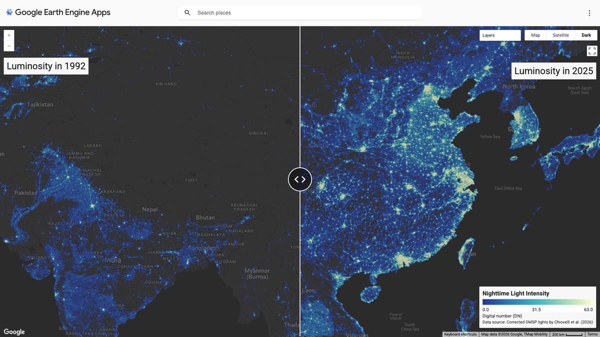
How has the world at night changed between two years? Pick any two years from 1992 to 2025 and compare their nighttime light maps side by side on a split screen, using a long harmonized satellite record that joins older and newer satellites. It runs on Google Earth Engine in your web browser.
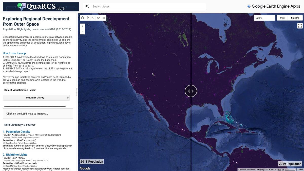
How did population, nighttime lights, land use and economic output change across Cambodia between 2013 and 2019? Explore maps and trends of these four measures to see how they evolved over space and time. It runs on Google Earth Engine in your web browser.
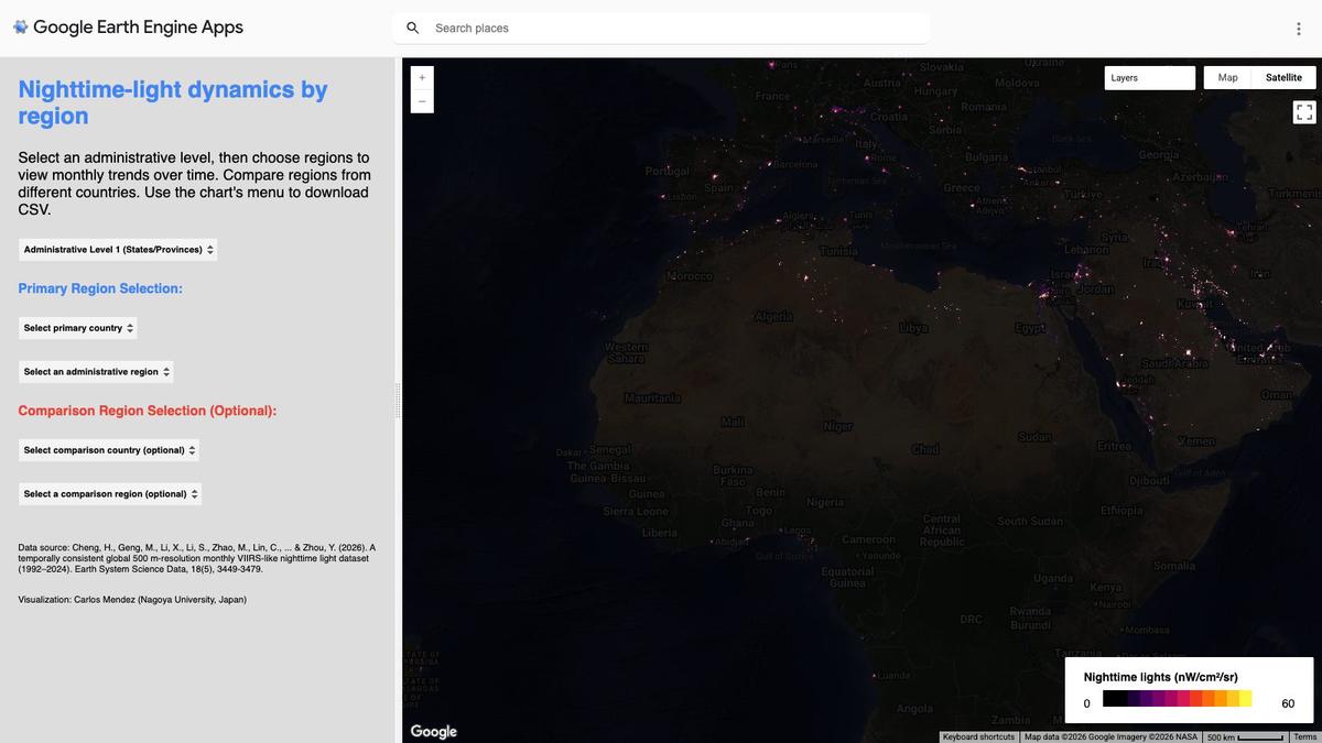
How does nighttime brightness change from month to month across a whole region? Choose an administrative region, such as a country or province, to see its monthly nighttime light series from 1992 to 2024, using a newer, more detailed night-light series rebuilt back to 1992. It runs on Google Earth Engine in your web browser.
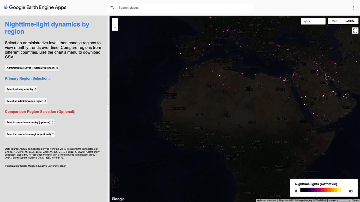
How has nighttime brightness changed year by year across a whole region? Choose an administrative region, such as a country or province, to see its yearly nighttime light series from 1992 to 2024, using a newer, more detailed night-light series rebuilt back to 1992. It runs on Google Earth Engine in your web browser.
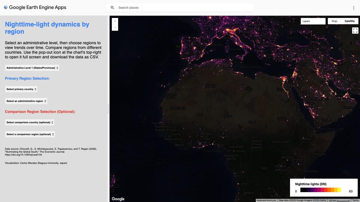
How has a whole region grown brighter at night since 1992? Choose an administrative region, such as a country or province, to see its yearly nighttime light series up to 2025, from a long harmonized satellite record that joins older and newer satellites. It runs on Google Earth Engine in your web browser.
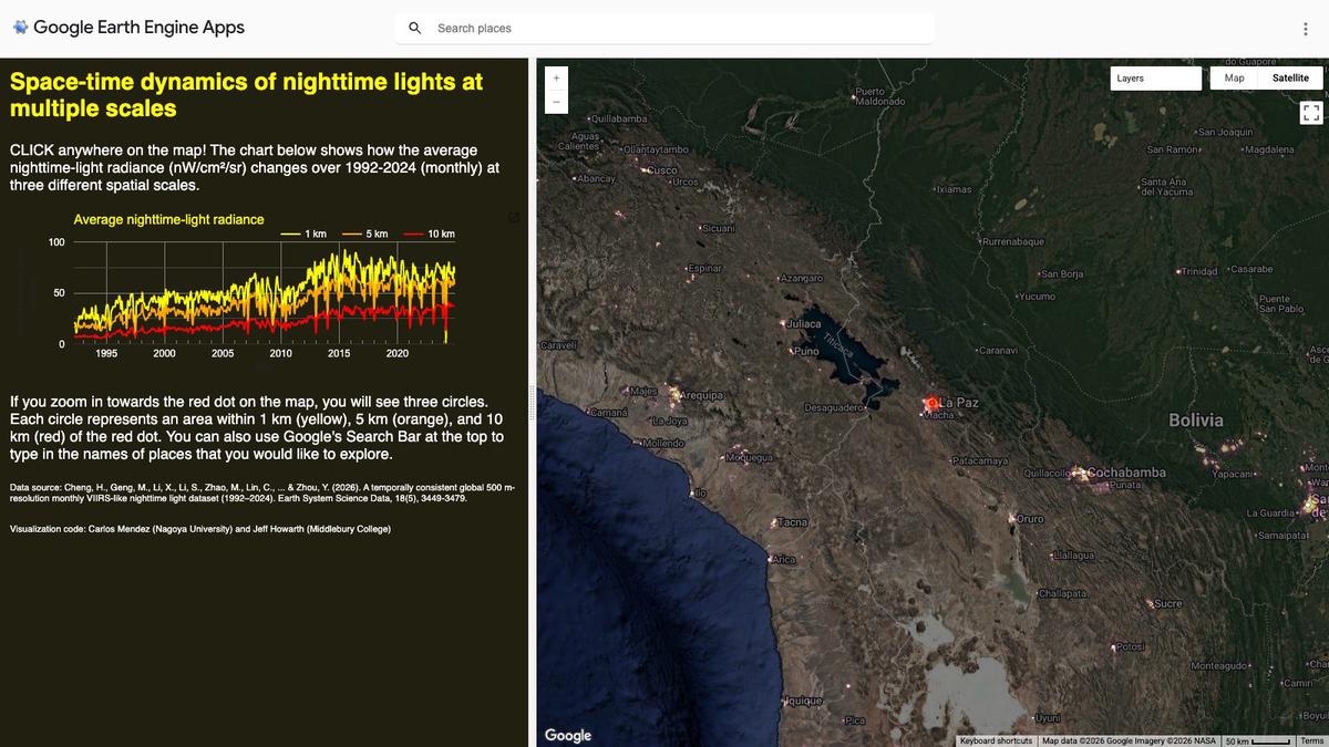
How does nighttime brightness change from month to month at a specific place? Click any point on the world map to see its monthly nighttime light series from 1992 to 2024, using a newer, more detailed night-light series rebuilt back to 1992. It runs on Google Earth Engine in your web browser.
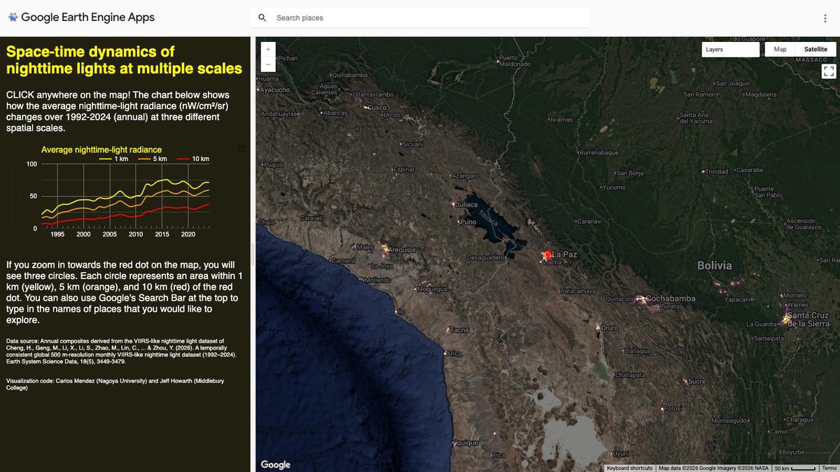
How has nighttime brightness changed year by year at a specific place? Click any point on the world map to see its yearly nighttime light series from 1992 to 2024, using a newer, more detailed night-light series rebuilt back to 1992. It runs on Google Earth Engine in your web browser.
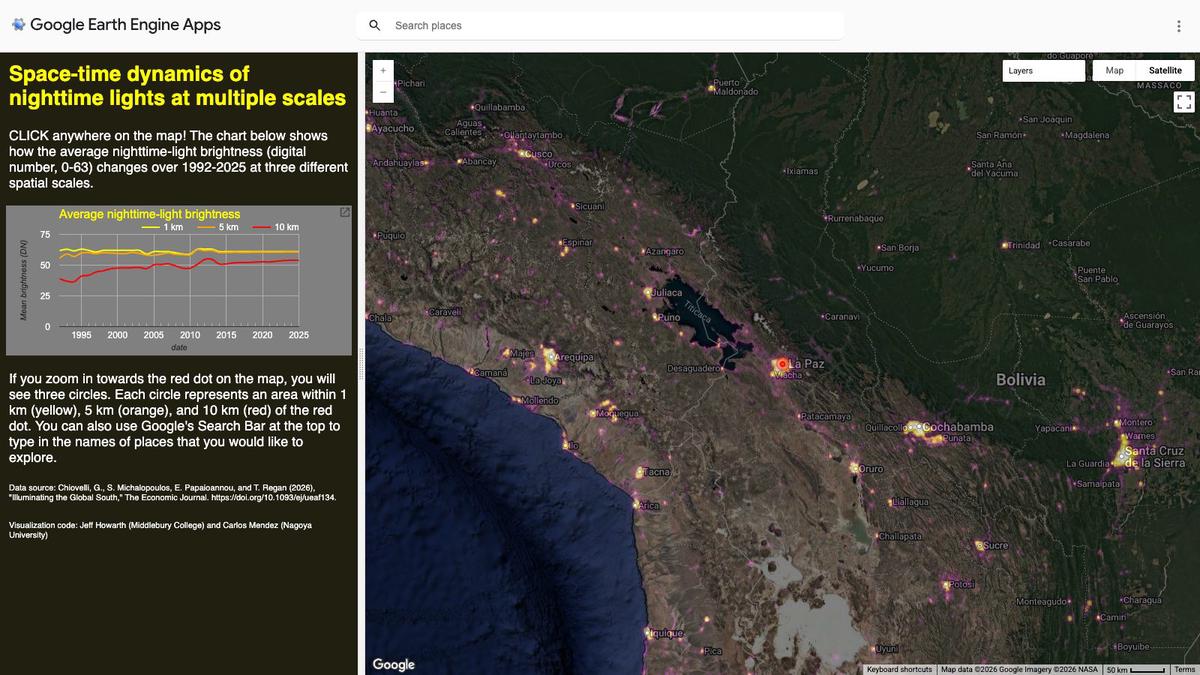
How bright have the nights been at a place you care about since 1992? Click any point on the world map to see its yearly nighttime light series up to 2025, from a long harmonized satellite record that joins older and newer satellites. It runs on Google Earth Engine in your web browser.
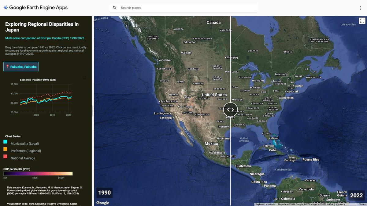
How large are the income gaps between the regions of Japan, and have they narrowed since 1990? Compare economic output per person across Japanese regions at several geographic scales, from 1990 to 2022. It runs on Google Earth Engine in your web browser.
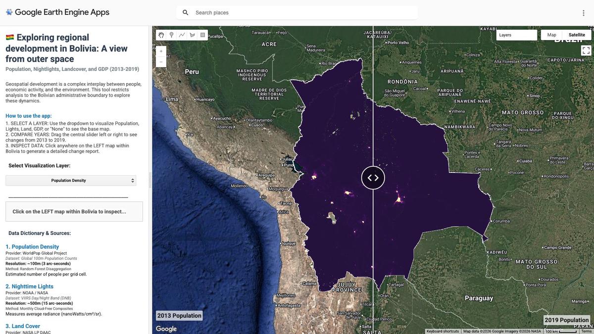
How did population, nighttime lights, land use and economic output change across Bolivia between 2013 and 2019? Explore maps and trends of these four measures to see how they evolved over space and time. It runs on Google Earth Engine in your web browser.
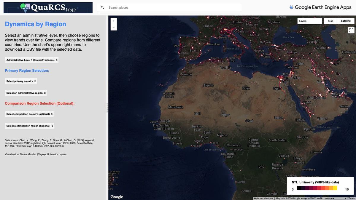
Which regions of the world are catching up in nighttime brightness, and which are falling behind? See how regions move up or down relative to each other from 1992 to 2023, using a newer, more detailed night-light series rebuilt back to 1992. It runs on Google Earth Engine in your web browser.
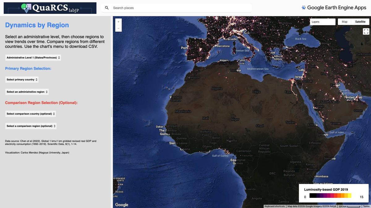
Which regions of the world are catching up in economic output, and which are falling behind? See how regions move up or down relative to each other from 1992 to 2019, using fine-grained estimates of economic output built from satellite night lights. It runs on Google Earth Engine in your web browser.
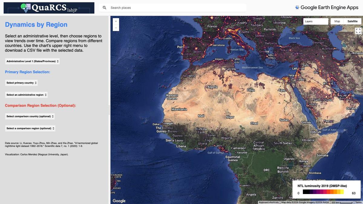
Which regions of the world are catching up in nighttime brightness, and which are falling behind? See how regions move up or down relative to each other from 1992 to 2019, using a long harmonized satellite record that joins older and newer satellites. It runs on Google Earth Engine in your web browser.
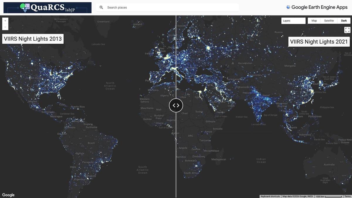
Where in the world have nights become brighter in recent years? Browse yearly global maps of nighttime lights from the newer, more detailed satellite series, which covers recent years only. It runs on Google Earth Engine in your web browser.
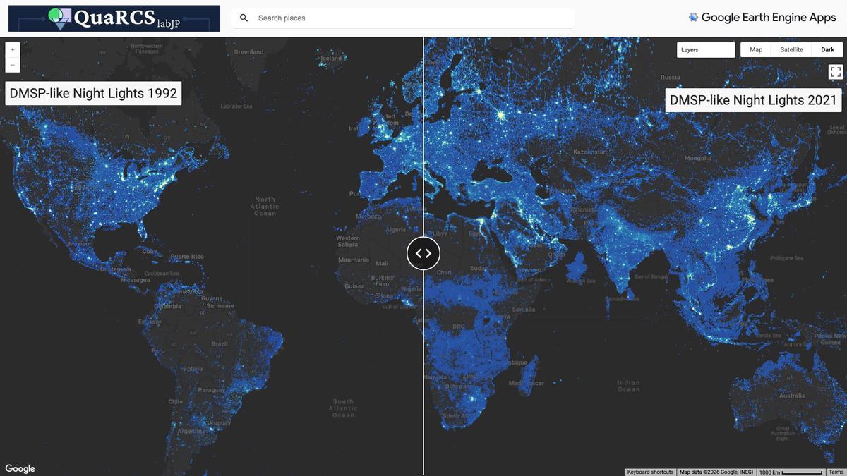
Where in the world did nights get brighter, and when? Browse global maps of nighttime lights over time, using a long harmonized series that joins older and newer satellites into one record starting in 1992. It runs on Google Earth Engine in your web browser.
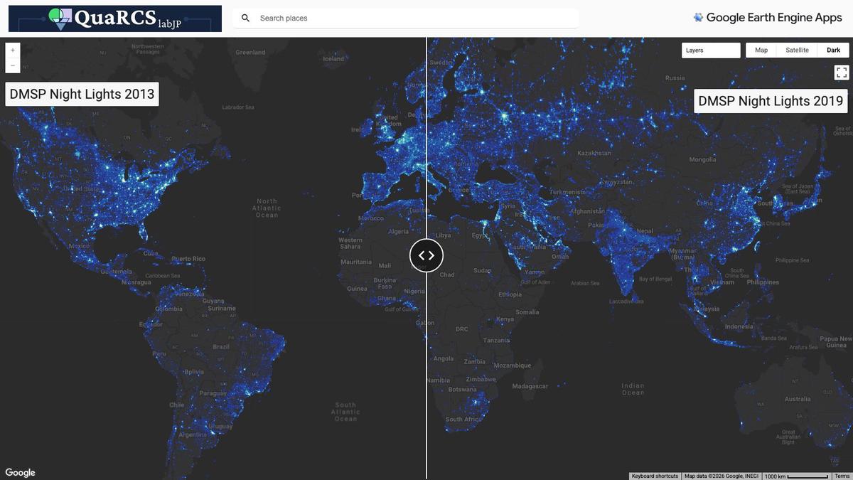
Where in the world did nights get brighter, and when? Browse global maps of nighttime lights over time, using the older satellite night-light series extended forward to more recent years. It runs on Google Earth Engine in your web browser.
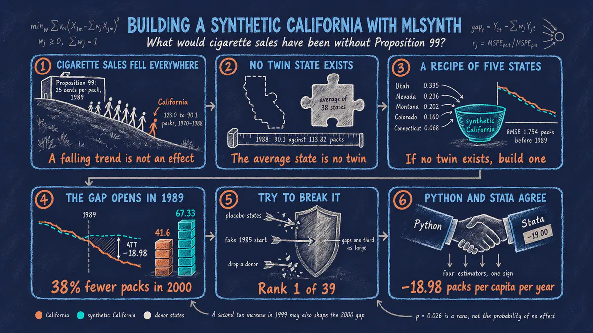
How much did Proposition 99, the 1989 California tobacco program, reduce cigarette sales? This beginner Python tutorial teaches the synthetic control method, which builds a look-alike California from other states, finds about 19 fewer packs sold per person each year, and then tries hard to break that result. It comes with an interactive app that runs in your web browser.
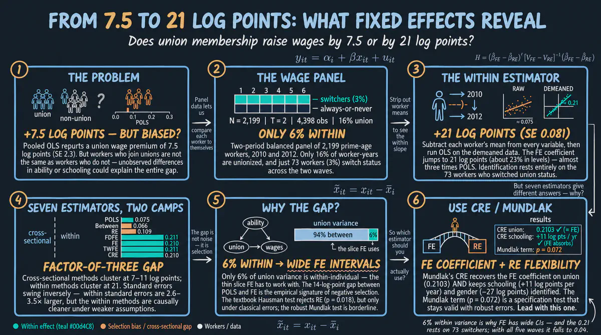
Does joining a union raise wages? Following the same workers over two years in Python, we compare seven ways to analyze repeated data and see that the estimated wage gain nearly triples once each worker is compared with the same worker at another time. It comes with an interactive app that runs in your web browser.
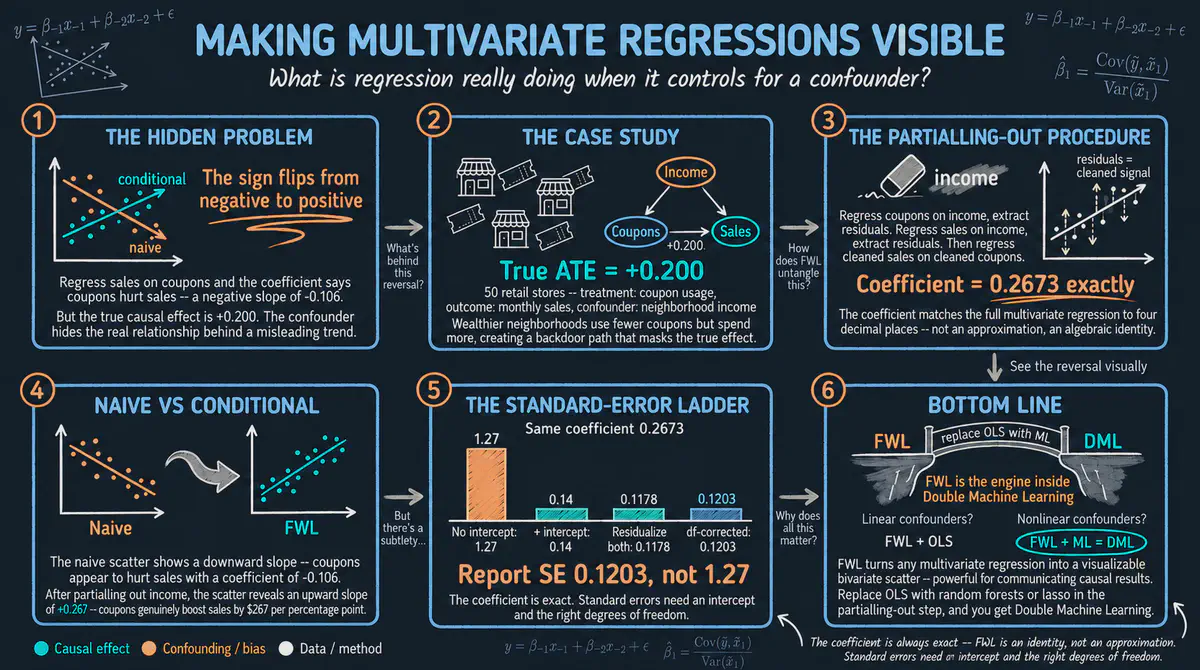
What does it really mean to control for another factor in a regression? This Python tutorial uses a simulated fast food coupon campaign to show that any such result can be rebuilt by first removing what the other factors explain and then plotting what is left in a simple two-variable chart. It comes with an interactive app that runs in your web browser.
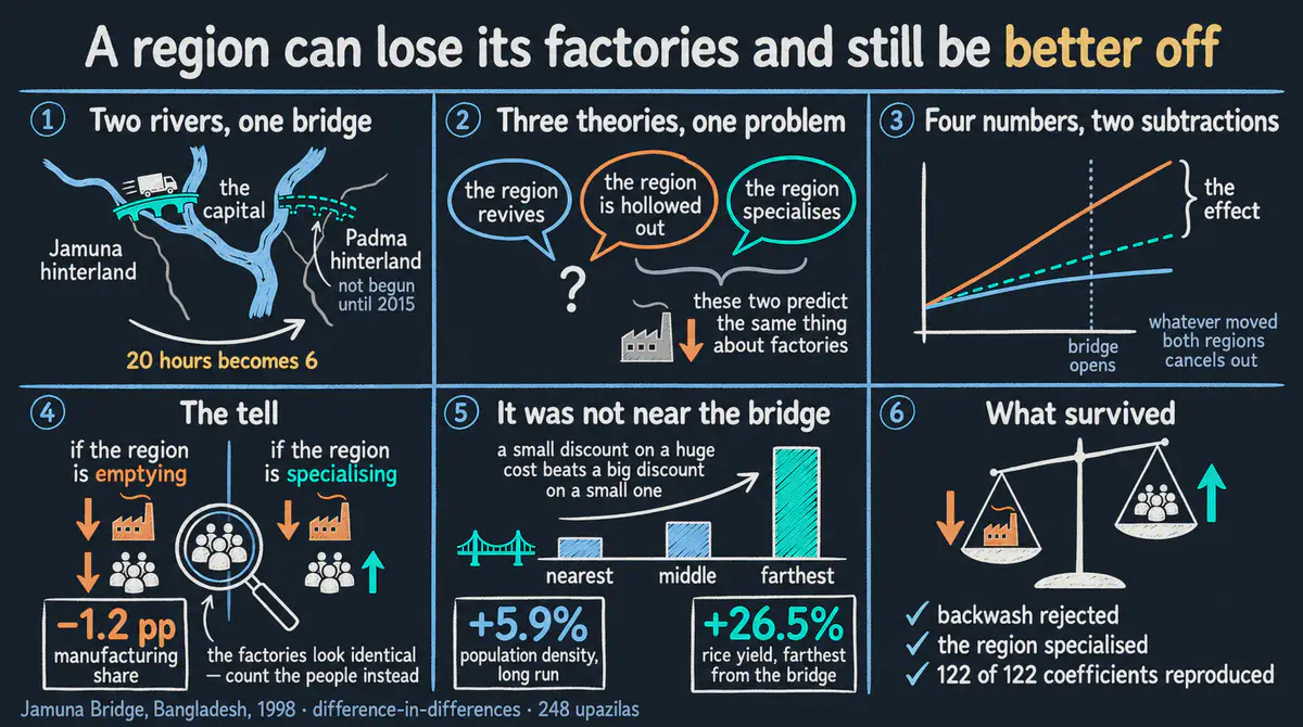
When a major bridge connected millions of people in northwest Bangladesh to the capital in 1998, did the region’s economy take off? This beginner-friendly Python tutorial uses satellite images of nighttime lights to compare the connected region with a similar one that stayed isolated, before and after the bridge opened.
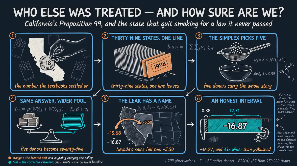
Did the 1988 California tobacco law cut cigarette sales, and did it also affect neighboring states such as Nevada? This Python tutorial builds a look-alike California from other states in three steps, the last one letting nearby states be affected too, and finds that the drop in California holds up. It comes with an interactive app that runs in your web browser.
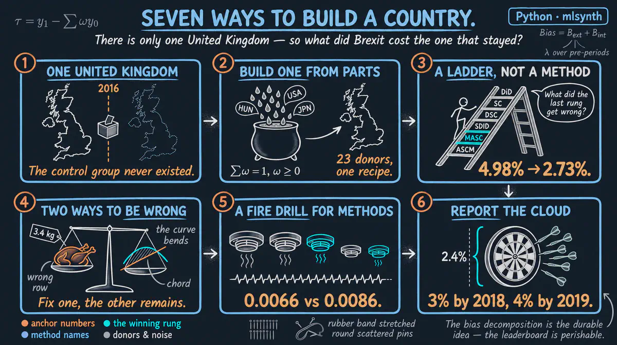
How much did the 2016 Brexit vote cost the British economy? This Python tutorial builds a look-alike United Kingdom from other wealthy economies with six related methods, finds output about 3 percent lower by the end of 2018, and shows how default settings can quietly change the answer. It comes with an interactive app that runs in your web browser.
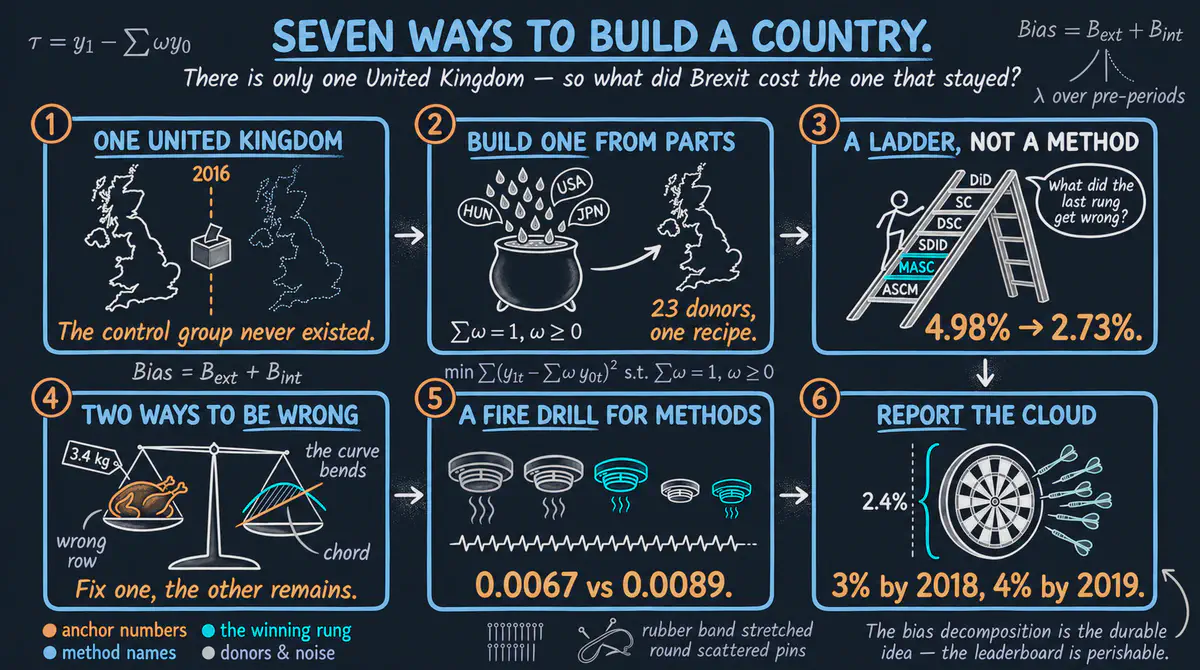
How much did the 2016 Brexit vote cost the economy of the United Kingdom? We build a look-alike United Kingdom from other rich countries, step by step through a ladder of increasingly flexible methods, and compare what each step says. This R tutorial includes cheat sheets for Stata and Python and an interactive app that runs in your web browser.
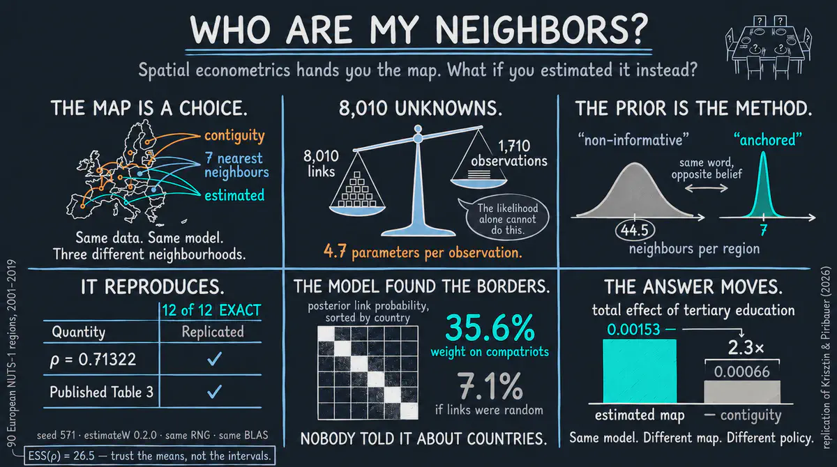
Which European regions actually influence each other? Instead of assuming that only bordering regions matter, we let growth data for 90 European regions from 2001 to 2019 reveal who the real neighbors are. This R tutorial comes with an interactive app that runs in your web browser.
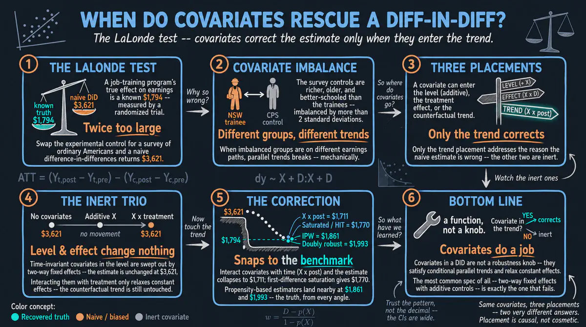
Can we still find the true effect of a job training program on earnings if we compare trainees with ordinary survey respondents instead of a randomized control group? This Python tutorial shows that adding background characteristics fixes the estimate only when they adjust the expected earnings trend of the comparison group. It comes with an interactive app that runs in your web browser.
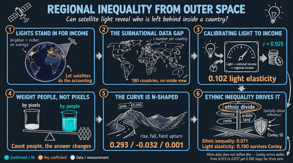
Learn how to turn satellite images of nighttime lights into estimates of regional income, then measure how unequal regions are within each country. Step by step in Python, we test whether regional inequality first rises and then falls as countries develop.
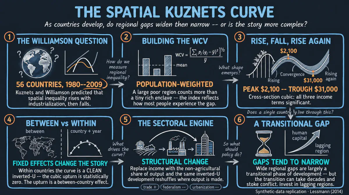
Do gaps between rich and poor regions within a country first widen and then narrow as the country develops? Using simulated data for 56 countries that mirrors a published study, we measure regional inequality and trace how it rises and falls with income, from simple to more flexible methods. This R tutorial comes with an interactive app that runs in your web browser.
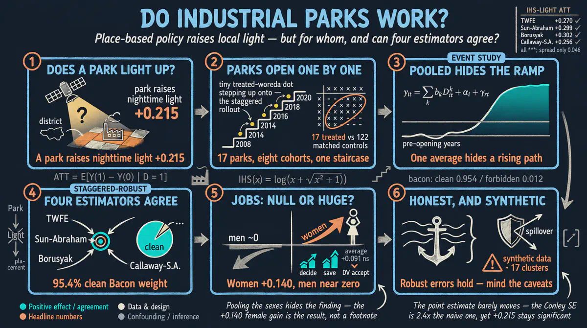
Do industrial parks bring more economic activity to nearby towns, and who benefits? This Python tutorial compares places that got a park with places that did not, before and after it opened, using simulated data modeled on Ethiopia, and also looks at household welfare and outcomes for women. It comes with an interactive app that runs in your web browser.
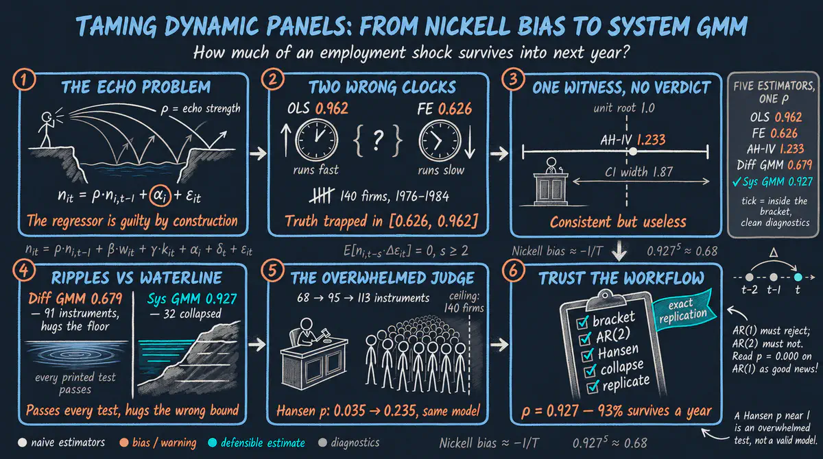
When a firm gains or loses workers this year, how much of that change is still there next year? This Python tutorial uses data on 140 British firms to show why simple estimates of this persistence mislead and how more careful methods and checks reach a reliable answer. It comes with an interactive app that runs in your web browser.
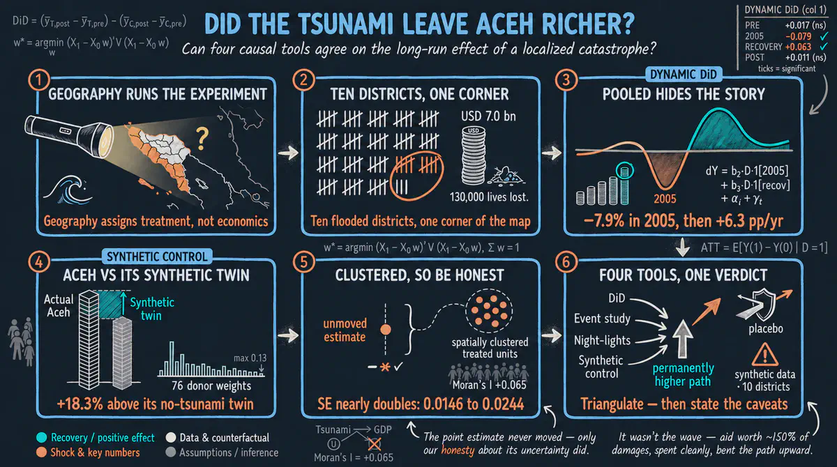
How did the 2004 tsunami affect the economy of Aceh, Indonesia, over the long run? This beginner-friendly Python tutorial uses simulated data, nighttime lights, and several causal methods to compare damaged and undamaged areas before and after the disaster.
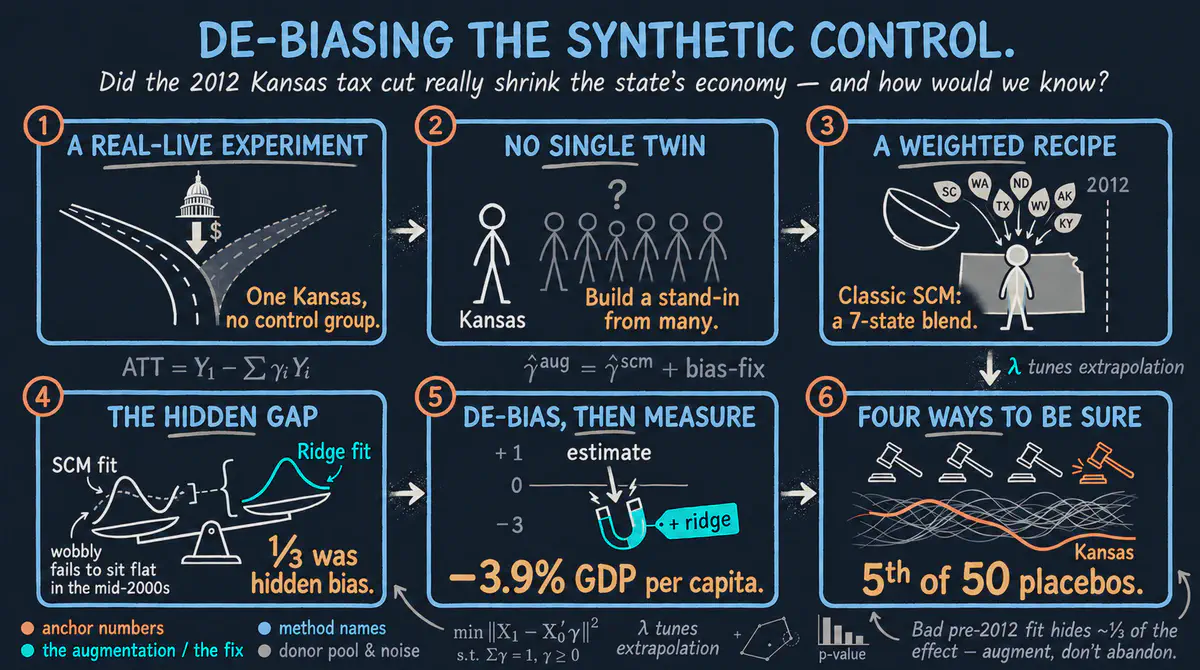
Did the large 2012 Kansas tax cut boost the state economy, or shrink it? This beginner R tutorial builds a look-alike Kansas from other states, then corrects the remaining mismatch, and finds output per person roughly 3 to 4 percent lower, although chance cannot be fully ruled out. It comes with an interactive app that runs in your web browser.
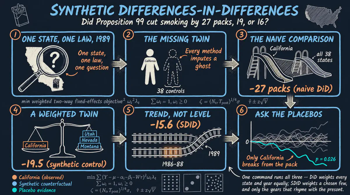
Did the 1988 tobacco tax in California reduce smoking? In Stata, we compare three ways of building a comparison for California from other states, including a newer method that blends their strengths, and all three agree that cigarette sales fell, though by different amounts. It comes with an interactive app that runs in your web browser.
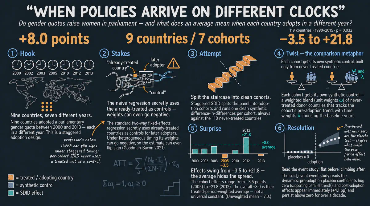
Do gender quotas raise the share of women in national parliaments? In Stata, we compare 9 countries that adopted quotas in different years with look-alike groups built from 110 countries without quotas, and find an average gain of about 8 percentage points that varies a lot across countries. The tutorial includes an interactive app that runs in your web browser.
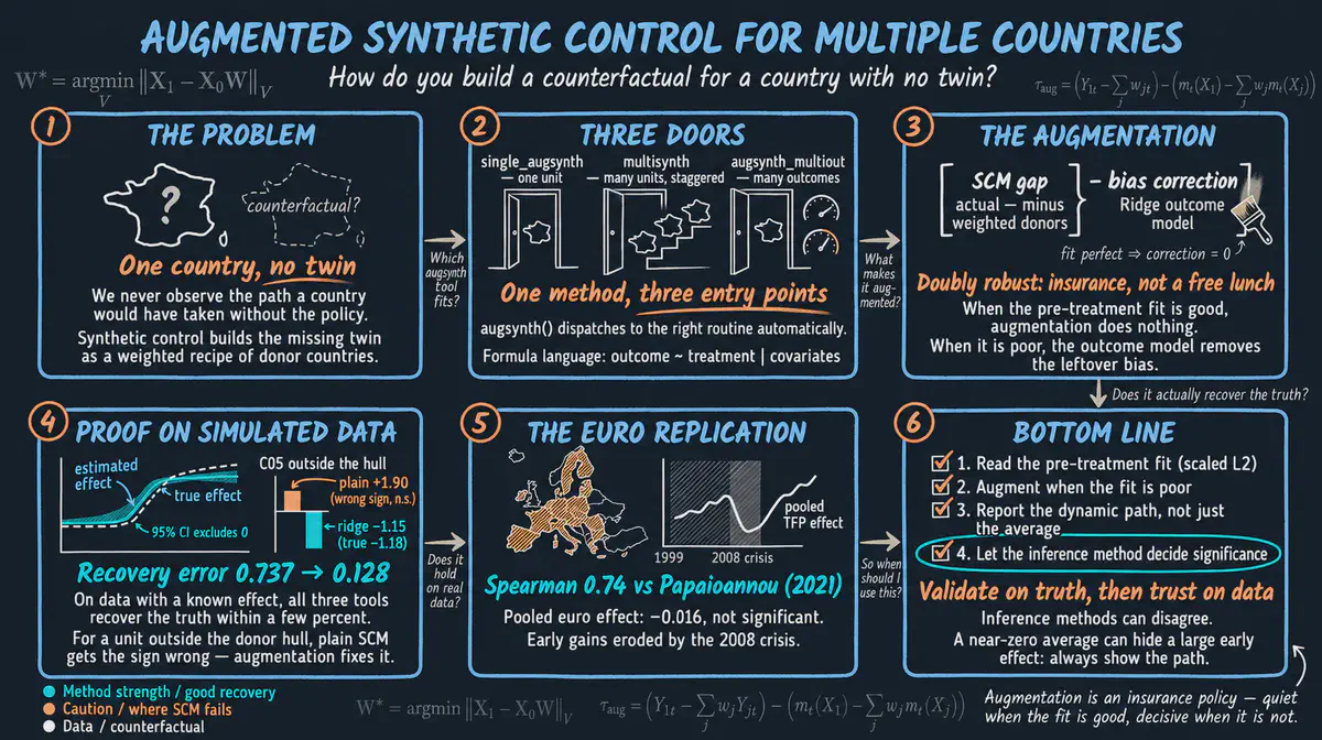
Did joining the euro make countries more productive? We build look-alike comparison countries from economies that did not join, first with simulated data and then with a published study of the euro area, and check whether the effect is real or just noise. This R tutorial comes with an interactive app that runs in your web browser.
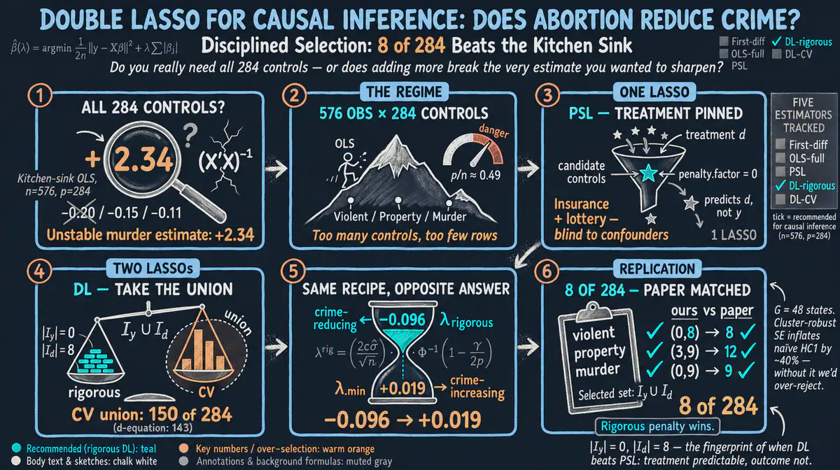
Did legal abortion lower crime in the United States, as a famous 2001 study claimed? Instead of hand-picking a few control variables, we let a data-driven method choose among 284 candidates and check whether the original finding holds up. This R tutorial comes with an interactive app that runs in your web browser.
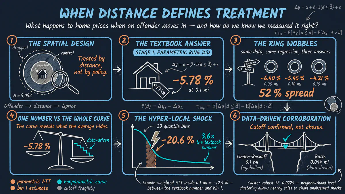
What happens to nearby home prices when a registered sex offender moves into a neighborhood? We compare homes close to the address with homes a little farther away, before and after the move, and show how the distance chosen as the cutoff can change the answer. This R tutorial comes with an interactive app that runs in your web browser.
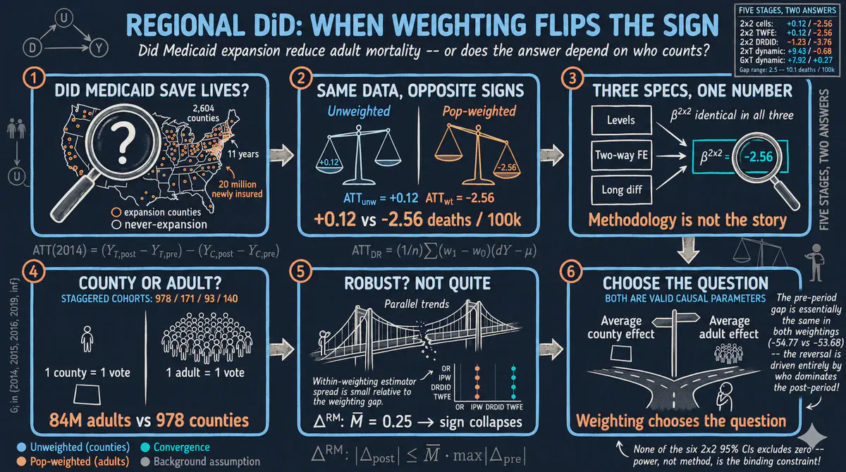
Did expanding Medicaid health coverage to low-income adults reduce deaths? We compare counties in states that expanded coverage with counties in states that did not, and show how counting each county equally or each person equally can change the answer. This R tutorial includes an interactive app that runs in your web browser.
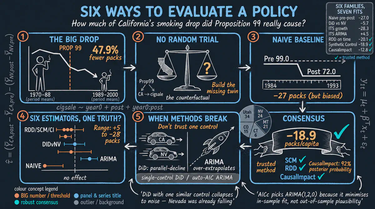
Did the 1988 California cigarette tax reduce cigarette sales, and do different methods agree on how much? This R tutorial applies six ways of evaluating a policy to the same data and finds that most point to a drop of roughly 13 to 20 packs per person each year. It comes with an interactive app that runs in your web browser.
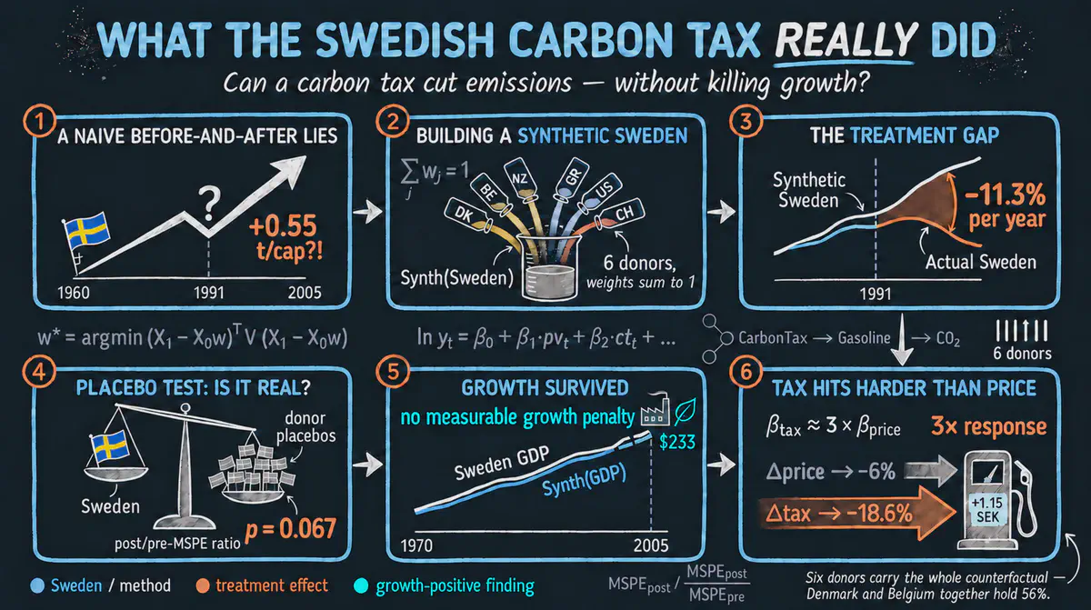
Did the carbon tax that Sweden introduced in 1991 cut carbon emissions from transport, and did it hurt the economy? This Python tutorial builds a look-alike Sweden from other wealthy countries and finds transport emissions about 11 percent lower each year, with no sign of slower economic growth. It comes with an interactive app that runs in your web browser.
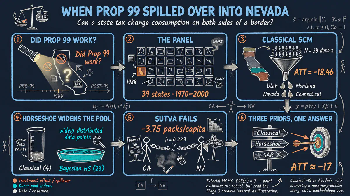
How much did the 1988 California tobacco tax reduce cigarette sales? We build a look-alike California from other states and also measure how the policy spilled over to neighboring states such as Nevada, where people cross the border to buy cigarettes. This R tutorial comes with an interactive app that runs in your web browser.
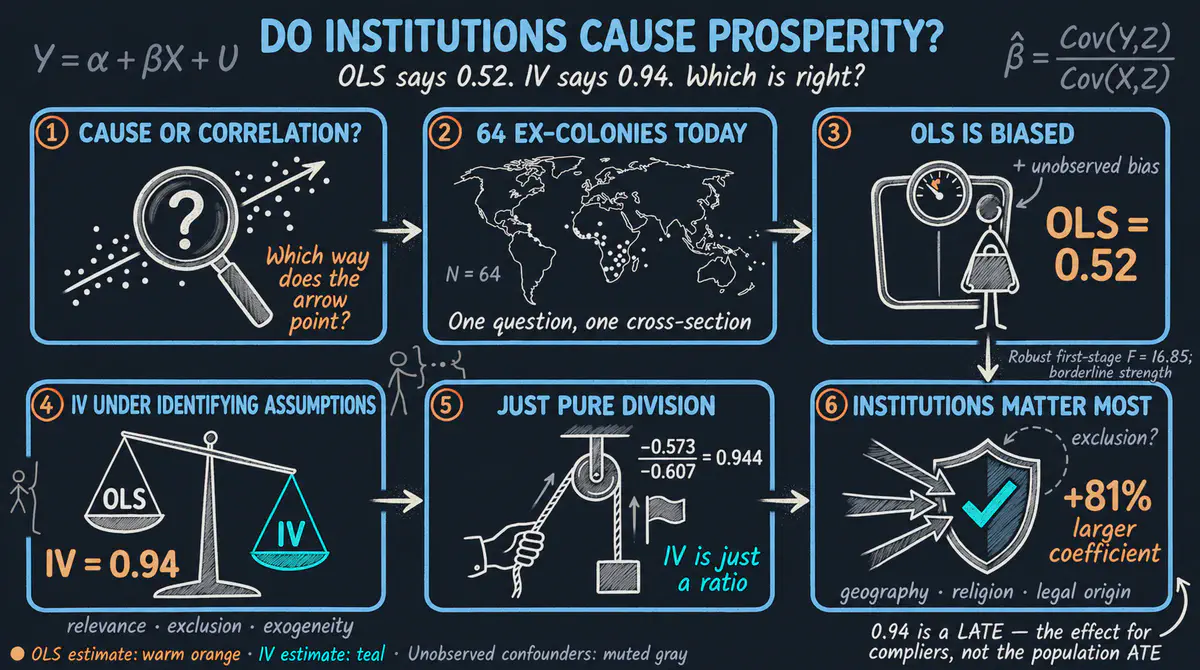
Do good institutions make countries richer? This Python tutorial revisits the 2001 study by Acemoglu, Johnson and Robinson, which uses death rates of early European settlers in 64 former colonies to isolate the effect of institutions, and shows that a simple comparison understates that effect. It comes with an interactive app that runs in your web browser.
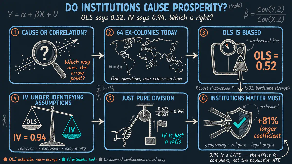
Do good institutions make countries richer? Following the 2001 study by Acemoglu, Johnson and Robinson in Stata, we use the death rates of early European settlers in 64 former colonies as a natural experiment, and find an effect much larger than a simple comparison suggests. The tutorial includes an interactive app that runs in your web browser.
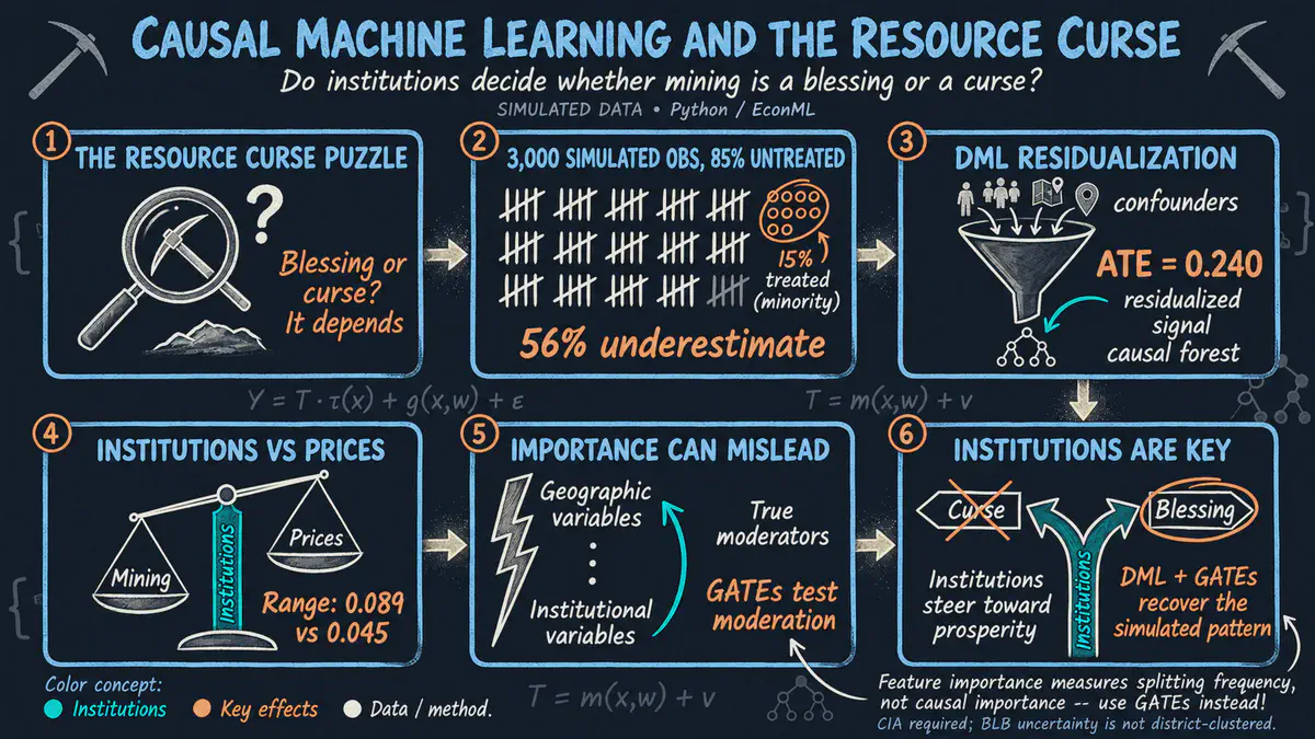
Does mining wealth help or hurt local development, and do good local institutions make the difference? This Python tutorial uses causal machine learning on simulated district data with known true effects to measure how the impact of mining and mineral prices varies from place to place. It comes with an interactive app that runs in your web browser.
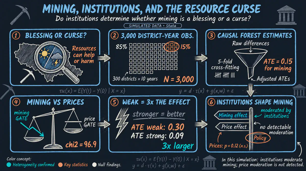
Does mining make places richer or poorer, and does the answer depend on the quality of government? Using simulated data that mirrors a published study, we use machine learning in Stata to estimate how the effects of mining and mineral prices on development differ from place to place. The tutorial comes with an interactive app that runs in your web browser.
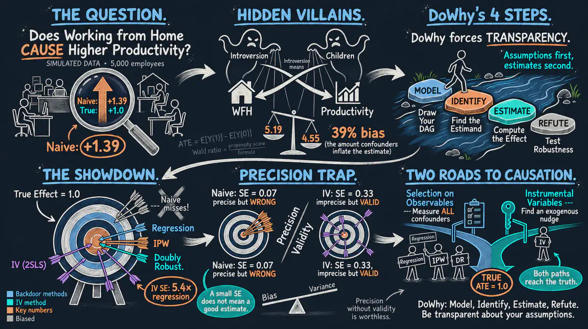
Does working from home make employees more productive, or do productive people simply choose to work from home? This beginner Python tutorial uses simulated data with a known answer to show a four-step approach to cause and effect: state your assumptions, decide what to compare, estimate the effect and stress-test it. It comes with an interactive app that runs in your web browser.
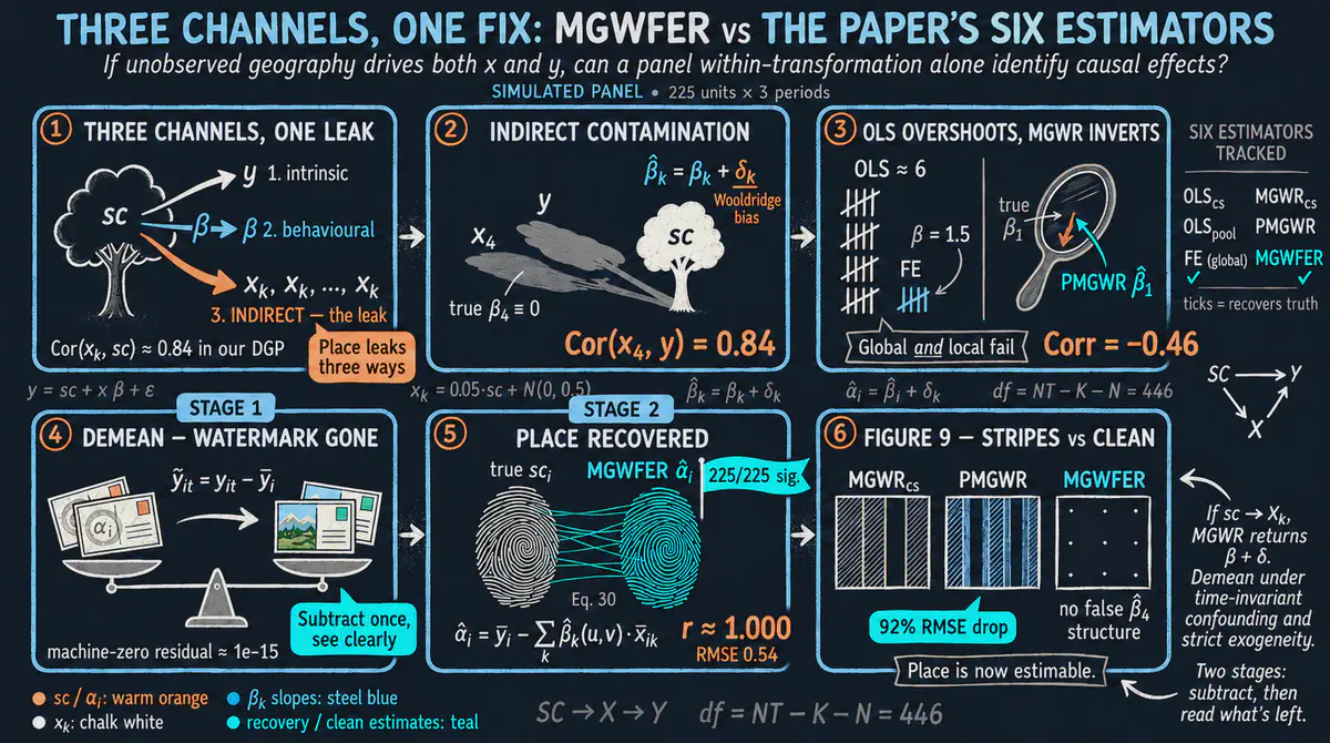
When we measure how a relationship changes from place to place, hidden features of each place can distort the answer. This Python tutorial follows a 2026 study by Li and Fotheringham and uses simulated data on 225 places over three periods to show how following the same places over time removes that distortion. It comes with an interactive app that runs in your web browser.
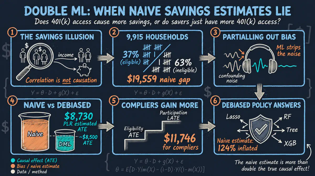
Does access to a workplace retirement savings plan make American households save more, or do the households that get it simply earn more? This Python tutorial uses double machine learning, which lets flexible prediction models account for income and other differences, on 1991 survey data. It comes with an interactive app that runs in your web browser.
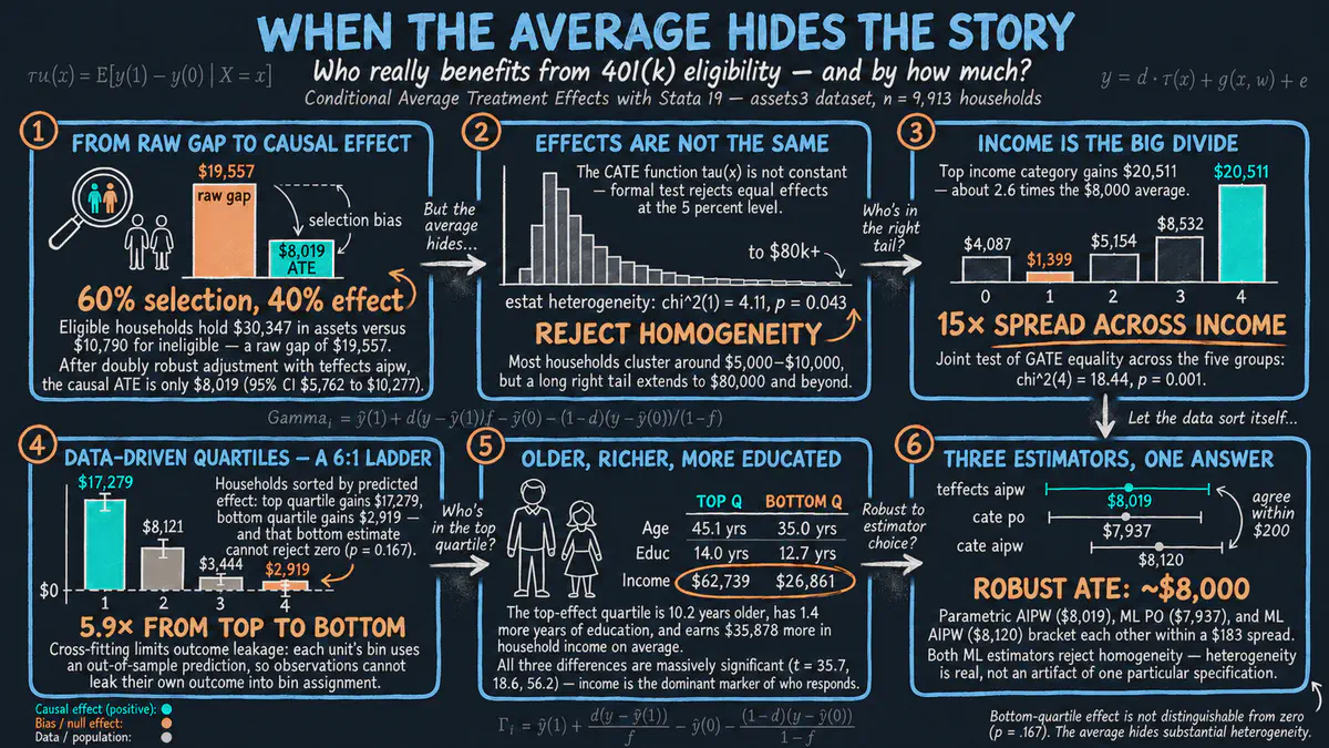
Does access to a workplace retirement savings plan help some households build more wealth than others? Instead of reporting one average effect, we use machine learning in Stata to estimate how the effect differs across households by income and other traits. The tutorial comes with an interactive app that runs in your web browser.
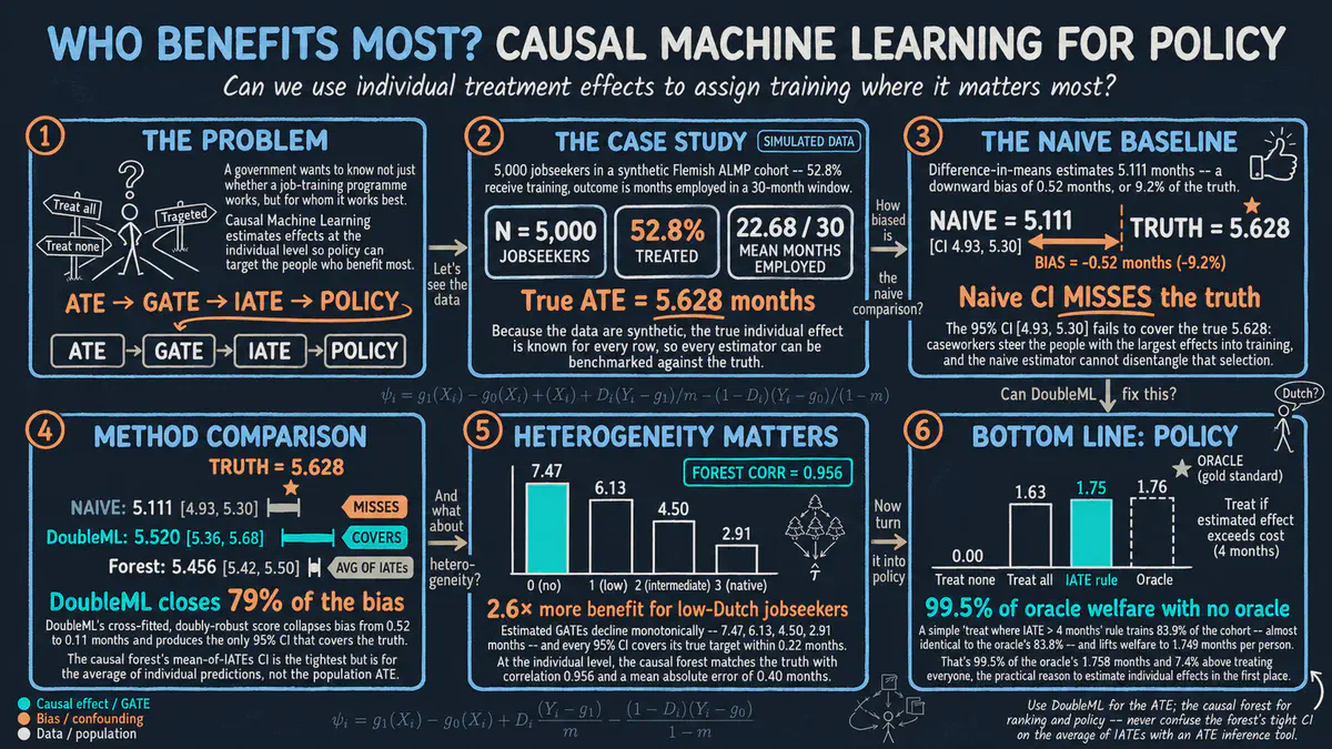
If a job training program helps unemployed people find work, who gains the most, and who should be offered a place first? This Python tutorial uses causal machine learning on simulated jobseeker data with known true effects to move from the average effect to personal effects and a better way to assign training. It comes with an interactive app that runs in your web browser.
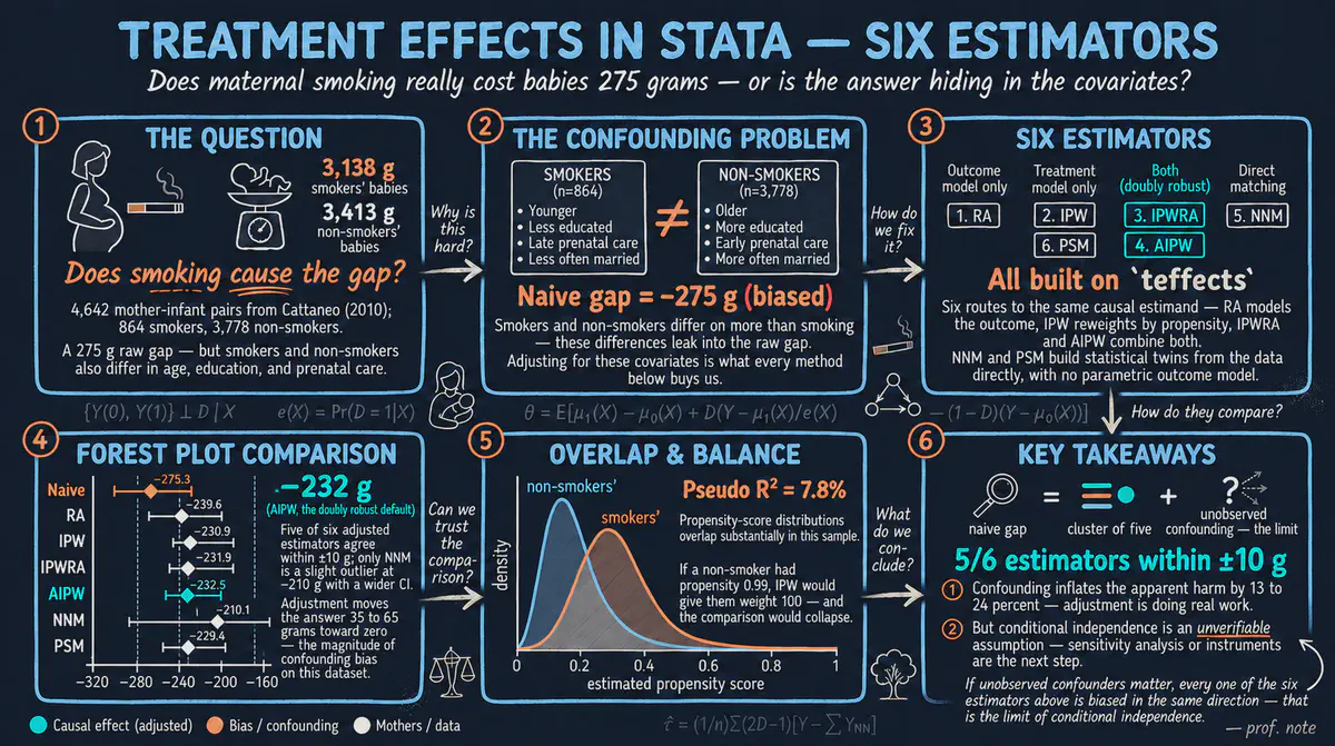
Does smoking during pregnancy lower the birth weight of babies? Using data on about 4,600 births in Stata, we compare six ways of making smokers and nonsmokers comparable, and most of them agree on a harm of roughly 230 grams. It comes with an interactive app that runs in your web browser.
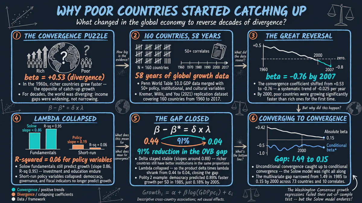
Why have poor countries grown faster than rich ones since around 2000, after decades of falling behind? We reproduce a 2021 study by Kremer, Willis and You showing that the policies, institutions and schooling that predict growth have themselves become more alike across countries. This Stata tutorial comes with an interactive app that runs in your web browser.
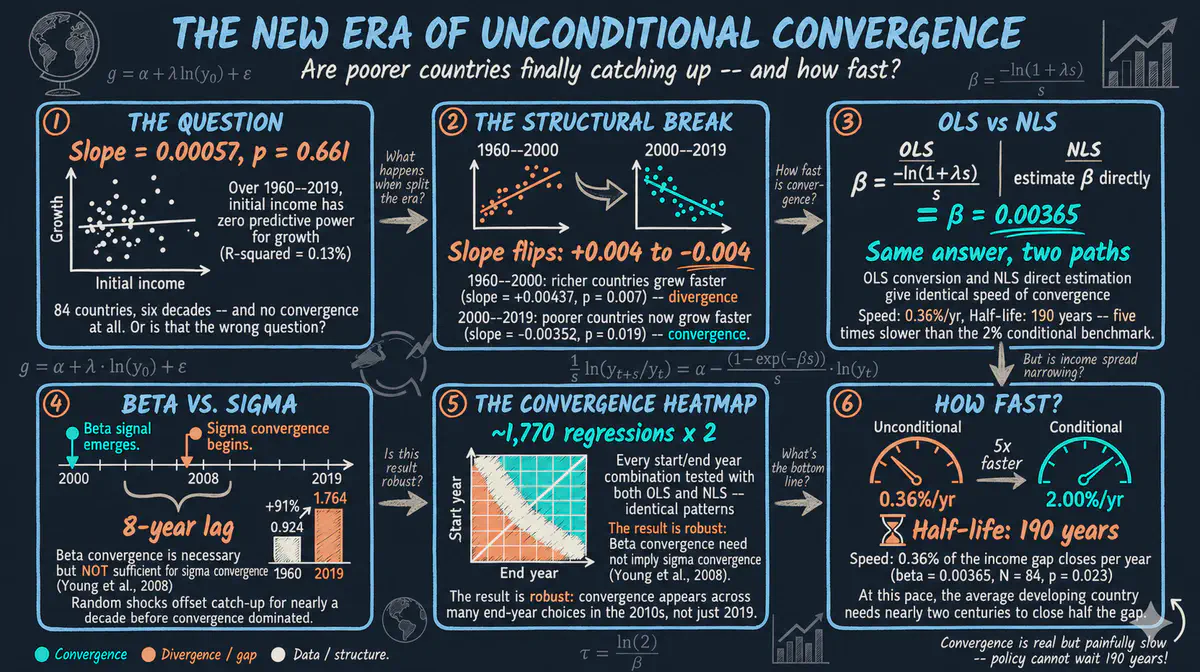
Are poorer countries catching up to richer ones? Using international income data, we test whether poorer countries grow faster and whether income gaps across the world are shrinking, and we see how the answer changed after 2000. This Stata tutorial comes with an interactive app that runs in your web browser.
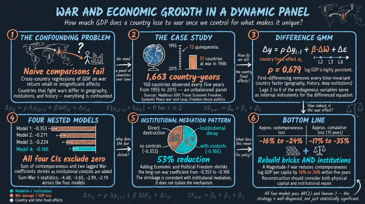
How much does war lower the living standards of a country? Using data on 160 countries from 1955 to 2015 in Stata, we follow each country over time to separate the damage of war from lasting national differences, and find that about half of the long-run cost works through weaker institutions. The tutorial includes an interactive app that runs in your web browser.
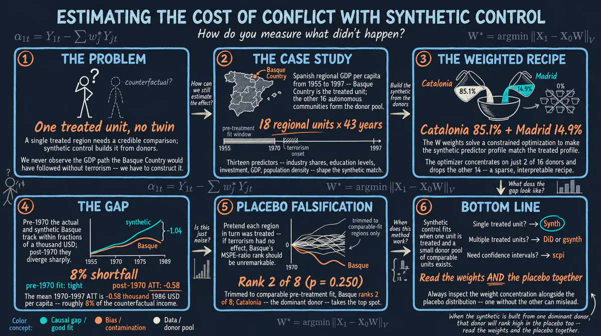
What did years of terrorist violence cost the economy of the Basque Country in Spain? This beginner R tutorial builds a look-alike Basque Country from other Spanish regions, mostly Catalonia and Madrid, and finds income per person roughly 8 percent lower at the widest point of the gap. It comes with an interactive app that runs in your web browser.
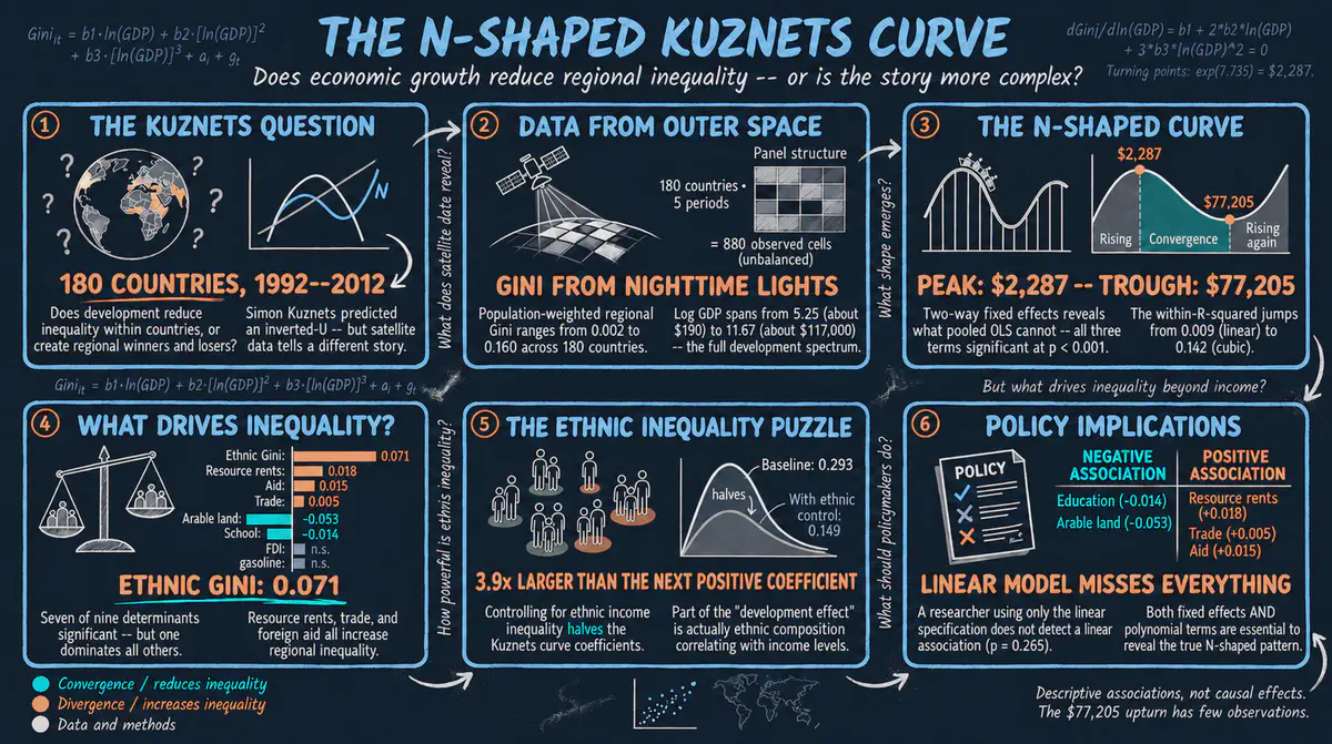
As countries grow richer, do the gaps between their regions first widen and then narrow, or do they widen again at the top? This Python tutorial uses satellite images of night lights for about 180 countries and compares each country with itself over time, finding an N-shaped pattern. It comes with an interactive app that runs in your web browser.
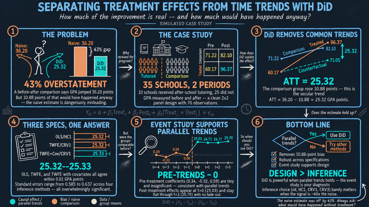
Did an after-school tutoring program really raise student grades, or were grades rising everywhere? This Python tutorial compares 10 tutored high schools with 25 others, before and after the program, to separate its effect from the general upward trend. It comes with an interactive app that runs in your web browser.
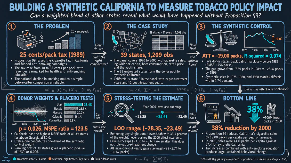
Did the 1988 tobacco tax and anti-smoking campaign in California cut cigarette sales? In Stata, we use the synthetic control method, which builds a look-alike California from a mix of other states, and find that sales fell by about 19 packs per person per year. It comes with an interactive app that runs in your web browser.
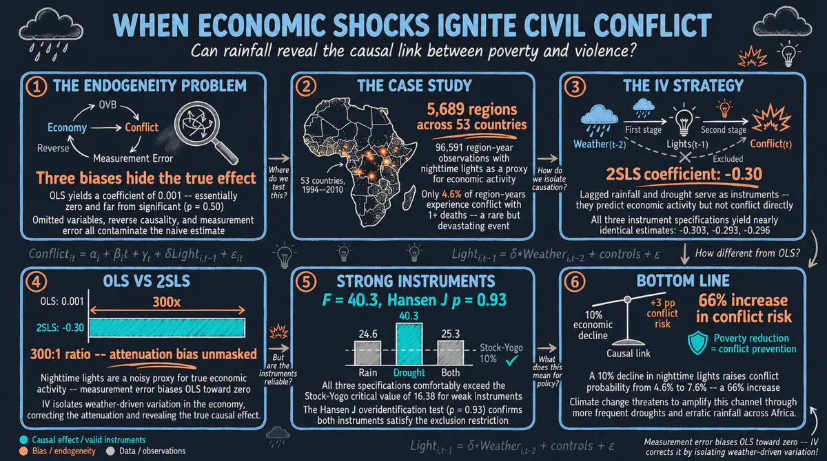
Does an economic downturn make civil conflict more likely? Using yearly data on more than 5,000 African regions in Stata, we treat rainfall shocks as a natural experiment for local economic activity, measured by night lights seen from space, and find that economic decline raises the risk of conflict. It comes with an interactive app that runs in your web browser.
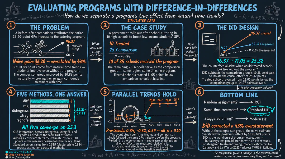
Did an after-school tutoring program raise the grades of low-income high school students? Using simulated data on 35 schools in Stata, we compare how grades changed in schools with and without the program, and we check whether both groups were on similar paths before it started. It comes with an interactive app that runs in your web browser.
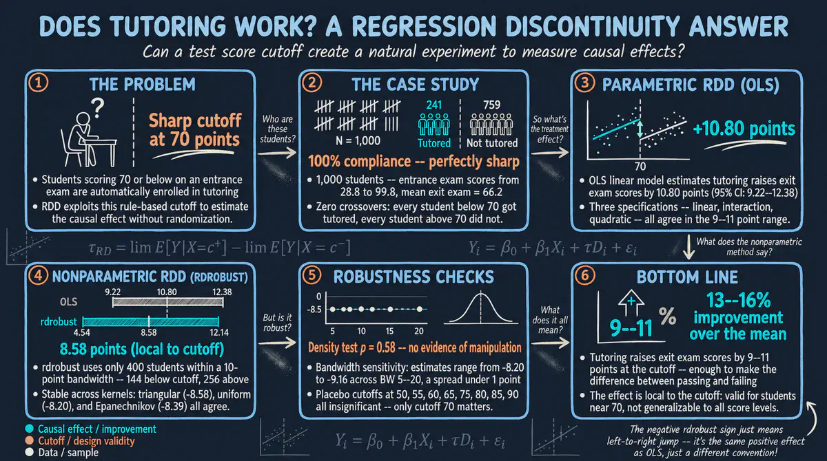
Does extra tutoring raise final exam scores? In Stata, we compare students who scored just below and just above the cutoff of 70 on an entrance exam that decided who got tutoring, and find gains of about 9 to 11 points. It comes with an interactive app that runs in your web browser.
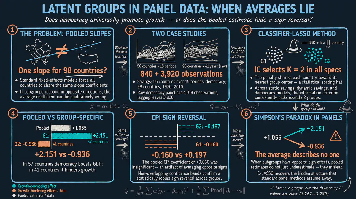
Do all countries respond the same way to democracy or inflation? In Stata, we use a method that sorts countries into hidden groups that behave alike, and find that the average link between democracy and economic growth hides a strong positive effect in 57 countries and a negative one in 41. It comes with an interactive app that runs in your web browser.
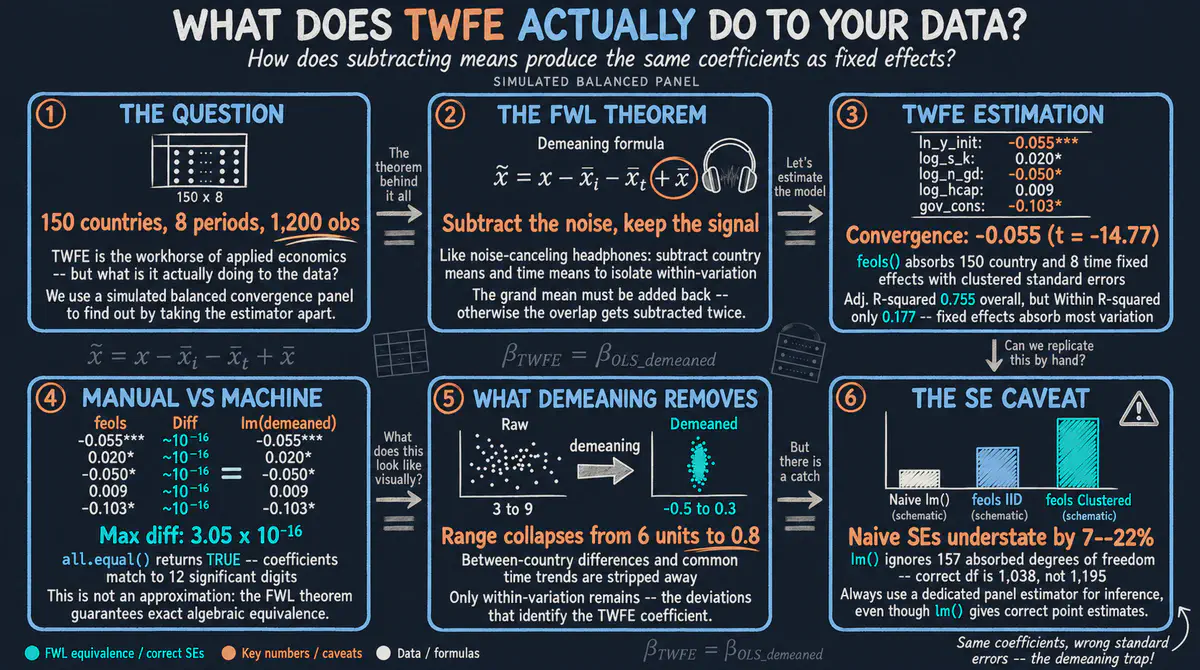
What does a regression that adjusts for country and year differences actually do to the data? Using simulated data for 150 countries in R, we show step by step that it equals subtracting country and year averages before a simple regression, and why the usual margins of error then need a fix. It comes with an interactive app that runs in your web browser.
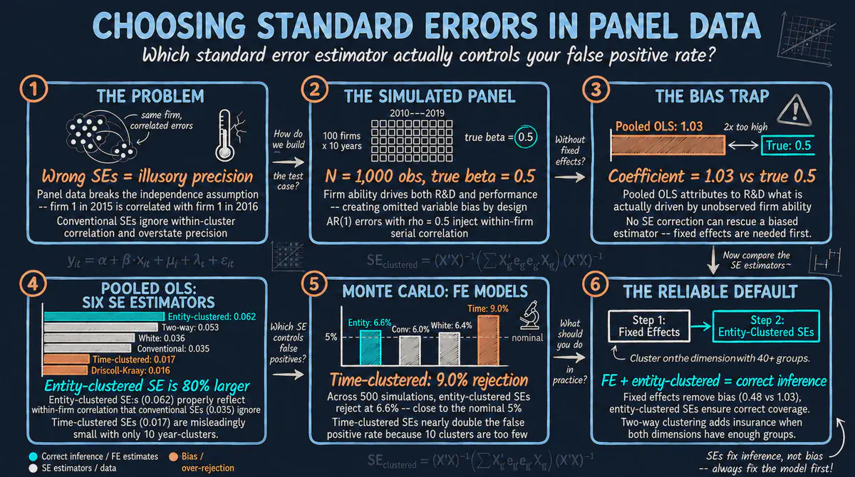
How sure can we be about an estimate when the same firms are observed year after year? Using simulated data for 100 firms in Python, we compare several ways of measuring the margin of error and show that no margin of error can fix an estimate that is biased to begin with. It includes an interactive app that runs in your web browser.
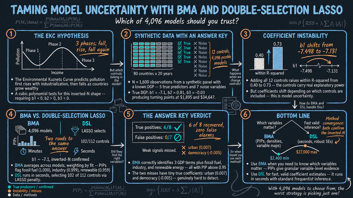
Do carbon emissions first fall, then rise and then fall again as countries get richer? With 12 possible control variables there are thousands of possible models, so we use two data-driven methods that weigh or select the controls and test them on simulated data where we know the right answer. This Stata tutorial comes with an interactive app that runs in your web browser.
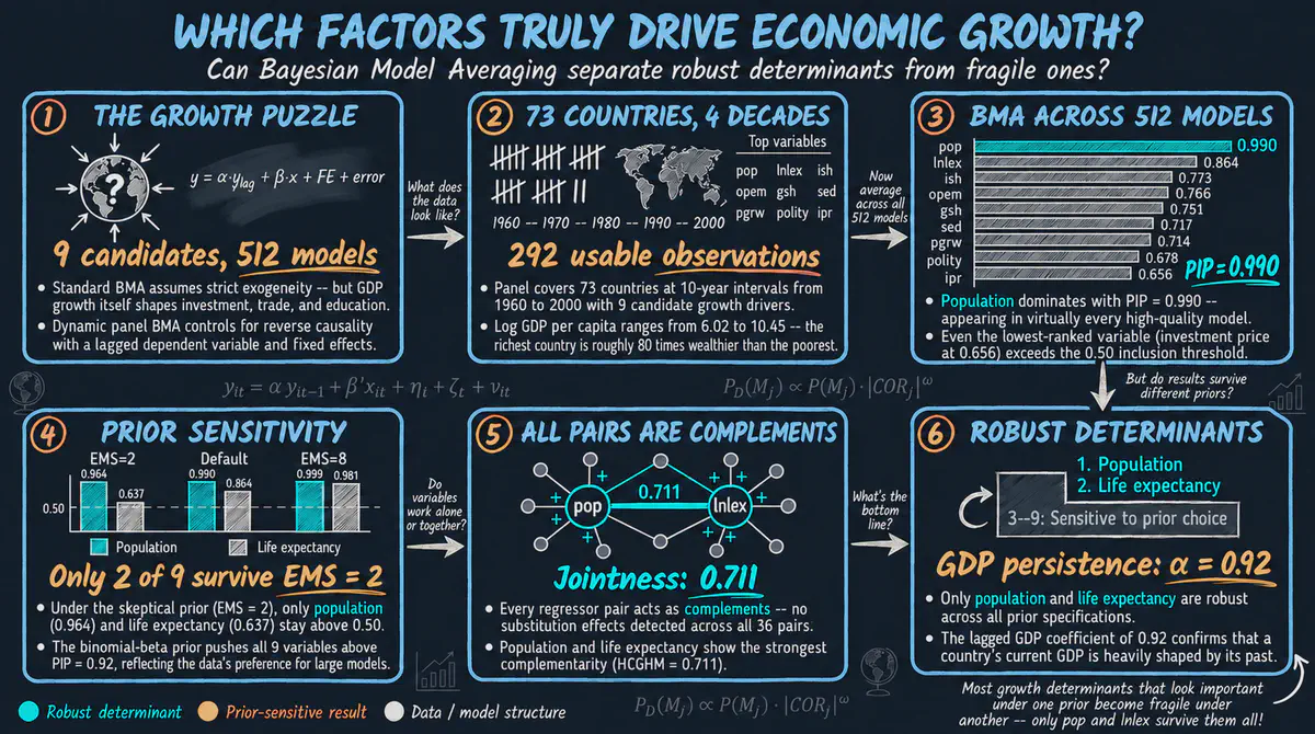
Which factors truly drive economic growth, such as investment, education or trade? Using 73 countries over four decades, we average across every possible combination of factors instead of betting on a single model, while allowing growth itself to shape those factors. This R tutorial comes with an interactive app that runs in your web browser.
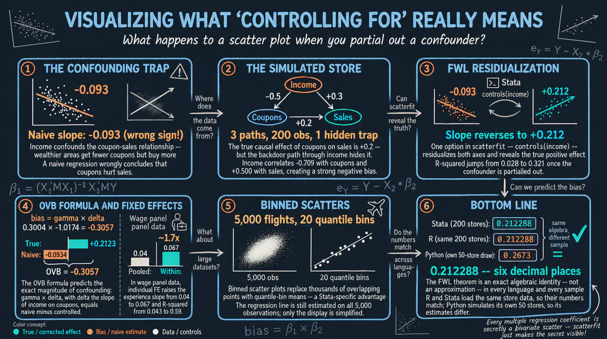
What does it really mean to control for a variable in a regression? In Stata, we turn that idea into a picture: we strip out the influence of other factors and plot what is left, using examples on store sales, airline flights and worker wages. It comes with an interactive app that runs in your web browser.
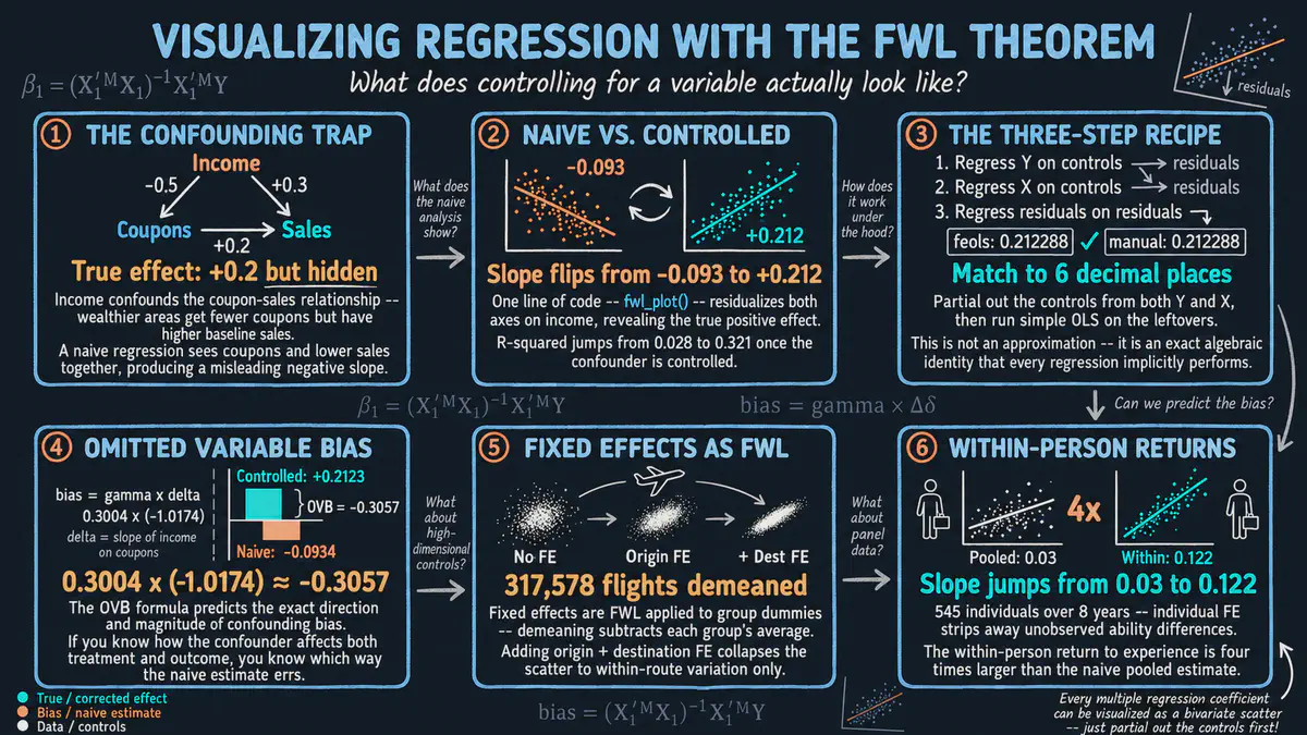
What does it really mean to control for a variable in a regression? We use a classic result from statistics to turn that idea into simple scatter plots, first with simulated data and then with real data that follows the same people over time. This R tutorial comes with an interactive app that runs in your web browser.
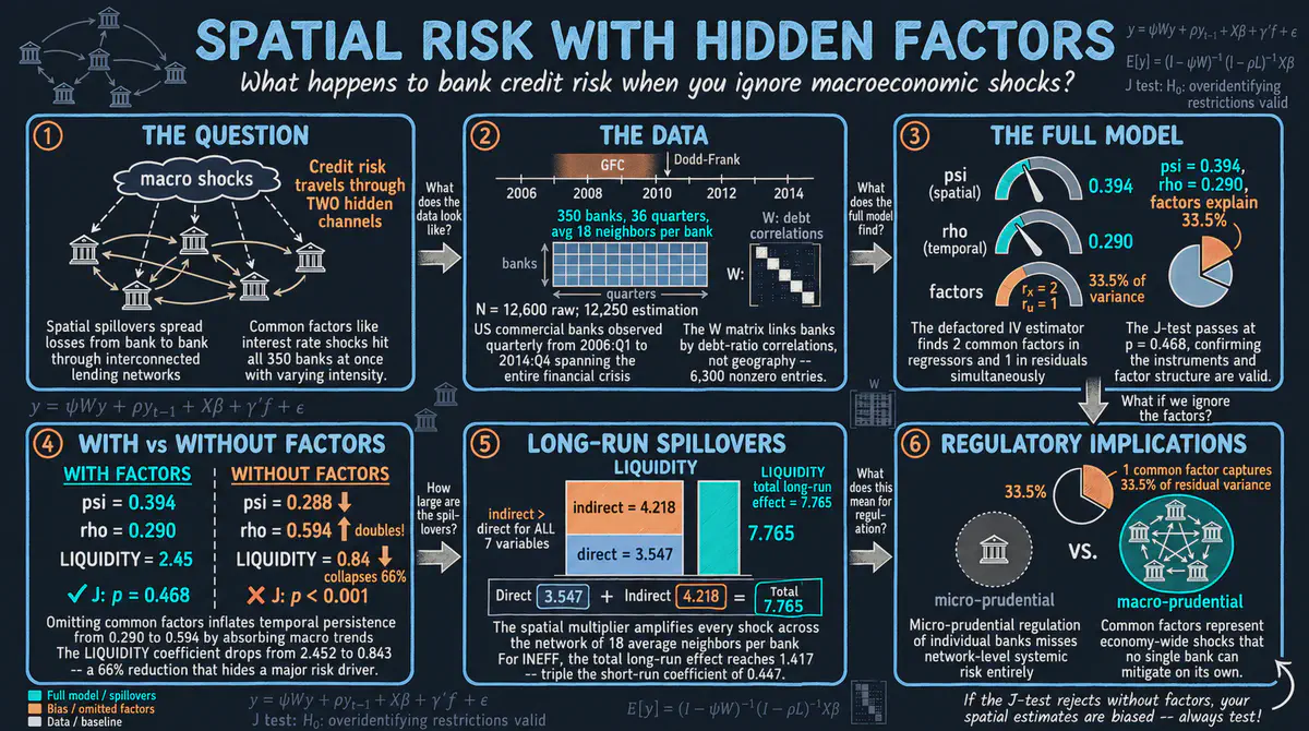
How does credit risk spread across banks? Using quarterly data on 350 American banks from 2006 to 2014 in Stata, we model bad loans that spill over between similar banks, persist over time and respond to shared economic shocks, and show that ignoring those shocks gives misleading answers. It comes with an interactive app that runs in your web browser.
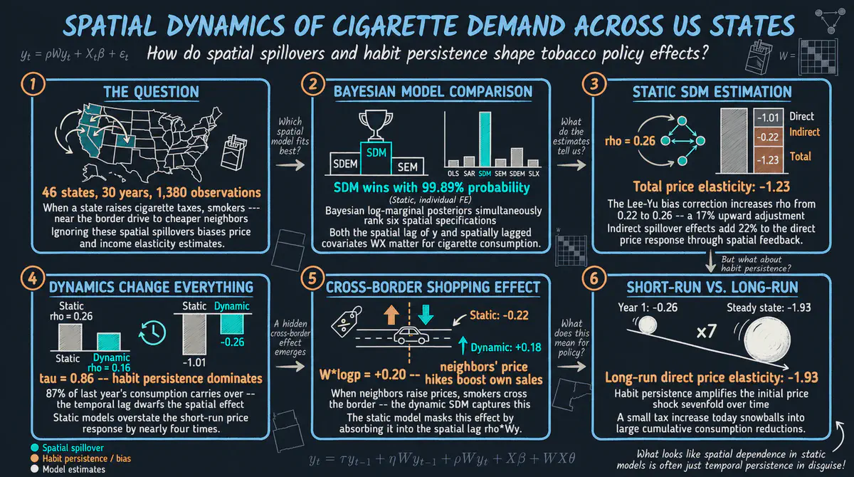
When a state raises cigarette prices, do smokers simply buy in the state next door? Using cigarette demand in 46 American states from 1963 to 1992, we measure how prices and income affect smoking at home and in neighboring states, and how habits carry over from year to year. This R tutorial comes with an interactive app that runs in your web browser.
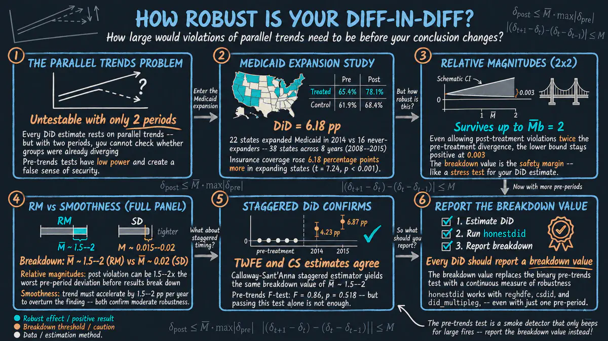
Did expanding Medicaid in some American states raise health insurance coverage among low-income adults, and how much can we trust that answer? In Stata, we measure how far the states could drift apart before the estimated gain would disappear, turning a yes-or-no check into a clear measure of robustness. It comes with an interactive app that runs in your web browser.
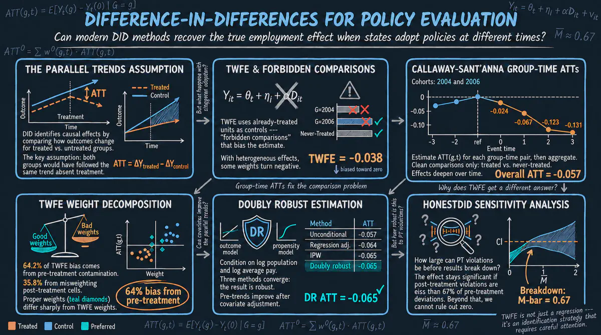
Did raising the minimum wage cost teenagers their jobs? Using American states that raised their wage floors at different times, we compare states before and after each increase and show why the classic shortcut can mislead when policies start on different dates. This R tutorial comes with an interactive app that runs in your web browser.
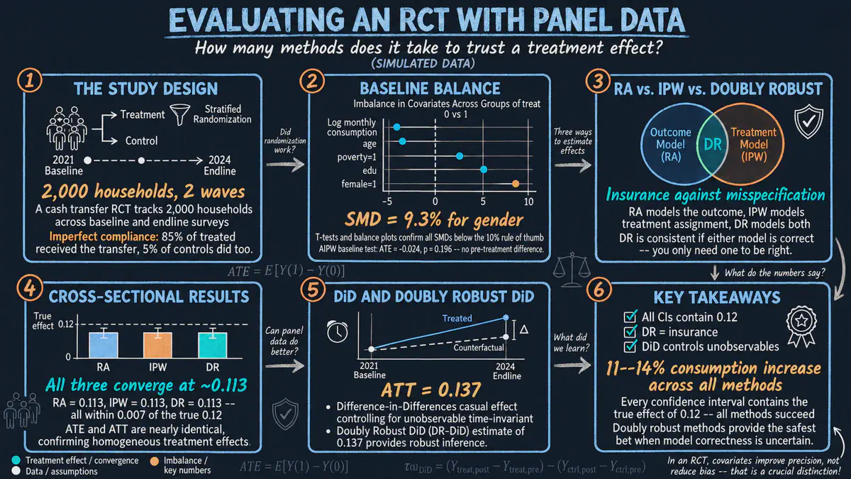
Does giving cash to poor households raise what they spend on everyday needs? Using a simulated randomized experiment with 2,000 households in Stata, we compare several ways of estimating the effect and see that all of them recover the true gain of about 12 percent. It comes with an interactive app that runs in your web browser.
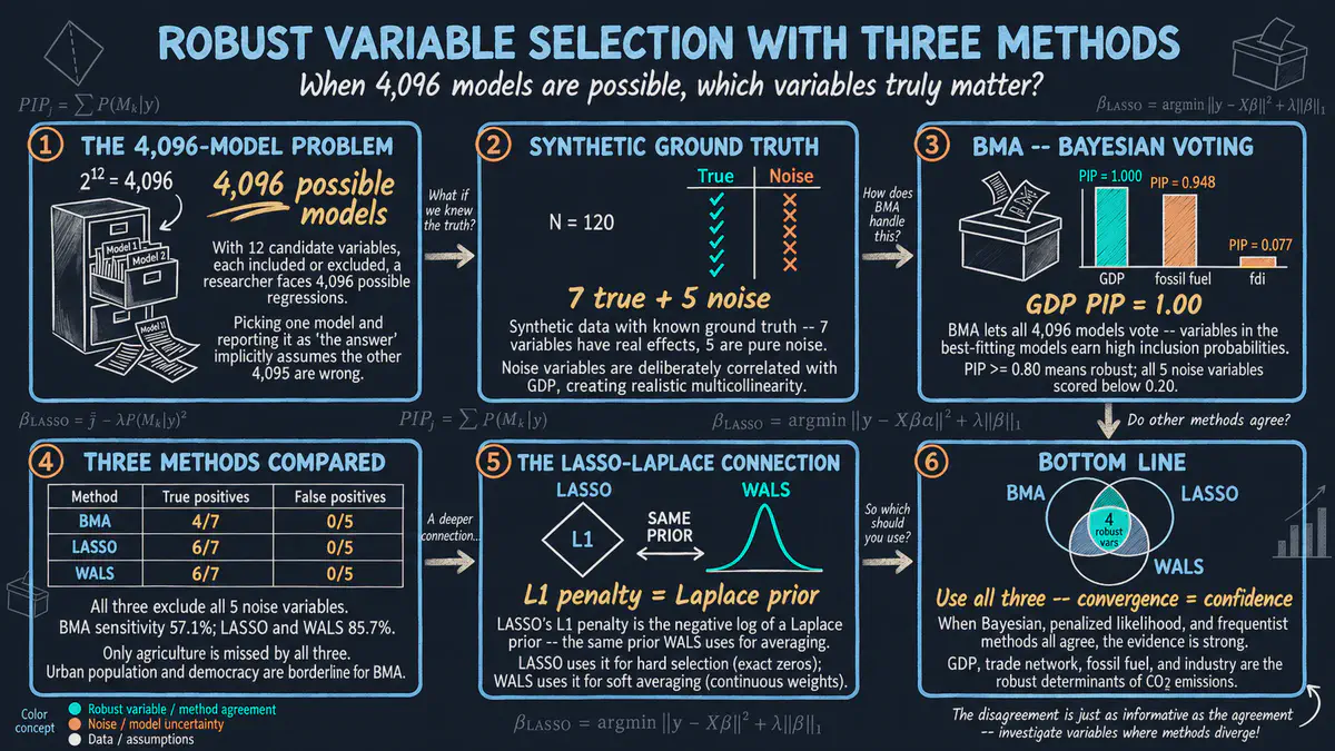
When many factors could explain carbon emissions, which ones truly matter? Using simulated data for 120 fictional countries where the right answer is known, this R tutorial compares three methods for choosing which factors to keep and shows that factors flagged by all three are the safest bets. It comes with an interactive app that runs in your web browser.
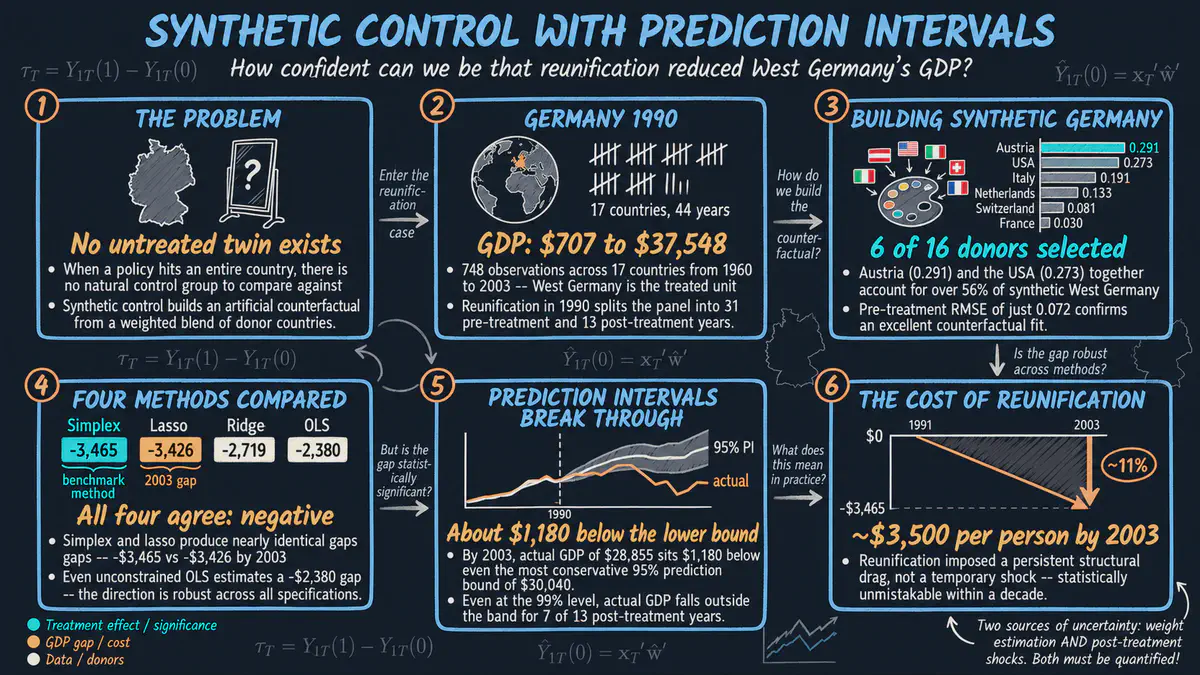
Did German reunification in 1990 lower income in West Germany, and how sure can we be? This Python tutorial builds a look-alike West Germany from other wealthy countries and adds a range of likely values around the estimate, showing income per person about 11 percent below the comparison by 2003. It comes with an interactive app that runs in your web browser.
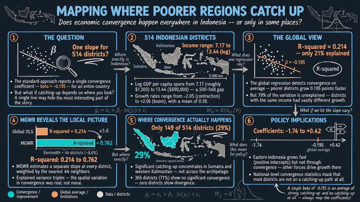
Do poorer districts in Indonesia catch up with richer ones at the same pace everywhere? This Python tutorial uses a map-based regression that lets each relationship change from place to place, each at its own geographic scale, across 514 districts. It comes with an interactive app that runs in your web browser.
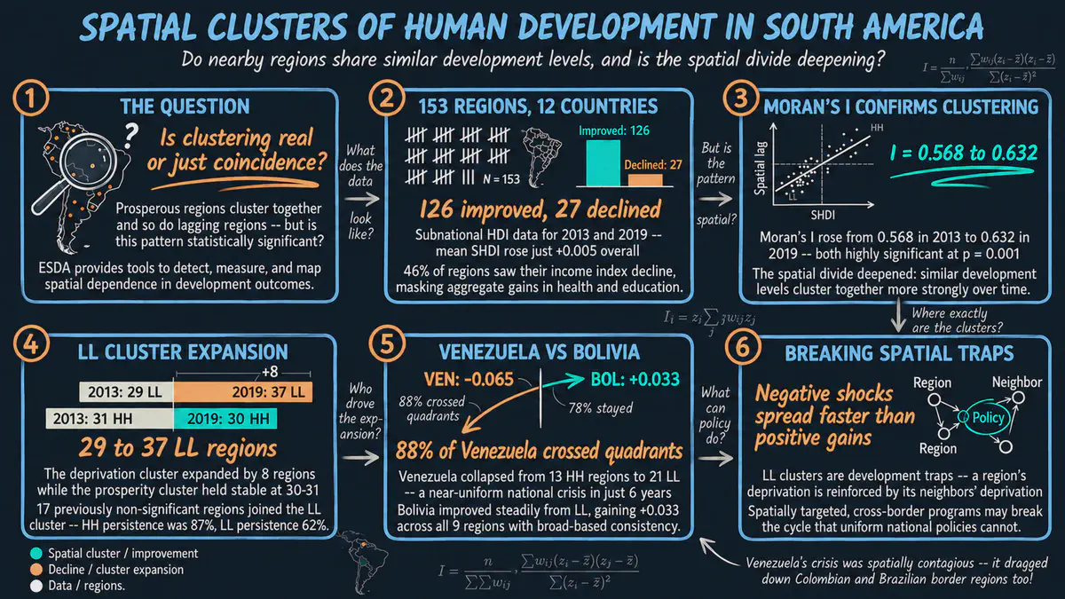
Do regions with high or low human development cluster together on the map of South America, and did those clusters shift between 2013 and 2019? This Python tutorial maps 153 regions and uses spatial statistics to test whether neighbors are more alike than chance would suggest. It comes with an interactive app that runs in your web browser.

How can we tell whether regions are developing over time when the measuring stick itself must stay the same? Using education, health and income data for 153 South American regions in 2013 and 2019, this Python tutorial builds one development index from both years together so that scores can be compared across time. It comes with an interactive app that runs in your web browser.
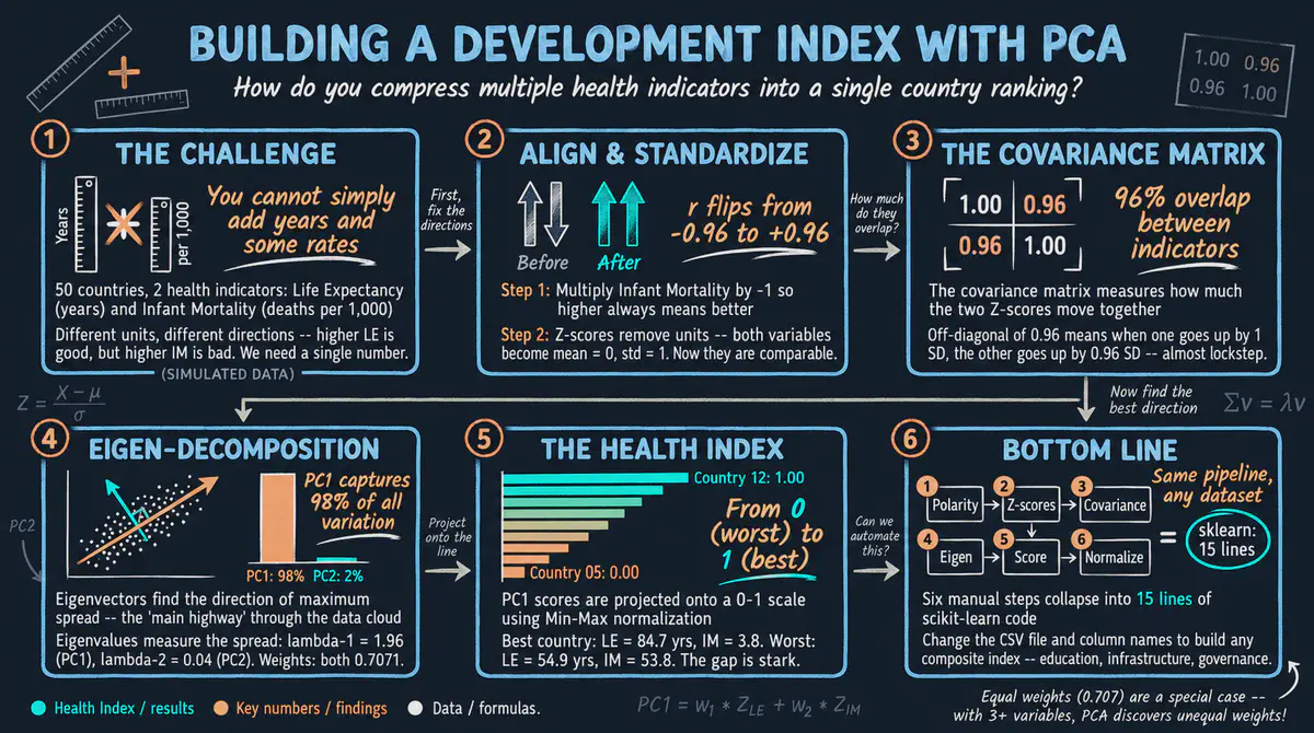
How can two health measures, life expectancy and infant mortality, be combined into one fair health score? Using simulated data for 50 countries, this Python tutorial builds the index step by step with principal component analysis, a method that finds the single direction capturing most of the shared information. It comes with an interactive app that runs in your web browser.
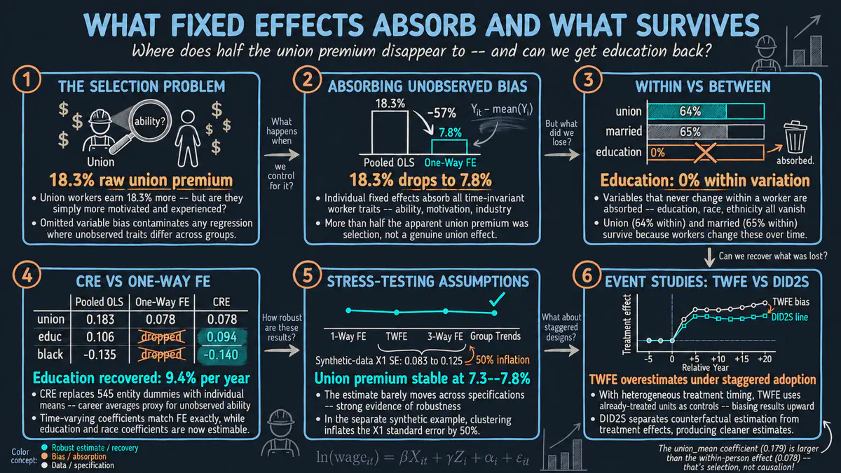
How much of the higher pay of union workers comes from the union itself, and how much from who joins? This Python tutorial shows how fixed effects, which compare each worker only with the same worker over time, remove hidden differences and cut the apparent union pay gain from about 18 to 8 percent. It comes with an interactive app that runs in your web browser.
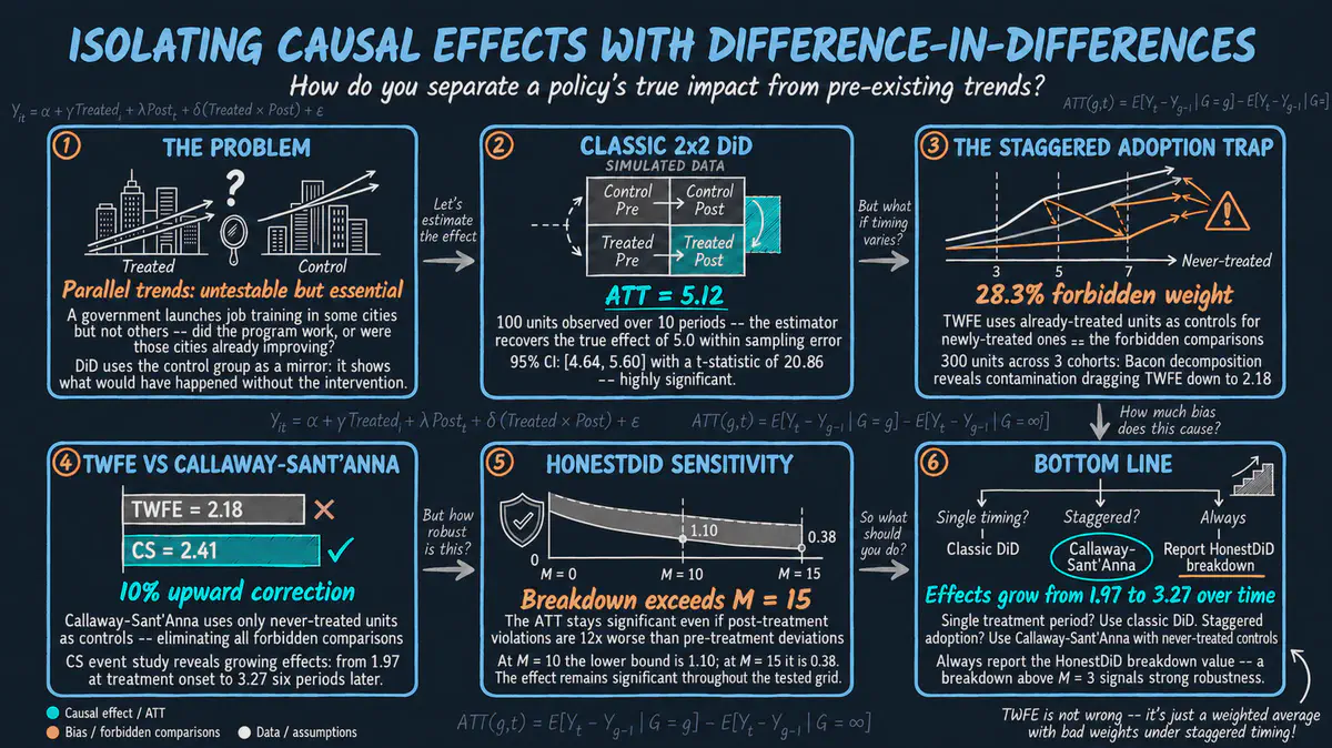
Did a new policy really change outcomes, or were things already improving? This Python tutorial introduces the difference-in-differences method, which compares changes over time between places that got the policy and places that did not, using simulated data, and checks how solid the answer is. It comes with an interactive app that runs in your web browser.
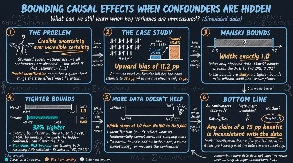
Does job training help people find work when an important factor, such as past work experience, was never measured? Using simulated workers in Python, we compute a range that the true effect must lie within instead of a single number, and see why more data alone cannot narrow it. It comes with an interactive app that runs in your web browser.
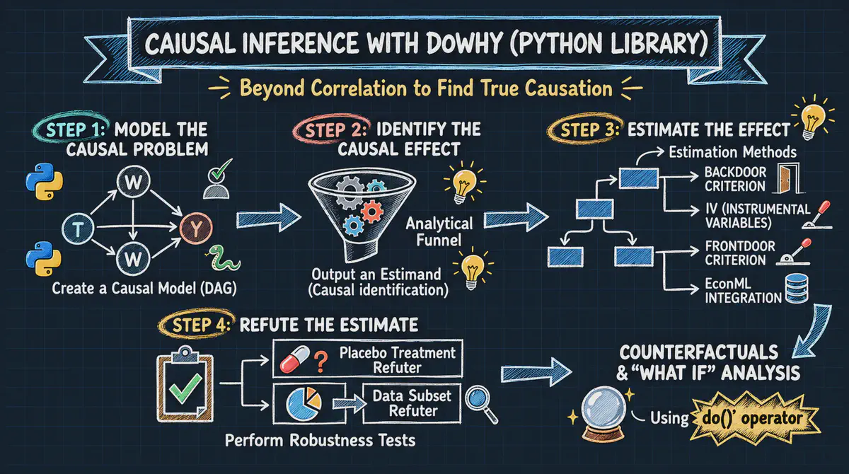
Did a job training program raise the earnings of disadvantaged workers? This Python tutorial applies a four-step approach to cause and effect (state your assumptions, decide what to compare, estimate the effect and stress-test it) to the classic LaLonde job training data. It comes with an interactive app that runs in your web browser.
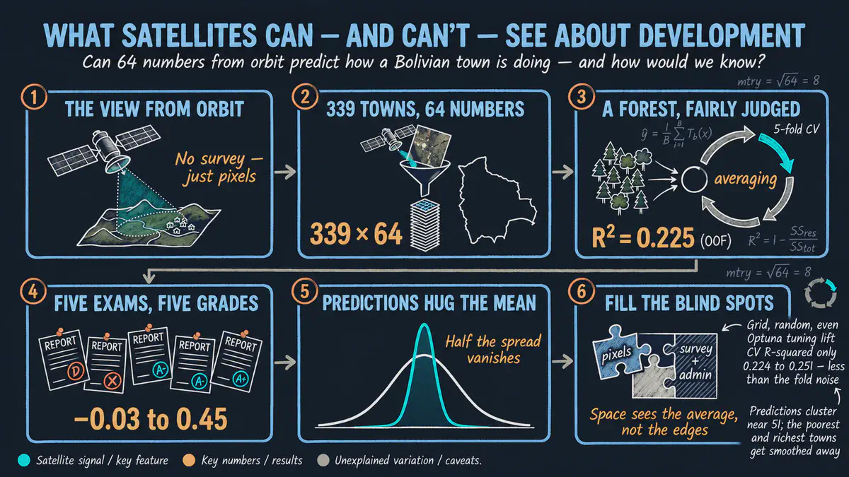
Can satellite images tell us how well each municipality in Bolivia is developing? This beginner-friendly Python tutorial trains a random forest, a machine learning model that averages many decision trees, tests it on places it never saw, and finds that the images hold real but limited information. It comes with an interactive app that runs in your web browser.
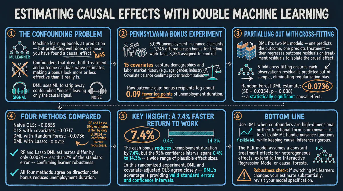
Does a cash bonus help unemployed workers find jobs faster? This Python tutorial uses double machine learning, which lets flexible prediction models strip out the influence of background characteristics, on data from a real experiment in Pennsylvania. It comes with an interactive app that runs in your web browser.
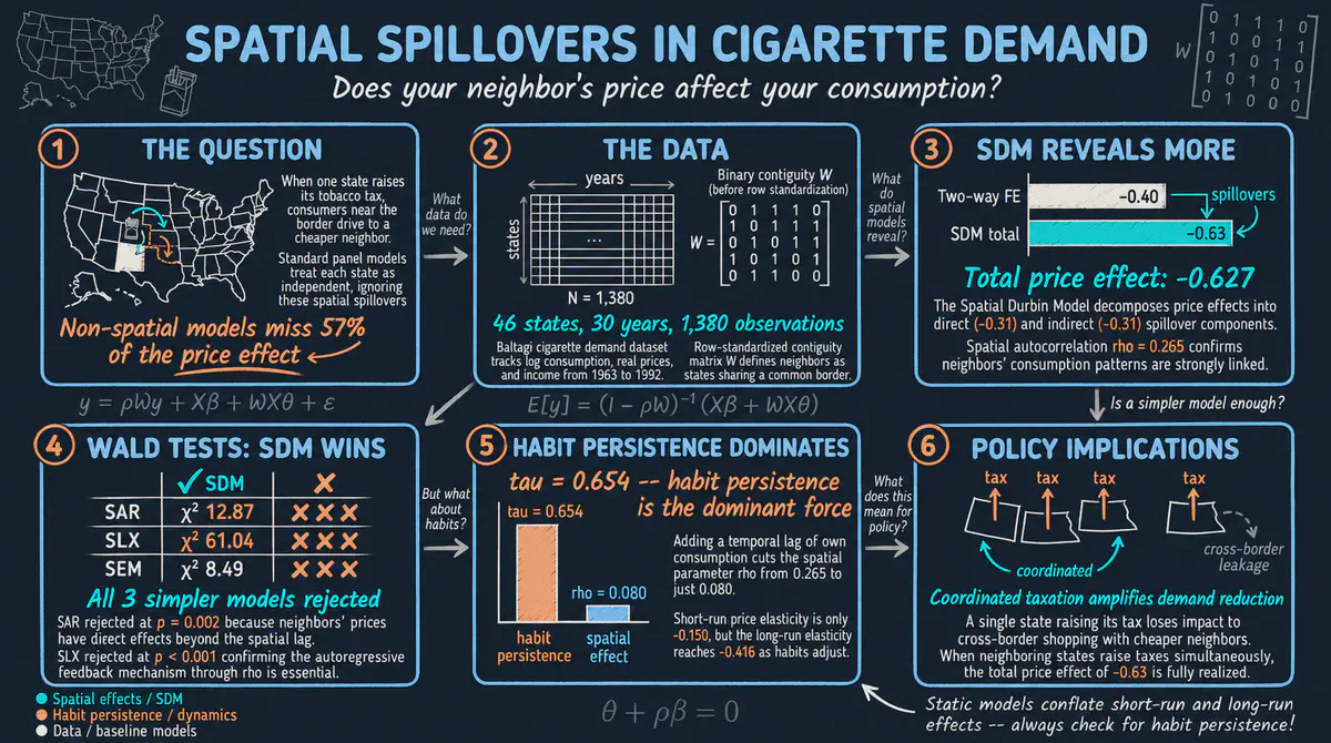
Do cigarette prices in one state change how much people smoke in neighboring states? Using data on 46 American states from 1963 to 1992 in Stata, we model cross-border shopping and smoking habits, and find that ignoring neighbors understates how much prices matter. It comes with an interactive app that runs in your web browser.
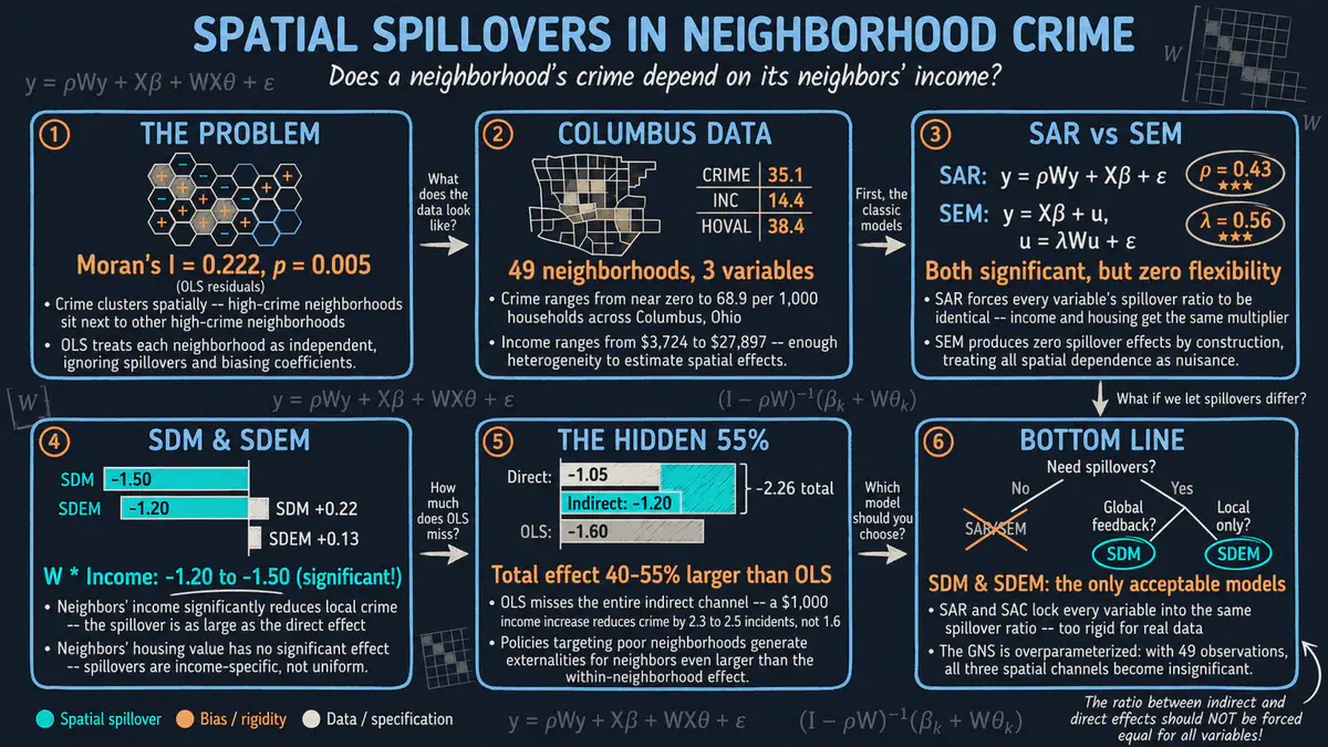
Does crime spill over from one neighborhood to the next? Using data on 49 neighborhoods in Columbus, Ohio, in Stata, we compare models in which crime, income and housing values in nearby areas also matter, and find that higher income lowers crime both in a neighborhood and next door. It comes with an interactive app that runs in your web browser.