Regional Inequality from Outer Space

Nighttime lights become a global income map — and reveal an N-shaped Kuznets curve

0.102light elasticity · lights → income
0.925predicted vs observed · calibration fit
0.071ethnic Gini · strongest driver

Carlos Mendez

Nagoya University (GSID)

August 4, 2026

The Problem

Act I

Almost every country reports one GDP number — and nothing about its insides

Every country reports one GDP number.

Almost none report the income of each province inside it.

That gap is invisible without subnational data.

The idea: let satellites do the accounting — brighter places are, on average, richer

Lessmann and Seidel (2017) use nighttime light as a stand-in for income.

Electricity, roads and activity all glow — so brightness tracks output where statistics do not.

Their pipeline, rebuilt here in Python end to end:

  • Predict regional GDP from light + a few controls
  • Construct population-weighted inequality indices from those predictions
  • Estimate how regional inequality moves with development

Four steps: calibrate, construct, curve, drivers

  • Calibration — turn light into income; how good is the fit?
  • Construction — five inequality indices from scratch; why population weights matter
  • The curve — an N-shaped regional Kuznets relationship
  • Drivers & robustness — ethnic inequality, and a spatial-HAC stress test

The Calibration

Act II

The lab: 5,258 region-years calibrate the model; 180 countries get measured

  • Calibration sample — 1,504 subnational regions in 81 countries that have both observed GDP and a light reading (5,258 region-years)
  • Country panel — 180 countries, 1992–2012, each carrying inequality indices built from its regions
  • Two units, kept straight — predict at the region level, measure inequality at the country level

Mean regional Gini \(= 0.064\) (max \(0.163\)): most countries are internally fairly equal, with a long unequal tail.

Light becomes income through a calibrated elasticity, net of national income and geography

\[y_r = \beta_0 + \beta_1 \ell_r + \beta_2 g_c + \gamma' X_r + \mu_g + \tau_s + \varepsilon_r\]

Everything except light is a control. The number we care about is \(\beta_1\).

The calibrated light elasticity is 0.102, with regional income tracking national income almost one-for-one

0.102

random-effects light elasticity (col 7) · national-GDP elasticity \(= 0.889\) · matches the paper exactly

The predictions hug the 45° line across four orders of magnitude of income
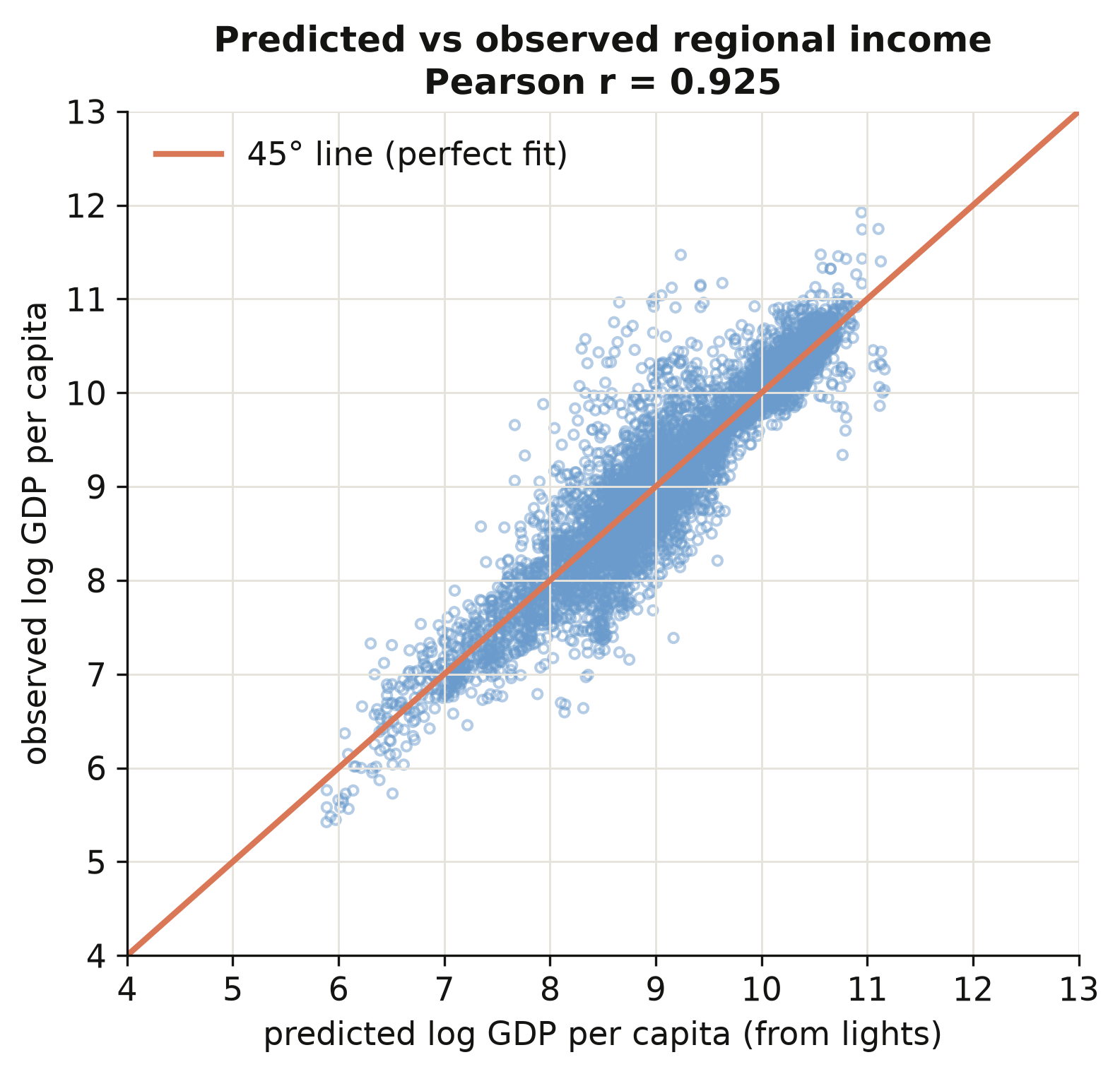
Predicted vs observed log regional GDP per capita, 5,258 region-years (\(r = 0.925\)). The fit holds from the poorest regions to the richest.

The calibration generalises across the whole income range, not one band.

The Construction

Act II

Five inequality indices, built from scratch and weighted by population

\[\bar y = \frac{\sum_i w_i y_i}{\sum_i w_i}, \qquad p_i = \frac{w_i}{\sum_j w_j}, \qquad r_i = \frac{y_i}{\bar y}\]

One function turns a country’s regions into five indices — each region counting its people.

The whole weighted Gini is one line — and np.abs is the trap

# --- Step 3b: the Gini = population-weighted average gap between people --
# y[:, None] - y[None, :] builds the full matrix of pairwise income gaps:
# entry (i, j) is yᵢ - yⱼ. np.abs makes them |yᵢ - yⱼ|; np.outer(w, w)
# weights each pair by both populations. Summing and normalising gives Gini.
gini = (np.abs(y[:, None] - y[None, :]) * np.outer(w, w)).sum() / (2 * sw**2 * mu)
return dict(GINIW=gini, GE_m1W=ge_m1, GE_0W=ge_0, GE_1W=ge_1, COVW=cv)

Drop the absolute value and the Gini collapses to zero.

Population weights are not cosmetic — they correlate only 0.75 with equal weights
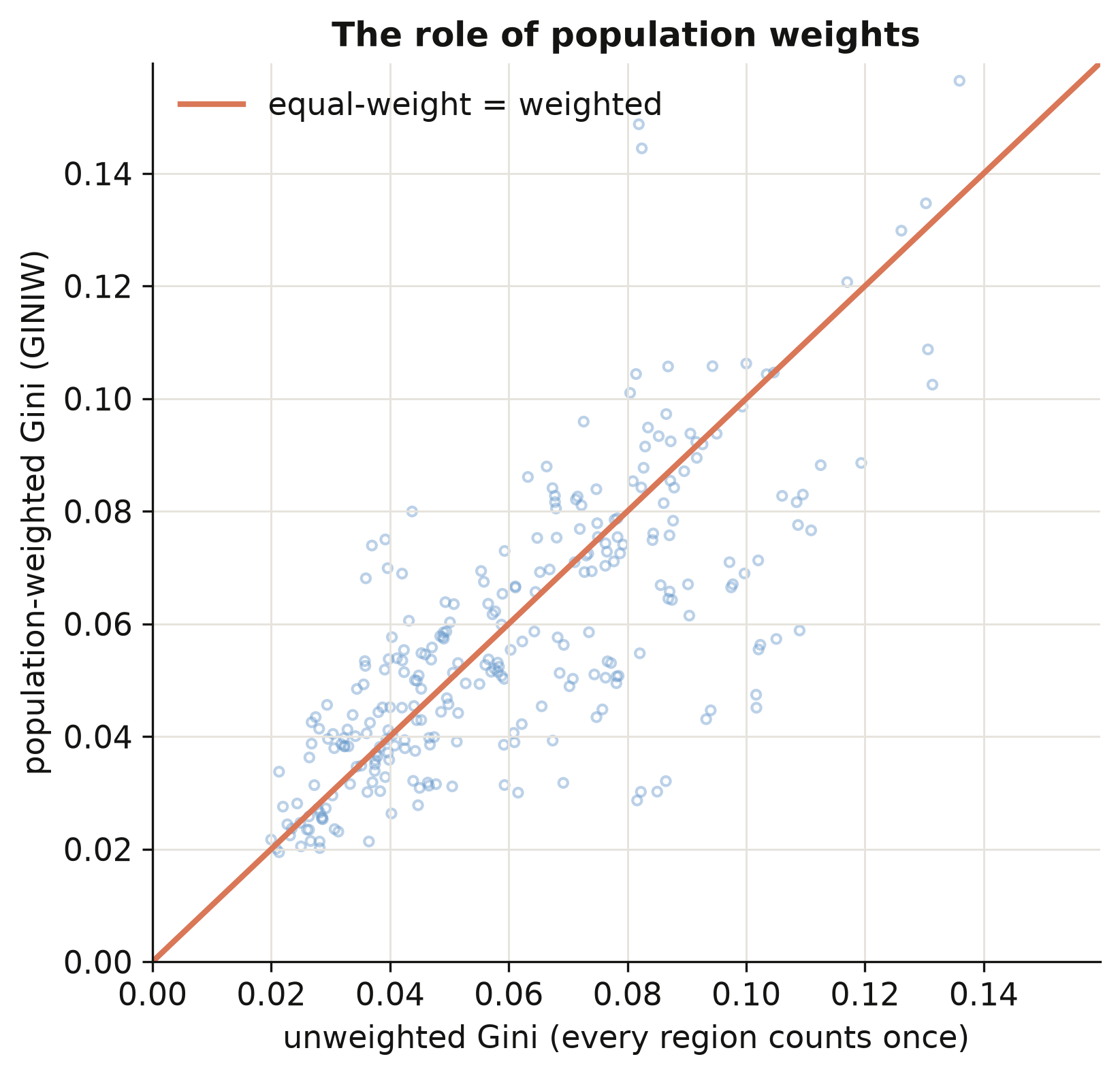
Population-weighted vs equal-weight Gini across country-years (corr \(= 0.75\)). Most points sit below the 45° line: weighting lowers measured inequality by \(0.0034\) on average.

The Result

Act II

With country and period fixed effects, the regional Kuznets curve is an N — not a single hump

\[\text{GINIW}_{ct} = \beta_1 \ln Y_{ct} + \beta_2 (\ln Y_{ct})^2 + \beta_3 (\ln Y_{ct})^3 + \alpha_c + \delta_t + u_{ct}\]

Cubic term Estimate Sign
\(\beta_1\) (linear) \(0.293\) rises with early development
\(\beta_2\) (quadratic) \(-0.032\) then bends down
\(\beta_3\) (cubic) \(0.001\) faint upturn at the very top

\(N = 879\), 180 countries, 5-year periods. Same sign pattern across all five indices — the N is not an artefact of the Gini.

Three development phases, one descriptive association
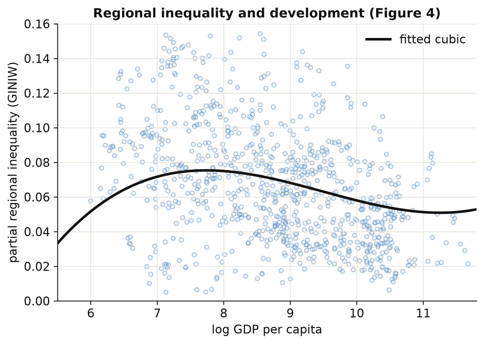
Regional inequality (net of period effects) against log development, with the fitted cubic overlaid. The curve rises to a gentle peak near $3,000 per capita, declines through middle income, and ticks faintly upward at the top.

  • Early development — activity concentrates; inequality rises
  • Middle income — lagging regions catch up; inequality falls
  • The very richest — agglomeration re-concentrates; a faint rise

Up, then down, then faintly up — a description, not a policy lever.

The Drivers

Act II

Beyond income, ethnic inequality is the strongest correlate — by far

0.071

ethnic-Gini coefficient (\(p < 0.001\), \(N = 844\)) · a \(0.1\) higher ethnic Gini implies \(+0.007\) regional Gini — about 11% of the \(0.064\) mean

Ranked side by side: ethnicity towers; farmland pulls the other way

Determinant (on top of the cubic + FE) Coefficient Direction
Ethnic inequality \(+0.071\) concentrates
Resource rents \(+0.018\) concentrates
Aid / GDP \(+0.015\) concentrates
Trade openness \(+0.005\) concentrates
Arable-land share \(-0.053\) equalises

Ethnic division concentrates; broad-based farming spreads.

Robustness

Act III

Allowing neighbours to share shocks doubles the standard error — the elasticity still holds
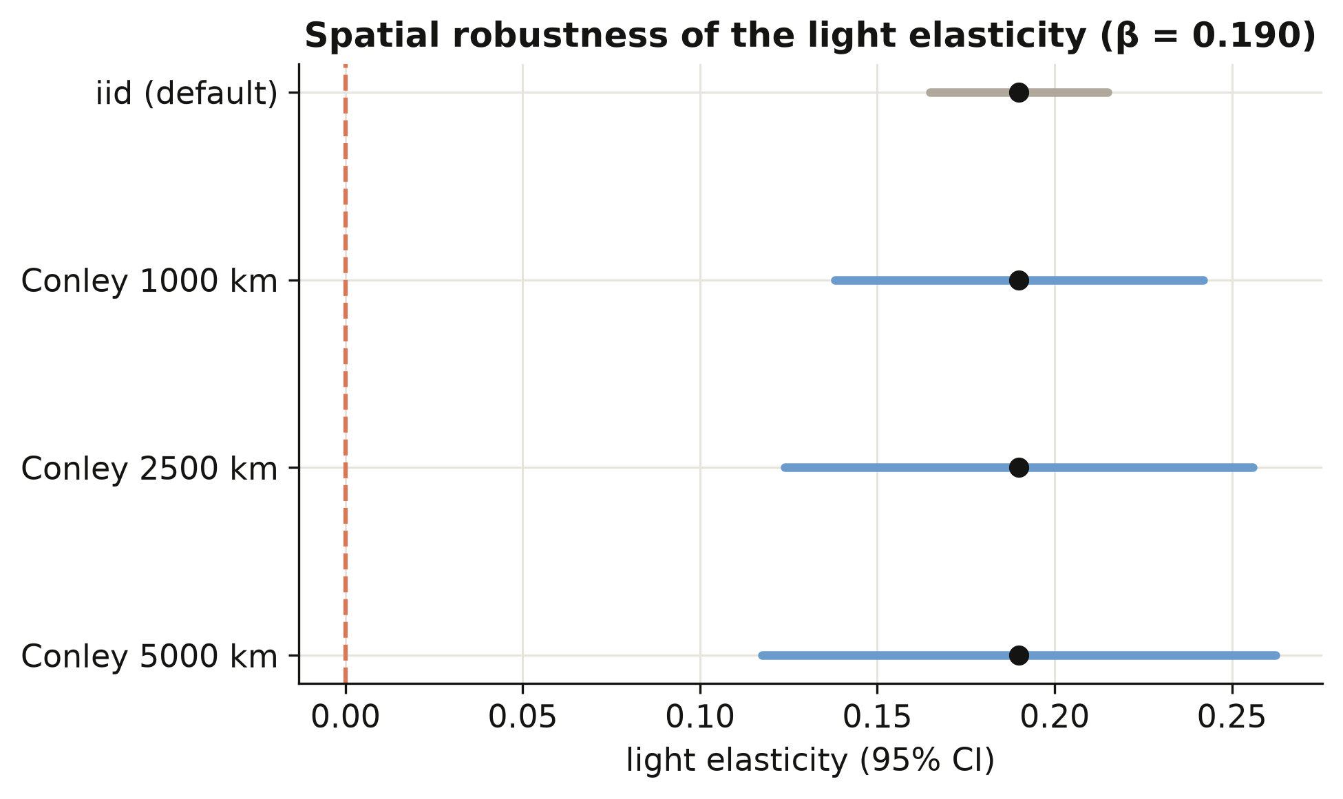
Conley spatial-HAC standard errors for the clean light elasticity (\(\beta = 0.190\)). The interval widens with the radius; the estimate does not move.

Inference SE \(t \approx\)
Naive (iid) \(0.013\) \(14\)
Conley 1,000 km \(0.026\) \(7\)
Conley 5,000 km \(0.037\) \(5\)

The point estimate \(\beta = 0.190\) never moves; only the honest uncertainty grows.

Does machine-assembled satellite data make this causal? No

Objection. You absorbed country and period effects and survived a spatial-HAC test — surely development causes this inequality path?

Response. No. Lights→GDP is a prediction model, not a structural one.

The Kuznets and determinant results are associations, not causal effects.

You can now see inequality inside a country with no statistical office.

Predict income from light · weight by people · let the curve bend twice.