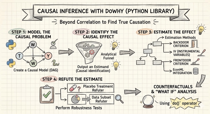
Introduction to Causal Inference: The DoWhy Approach with the Lalonde Dataset
![]()
Overview
Does a job training program actually cause participants to earn more, or do people who enroll in training simply differ from those who do not? This is the central challenge of causal inference: distinguishing genuine treatment effects from confounding differences between groups. A simple comparison of average earnings between participants and non-participants can be misleading if the two groups differ in age, education, or prior employment history.
DoWhy is a Python library that provides a principled, end-to-end framework for causal inference. It organizes the analysis into four explicit steps — Model, Identify, Estimate, Refute — each of which forces the analyst to state and test causal assumptions rather than hiding them inside a black-box estimator. In this tutorial, we apply DoWhy to the Lalonde dataset, a classic dataset from the National Supported Work (NSW) Demonstration program, to estimate how much the job training program increased participants' earnings in 1978.
Learning objectives:
- Understand DoWhy’s four-step causal inference workflow (Model, Identify, Estimate, Refute)
- Define a causal graph that encodes domain knowledge about confounders
- Identify causal estimands from the graph using the backdoor criterion
- Estimate causal effects using multiple methods (regression adjustment, IPW, doubly robust, propensity score stratification, propensity score matching)
- Assess robustness of estimates using refutation tests
DoWhy’s four-step framework
Most statistical software lets you jump straight from data to estimates, skipping the hard work of stating assumptions and testing whether the results are trustworthy. DoWhy takes a different approach: it organizes every causal analysis into four explicit steps, each answering a distinct question.
graph LR
    A["<b>1. Model</b><br/>Define causal<br/>assumptions"] --> B["<b>2. Identify</b><br/>Find the right<br/>formula"]
    B --> C["<b>3. Estimate</b><br/>Compute the<br/>causal effect"]
    C --> D["<b>4. Refute</b><br/>Stress-test<br/>the result"]

    style A fill:#6a9bcc,stroke:#141413,color:#fff
    style B fill:#d97757,stroke:#141413,color:#fff
    style C fill:#00d4c8,stroke:#141413,color:#fff
    style D fill:#8b5cf6,stroke:#141413,color:#fff
Each step answers a specific question and builds on the previous one:
- Model — “What are the causal relationships?" Encode your domain knowledge as a causal graph (a DAG). This is where you declare which variables cause which, making your assumptions explicit and debatable rather than hidden inside a regression.
- Identify — “Can we estimate the effect from data?" Given the graph, DoWhy uses graph theory to determine whether the causal effect is identifiable — meaning it can be computed from observed data alone — and returns the mathematical formula (the estimand) needed to do so.
- Estimate — “What is the causal effect?" Apply one or more statistical methods to compute the actual numeric estimate. DoWhy supports multiple estimators so you can check whether different methods agree.
- Refute — “Should we trust the estimate?" Run automated falsification tests that probe whether the result could be a statistical artifact, whether it is sensitive to unobserved confounders, and whether it is stable across subsamples.
The ordering is deliberate. You cannot estimate a causal effect without first identifying the correct formula, and you cannot identify the formula without first specifying your causal assumptions. This sequential discipline is DoWhy’s key contribution: it prevents the common mistake of running a regression and calling the coefficient “causal” without ever checking whether the adjustment set is correct or whether the result survives basic robustness checks.
Setup and imports
Before running the analysis, install the required package if needed:
pip install dowhy # https://pypi.org/project/dowhy/
The following code imports all necessary libraries and sets configuration variables. We define the outcome, treatment, and covariate columns that will be used throughout the analysis.
import warnings
warnings.filterwarnings("ignore")

import numpy as np
import pandas as pd
import matplotlib.pyplot as plt
from sklearn.linear_model import LogisticRegression, LinearRegression as SklearnLR
from dowhy import CausalModel
from dowhy.datasets import lalonde_dataset

# Reproducibility
RANDOM_SEED = 42
np.random.seed(RANDOM_SEED)

# Configuration
OUTCOME = "re78"
OUTCOME_LABEL = "Earnings in 1978 (USD)"
TREATMENT = "treat"
TREATMENT_LABEL = "Job Training (treat)"
COVARIATES = ["age", "educ", "black", "hisp", "married", "nodegr", "re74", "re75"]
Data loading: The Lalonde Dataset
The Lalonde dataset comes from the National Supported Work (NSW) Demonstration, a randomized employment program conducted in the 1970s in the United States. Eligible applicants — mostly disadvantaged workers with limited employment histories — were randomly assigned to receive job training (treatment) or not (control). The dataset records each participant’s demographics, prior earnings, and post-program earnings in 1978. It has become a benchmark for testing causal inference methods because the random assignment provides a credible ground truth against which observational estimators can be compared.
DoWhy includes the Lalonde dataset directly, so we can load it with the lalonde_dataset() function.
df = lalonde_dataset()

# Convert boolean treatment to integer for DoWhy compatibility
df[TREATMENT] = df[TREATMENT].astype(int)

print(f"Dataset shape: {df.shape}")
print(f"\nTreatment groups:")
print(df[TREATMENT].value_counts().sort_index().rename({0: "Control", 1: "Training"}))
print(f"\nOutcome ({OUTCOME}) summary:")
print(df[OUTCOME].describe().round(2))
Dataset shape: (445, 12)

Treatment groups:
treat
Control     260
Training    185
Name: count, dtype: int64

Outcome (re78) summary:
count      445.00
mean      5300.76
std       6631.49
min          0.00
25%          0.00
50%       3701.81
75%       8124.72
max      60307.93
Name: re78, dtype: float64
The dataset contains 445 participants with 12 variables. The treatment is split into 185 individuals who received job training and 260 controls who did not. The outcome variable, real earnings in 1978 (re78), has a mean of \$5,301 but enormous variation (standard deviation of \$6,631), ranging from \$0 to \$60,308. The median (\$3,702) is well below the mean, indicating a right-skewed distribution — many participants earned little or nothing while a few earned substantially more.
Exploratory data analysis
Outcome distribution by treatment group
Before any causal modeling, we compare the raw earnings distributions between training and control groups. If the training program had an effect, we expect to see higher average earnings in the training group — but we cannot yet tell whether any difference is truly caused by the program or driven by pre-existing differences between the groups.
fig, ax = plt.subplots(figsize=(8, 5))
for group, label, color in [(0, "Control", "#6a9bcc"), (1, "Training", "#d97757")]:
    subset = df[df[TREATMENT] == group][OUTCOME]
    ax.hist(subset, bins=30, alpha=0.6, label=f"{label} (mean=${subset.mean():,.0f})",
            color=color, edgecolor="white")
ax.set_xlabel(OUTCOME_LABEL)
ax.set_ylabel("Count")
ax.set_title(f"Distribution of {OUTCOME_LABEL} by Treatment Group")
ax.legend()
plt.savefig("dowhy_outcome_by_treatment.png", dpi=300, bbox_inches="tight")
plt.show()

Both distributions are heavily right-skewed, with a large spike near zero reflecting participants who had no earnings. The training group has a higher mean (\$6,349) compared to the control group (\$4,555), a raw difference of about \$1,794. However, both distributions overlap substantially, and the spike at zero is present in both groups, indicating that many participants struggled to find employment regardless of training.
Covariate balance
In a randomized experiment, we expect the covariates to be balanced across treatment and control groups. Under randomization, the naive difference-in-means is unbiased for the ATE in expectation — but with a finite sample of 445 observations, chance imbalances can still arise and reduce the precision of the estimate. Checking covariate balance helps us assess whether such imbalances exist and whether covariate adjustment could improve efficiency. We first examine the categorical covariates as proportions, then use Standardized Mean Differences to assess balance across all covariates on a common scale.
Categorical covariates
The four binary covariates — black, hisp, married, and nodegr (no high school degree) — indicate demographic group membership. Comparing their proportions across treatment and control groups reveals whether random assignment produced balanced groups on these characteristics.
categorical_vars = ["black", "hisp", "married", "nodegr"]
cat_means = df.groupby(TREATMENT)[categorical_vars].mean()

fig, ax = plt.subplots(figsize=(8, 5))
x = np.arange(len(categorical_vars))
width = 0.35
ax.bar(x - width / 2, cat_means.loc[0], width, label="Control",
       color="#6a9bcc", edgecolor="white")
ax.bar(x + width / 2, cat_means.loc[1], width, label="Training",
       color="#d97757", edgecolor="white")
ax.set_xticks(x)
ax.set_xticklabels(categorical_vars, rotation=45, ha="right")
ax.set_ylabel("Proportion")
ax.set_ylim(0, 1)
ax.set_title("Covariate Balance: Categorical Variables")
ax.legend()
plt.savefig("dowhy_covariate_balance_categorical.png", dpi=300, bbox_inches="tight")
plt.show()

The categorical covariates are well balanced across treatment and control groups, consistent with random assignment. The sample is predominantly Black (83%) and has a high rate of lacking a high school diploma (78%), reflecting the disadvantaged population targeted by the NSW program. Hispanic and married proportions are low in both groups (roughly 6% and 16%, respectively), with no meaningful differences between treatment arms.
Covariate balance: Standardized Mean Differences
Comparing raw group means can be misleading when covariates are measured on different scales. Suppose the control group earns \$500 more in prior earnings (re74) than the training group, and is also 1 year older on average. Which imbalance is larger? The raw numbers cannot answer this question — \$500 sounds like a lot, but prior earnings vary by thousands of dollars across individuals, so a \$500 gap may be trivial relative to the spread. A 1-year age difference sounds small, but if most participants are clustered around age 25, that gap may represent a meaningful shift in the distribution.
The Standardized Mean Difference (SMD) resolves this by asking: how many standard deviations apart are the treatment and control groups on each covariate? For each variable, we compute the difference in group means and divide by the pooled standard deviation. This converts every covariate — whether binary, measured in years, or measured in dollars — to the same unitless scale, making imbalances directly comparable:
$$\text{SMD} = \frac{\bar{X}_{treated} - \bar{X}_{control}}{\sqrt{(s^2_{treated} + s^2_{control}) \,/\, 2}}$$
An absolute SMD below 0.1 is the conventional threshold for “good balance” (Austin, 2011). Values above 0.1 signal that the groups differ by more than one-tenth of a standard deviation on that variable — enough to potentially confound the treatment effect estimate. A Love plot displays the absolute SMD for all covariates as horizontal bars, with a dashed line at the 0.1 threshold. Bars in steel blue fall below the threshold (balanced), while bars in warm orange exceed it (imbalanced).
# Standardized Mean Difference (SMD) for all covariates
treated = df[df[TREATMENT] == 1]
control = df[df[TREATMENT] == 0]

smd_values = {}
for var in COVARIATES:
    diff = treated[var].mean() - control[var].mean()
    pooled_sd = np.sqrt((treated[var].std()**2 + control[var].std()**2) / 2)
    smd_values[var] = diff / pooled_sd

smd_df = pd.DataFrame({"variable": list(smd_values.keys()),
                        "smd": list(smd_values.values())})
smd_df["abs_smd"] = smd_df["smd"].abs()
smd_df = smd_df.sort_values("abs_smd")

fig, ax = plt.subplots(figsize=(8, 5))
colors = ["#6a9bcc" if v < 0.1 else "#d97757" for v in smd_df["abs_smd"]]
ax.barh(smd_df["variable"], smd_df["abs_smd"], color=colors,
        edgecolor="white", height=0.6)
ax.axvline(0.1, color="#141413", linewidth=1, linestyle="--", label="SMD = 0.1 threshold")
ax.set_xlabel("Absolute Standardized Mean Difference")
ax.set_title("Covariate Balance: Love Plot (All Covariates)")
ax.legend(loc="lower right")
plt.savefig("dowhy_covariate_balance_smd.png", dpi=300, bbox_inches="tight")
plt.show()

The Love plot reveals a more nuanced picture than raw mean comparisons would suggest. Prior earnings (re74 and re75) — which appeared imbalanced when comparing raw means in the thousands — are actually well balanced on the standardized scale (SMD < 0.1), because their large variances absorb the mean differences. In contrast, nodegr shows the largest imbalance (SMD ~0.31), followed by hisp (~0.18) and educ (~0.14). These imbalances, despite random assignment, reflect the small sample size and the disadvantaged population targeted by NSW. Although the naive difference-in-means remains unbiased under randomization, adjusting for these chance imbalances can improve the precision of the treatment effect estimate — a well-known result in the experimental design literature (Lin, 2013; Freedman, 2008).
The causal inference problem
ATE vs ATT: Two different causal questions
Before estimating the treatment effect, we need to be precise about which causal question we are asking. There are two distinct estimands, each answering a different policy-relevant question:
- Average Treatment Effect (ATE) — “What would happen if we assigned treatment to a random person from the entire population?" The ATE averages the treatment effect over everyone — both the treated and the untreated:
$$\text{ATE} = E[Y(1) - Y(0)]$$
- Average Treatment Effect on the Treated (ATT) — “What was the effect of treatment for those who actually received it?" The ATT averages the treatment effect only over the treated subpopulation:
$$\text{ATT} = E[Y(1) - Y(0) \mid T = 1]$$
The distinction matters because the people who receive treatment may differ systematically from those who do not. If the training program helps disadvantaged workers the most, and disadvantaged workers are more likely to enroll, then the ATT (the effect on those who enrolled) will be larger than the ATE (the effect if we enrolled everyone at random). Conversely, if the program is most effective for workers who are least likely to enroll, the ATE could exceed the ATT.
In this tutorial, we estimate the ATE — the average effect of the NSW job training program across the entire study population. This is the natural estimand for a randomized experiment where we want to evaluate the program’s overall impact. Four of our five estimation methods (regression adjustment, IPW, AIPW, and propensity score stratification) target the ATE directly. The exception is propensity score matching, which discards unmatched control units and therefore shifts the estimand toward the ATT — we flag this distinction when we discuss the matching results.
Why simple comparisons can mislead
A naive approach to estimating the treatment effect is to compute the difference in mean outcomes between the training and control groups. This gives us the Average Treatment Effect (ATE):
$$\text{ATE}_{naive} = \bar{Y}_{treated} - \bar{Y}_{control}$$
While this is a natural starting point and is unbiased in expectation under randomization, it can be imprecise when finite-sample covariate imbalances exist. Adjusting for covariates that predict the outcome can sharpen the estimate. In observational studies, the problem is more severe — without adjustment, the naive estimator can be genuinely biased by confounding.
mean_treated = df[df[TREATMENT] == 1][OUTCOME].mean()
mean_control = df[df[TREATMENT] == 0][OUTCOME].mean()
naive_ate = mean_treated - mean_control

print(f"Mean earnings (Training): ${mean_treated:,.2f}")
print(f"Mean earnings (Control):  ${mean_control:,.2f}")
print(f"Naive ATE (difference):   ${naive_ate:,.2f}")
Mean earnings (Training): $6,349.14
Mean earnings (Control):  $4,554.80
Naive ATE (difference):   $1,794.34
The naive estimate suggests that training increases earnings by \$1,794 on average. Under randomization, this estimate is unbiased in expectation, but the finite-sample covariate imbalances we observed earlier (particularly in nodegr, hisp, and educ) mean that covariate adjustment can sharpen the estimate and account for chance differences between groups. This is where DoWhy’s structured framework helps — it forces us to explicitly model our causal assumptions, identify the correct estimand, apply rigorous estimation methods, and test whether the results hold up under scrutiny.
Step 1: Model — Define the causal graph
The first step in DoWhy’s framework is to encode our domain knowledge as a causal graph — a Directed Acyclic Graph (DAG) that specifies which variables cause which. In our case, the covariates (age, education, race, prior earnings, etc.) are common causes of both treatment assignment and the outcome. Even in a randomized experiment, these covariates predict the outcome and adjusting for them improves precision, so we include them in the model. This also makes the tutorial directly applicable to observational settings where these variables are genuine confounders.
What is a DAG?
A Directed Acyclic Graph is the formal language of causal inference. Each word in the name carries meaning:
- Directed — every edge is an arrow pointing from cause to effect. If age affects earnings, we draw an arrow from
agetore78, never the reverse. - Acyclic — there are no feedback loops. You cannot follow the arrows and return to where you started. This rules out simultaneous causation (e.g., “A causes B and B causes A at the same time”), which requires more advanced models.
- Graph — variables are nodes (circles or squares) and causal relationships are edges (arrows). The full picture is a map of which variables drive which.
The DAG is not a statistical model — it encodes qualitative assumptions about the data-generating process before we look at a single number. Its power lies in what it tells us about which variables to adjust for and which to leave alone.
Types of variables in a causal graph
Not all variables play the same role. Understanding the three fundamental types is essential for deciding what to control for:
graph TD
    C["<b>Confounder</b><br/>(e.g., prior earnings)"] -->|"affects"| T["Treatment"]
    C -->|"affects"| Y["Outcome"]
    T -.->|"causal effect"| Y

    style C fill:#00d4c8,stroke:#141413,color:#fff
    style T fill:#6a9bcc,stroke:#141413,color:#fff
    style Y fill:#d97757,stroke:#141413,color:#fff
- Confounders (common causes) — A variable that affects both the treatment and the outcome. For example, prior earnings (
re74) may influence whether someone enrolls in training and how much they earn later. Confounders create a spurious association between treatment and outcome. You must adjust for confounders to isolate the causal effect.
graph LR
    T["Treatment"] -->|"causes"| M["<b>Mediator</b><br/>(e.g., skills)"]
    M -->|"causes"| Y["Outcome"]

    style T fill:#6a9bcc,stroke:#141413,color:#fff
    style M fill:#00d4c8,stroke:#141413,color:#fff
    style Y fill:#d97757,stroke:#141413,color:#fff
- Mediators — A variable that lies on the causal path from treatment to outcome. For example, if job training increases skills, and skills increase earnings, then
skillsis a mediator. You should NOT adjust for mediators — doing so would block the very causal pathway you are trying to measure, attenuating or eliminating the estimated effect.
graph TD
    T["Treatment"] -->|"affects"| Col["<b>Collider</b><br/>(e.g., in_survey)"]
    Y["Outcome"] -->|"affects"| Col
    T -.->|"causal effect"| Y

    style T fill:#6a9bcc,stroke:#141413,color:#fff
    style Col fill:#00d4c8,stroke:#141413,color:#fff
    style Y fill:#d97757,stroke:#141413,color:#fff
- Colliders — A variable that is caused by both the treatment and the outcome (or by variables on both sides). For example, if both training and high earnings make someone likely to appear in a follow-up survey, then
in_surveyis a collider. You should NOT condition on colliders — doing so can create a spurious association between treatment and outcome even where none exists (a phenomenon called collider bias or selection bias).
In the Lalonde dataset, all eight covariates (age, education, race, marital status, degree status, and prior earnings) are measured before treatment assignment, so they can only be confounders — they cannot be mediators or colliders. This makes the graph straightforward: every covariate points to both treat and re78.
The causal structure we assume is:
- Each covariate (age, educ, black, hisp, married, nodegr, re74, re75) affects both treatment assignment and earnings
- Treatment (
treat) affects the outcome (re78) - No covariate is itself caused by the treatment (pre-treatment variables)
We now create the CausalModel in DoWhy, specifying the treatment, outcome, and common causes. The model object stores the data, the causal graph, and metadata that DoWhy will use in subsequent steps to determine the correct adjustment strategy.
model = CausalModel(
    data=df,
    treatment=TREATMENT,
    outcome=OUTCOME,
    common_causes=COVARIATES,
)
print("CausalModel created successfully.")
CausalModel created successfully.
DoWhy can visualize the causal graph it constructed using the view_model() method, which uses Graphviz to render the DAG automatically from the model’s internal graph representation:
# Visualize the causal graph using DoWhy's built-in method
model.view_model(layout="dot")

from IPython.display import Image, display
display(Image(filename="causal_model.png"))

The DAG makes our assumptions explicit: the eight covariates are common causes that affect both treatment assignment (treat) and earnings (re78). The arrows encode the direction of causation — each confounder points to both treat and re78, and treat points to re78 (the causal effect we want to estimate). By stating these assumptions as a graph, DoWhy can automatically determine which variables need to be adjusted for and which estimation strategies are valid.
Step 2: Identify — Find the causal estimand
With the causal graph defined, DoWhy’s identify_effect() method uses graph theory to identify the causal estimand — the mathematical expression that, if computed correctly, equals the true causal effect. This step determines whether the effect is identifiable from the data given our assumptions, and what variables we need to condition on.
What does “identification” mean?
In causal inference, identification answers a deceptively simple question: can we compute the causal effect from the data we have, without running a new experiment? The answer is not always yes. Consider a scenario where an unmeasured variable (say, “motivation”) affects both whether someone enrolls in training and how much they earn afterward. No amount of data on age, education, and prior earnings can untangle the causal effect of training from the confounding effect of motivation — the causal effect is not identified without observing motivation.
Identification is the bridge between causal assumptions (encoded in the graph) and statistical computation (what we can actually calculate from data). If the effect is identified, the identification step produces an estimand — a precise mathematical formula that tells us exactly which conditional expectations or reweightings to compute. If the effect is not identified, no estimation method can produce a credible causal estimate, no matter how sophisticated.
Identification strategies
DoWhy checks three main strategies, each applicable in different causal structures:
- Backdoor criterion — The most common strategy. It applies when we can observe all confounders between treatment and outcome. By conditioning on these confounders, we “block” all backdoor paths — non-causal pathways that create spurious associations. In the Lalonde example, conditioning on the eight covariates satisfies the backdoor criterion because they are the only common causes of
treatandre78. - Instrumental variables (IV) — Useful when some confounders are unobserved. An instrument is a variable that affects treatment but has no direct effect on the outcome except through the treatment itself. For example, draft lottery numbers have been used as instruments for military service: the lottery affects whether someone serves (treatment) but has no direct effect on later earnings (outcome) except through the service itself. IV estimation requires strong assumptions but can identify causal effects when backdoor adjustment is impossible.
- Front-door criterion — Applies when there is a mediator that fully transmits the treatment effect and is itself unconfounded with the outcome. This strategy is rare in practice but theoretically important: it can identify causal effects even in the presence of unmeasured confounders between treatment and outcome, as long as the mediator pathway is clean.
A key advantage of DoWhy is that it automates the identification step. Given the causal graph, DoWhy algorithmically checks which strategies are valid and returns the correct estimand. This prevents a common and dangerous mistake in applied work: manually choosing which variables to “control for” without formally checking whether the chosen adjustment set actually satisfies the conditions for causal identification.
identified_estimand = model.identify_effect(proceed_when_unidentifiable=True)
print(identified_estimand)
Estimand type: EstimandType.NONPARAMETRIC_ATE

### Estimand : 1
Estimand name: backdoor
Estimand expression:
   d
────────(E[re78|educ,black,age,hisp,re75,married,re74,nodegr])
d[treat]
Estimand assumption 1, Unconfoundedness: If U→{treat} and U→re78
then P(re78|treat,educ,black,age,hisp,re75,married,re74,nodegr,U)
   = P(re78|treat,educ,black,age,hisp,re75,married,re74,nodegr)
DoWhy identifies the backdoor estimand as the primary identification strategy, expressing the causal effect as the derivative of the conditional expectation of earnings with respect to treatment, conditioning on all eight covariates. The critical assumption is unconfoundedness — there are no unmeasured confounders beyond the ones we specified. DoWhy also checks for instrumental variable and front-door estimands but finds none applicable, which is expected given our graph structure.
Step 3: Estimate — Compute the causal effect
With the estimand identified, we now use estimate_effect() to compute the actual causal effect estimate. DoWhy supports multiple estimation methods, each with different assumptions and properties. We compare five approaches to see how robust the estimate is across methods.
Causal estimation methods fall into three broad paradigms, distinguished by what they model:
- Outcome modeling (Regression Adjustment) — directly models the relationship $E[Y \mid X, T]$ between covariates, treatment, and outcome. Its validity depends on correctly specifying this outcome model.
- Treatment modeling (IPW, PS Stratification, PS Matching) — models the treatment assignment mechanism $P(T \mid X)$ (the propensity score) and uses it to remove confounding. All three methods rely exclusively on the propensity score — they differ in how they use it (reweighting, grouping, or pairing observations) but none of them model the outcome. Their validity depends on correctly specifying the propensity score model.
- Doubly robust (AIPW) — the only true hybrid. It explicitly combines an outcome model $E[Y \mid X, T]$ with a propensity score model $P(T \mid X)$, and is consistent if either model is correctly specified. This “double protection” is why it is called doubly robust.
The following diagram shows how these paradigms relate to the five methods we will apply:
graph TD
    Root["<b>Estimation Methods</b>"] --> OM["<b>Outcome Modeling</b><br/><i>Models E[Y | X, T]</i>"]
    Root --> TM["<b>Treatment Modeling</b><br/><i>Models P(T | X)</i>"]
    Root --> DR_cat["<b>Doubly Robust</b><br/><i>Models both E[Y | X, T]<br/>and P(T | X)</i>"]

    OM --> RA["Regression<br/>Adjustment"]
    TM --> IPW["Inverse Probability<br/>Weighting"]
    TM --> PSS["PS<br/>Stratification"]
    TM --> PSM["PS<br/>Matching"]
    DR_cat --> DR["AIPW"]

    style Root fill:#141413,stroke:#141413,color:#fff
    style OM fill:#6a9bcc,stroke:#141413,color:#fff
    style TM fill:#d97757,stroke:#141413,color:#fff
    style DR_cat fill:#00d4c8,stroke:#141413,color:#fff
    style RA fill:#6a9bcc,stroke:#141413,color:#fff
    style IPW fill:#d97757,stroke:#141413,color:#fff
    style PSS fill:#d97757,stroke:#141413,color:#fff
    style PSM fill:#d97757,stroke:#141413,color:#fff
    style DR fill:#00d4c8,stroke:#141413,color:#fff
Understanding these paradigms helps clarify why different methods can give somewhat different estimates and why comparing across paradigms is a powerful robustness check. The key trade-offs are:
- What each paradigm models: Outcome modeling specifies how covariates relate to earnings ($E[Y \mid X, T]$). Treatment modeling specifies how covariates relate to treatment assignment ($P(T \mid X)$) — all three PS methods use this same propensity score but differ in how they apply it. Doubly robust specifies both models simultaneously.
- What each paradigm assumes: Regression adjustment requires the outcome model to be correctly specified. All three propensity score methods (IPW, stratification, matching) require the propensity score model to be correctly specified. Doubly robust only requires one of the two to be correct.
- Bias-variance characteristics: Regression adjustment tends to be low-variance but can be biased if the outcome-covariate relationship is nonlinear. IPW can have high variance when propensity scores are extreme (near 0 or 1). Stratification and matching use the propensity score more conservatively — by grouping or pairing rather than directly reweighting — which can reduce variance relative to IPW. Doubly robust balances both concerns but is more complex to implement.
The three treatment modeling methods differ in how they use the propensity score to create balanced comparisons:
- IPW reweights every observation by the inverse of its propensity score, creating a pseudo-population where treatment is independent of covariates. It uses the full sample but can be unstable when propensity scores are near 0 or 1.
- PS Stratification divides observations into groups (strata) with similar propensity scores, then computes simple mean differences within each stratum. By comparing treated and control units within the same stratum, it approximates a block-randomized experiment.
- PS Matching pairs each treated unit with the control unit that has the most similar propensity score, then computes mean differences within matched pairs. It discards unmatched observations, focusing on the closest comparisons at the cost of reduced sample size.
None of these methods model the outcome — they all achieve confounding adjustment purely through the propensity score. If outcome modeling and treatment modeling agree, we can be more confident that neither model is badly misspecified.
Method 1: Regression Adjustment
Regression adjustment is grounded in the potential outcomes framework: each individual has two potential outcomes — $Y(1)$ if treated and $Y(0)$ if not — and the causal effect is their difference. Since we only observe one outcome per person, regression adjustment estimates both potential outcomes by modeling $E[Y \mid X, T]$, the conditional expectation of the outcome given covariates and treatment status. The treatment effect is the coefficient on the treatment indicator, which captures the difference in expected outcomes between treated and control units at the same covariate values — effectively comparing apples to apples.
The key assumption is that the outcome model must be correctly specified. If the true relationship between covariates and the outcome is nonlinear or includes interactions, a simple linear model will produce biased estimates. In econometrics, this approach is closely related to the Frisch-Waugh-Lovell theorem, which shows that the treatment coefficient in a multiple regression is identical to what you would get by first partialing out the covariates from both the treatment and the outcome, then regressing the residuals on each other. This makes regression adjustment the simplest and most transparent baseline estimator.
We use DoWhy’s backdoor.linear_regression method:
estimate_ra = model.estimate_effect(
    identified_estimand,
    method_name="backdoor.linear_regression",
    confidence_intervals=True,
)
print(f"Estimated ATE (Regression Adjustment): ${estimate_ra.value:,.2f}")
Estimated ATE (Regression Adjustment): $1,676.34
The regression adjustment estimate is \$1,676, slightly lower than the naive difference of \$1,794. The reduction from \$1,794 to \$1,676 reflects the covariate adjustment — by accounting for finite-sample imbalances in age, education, race, and prior earnings, the estimated treatment effect shrinks by about \$118. In this randomized setting, the adjustment primarily improves precision rather than removing bias, but the same technique is essential in observational studies where confounding is a genuine concern.
Method 2: Inverse Probability Weighting (IPW)
IPW takes a fundamentally different approach from regression adjustment. Instead of modeling the outcome, it models the treatment assignment mechanism. The central concept is the propensity score, $e(X) = P(T = 1 \mid X)$ — the probability that a unit receives treatment given its observed covariates. A person with a propensity score of 0.8 has an 80% chance of being treated based on their characteristics; a person with a score of 0.2 has only a 20% chance.
The key intuition behind inverse weighting is that units who are unlikely to receive the treatment they actually received carry more information about the causal effect. Consider a treated individual with a low propensity score (say 0.1) — this person was unlikely to be treated, yet was treated. Their outcome is especially informative because they are “similar” to the control group in all observable respects. IPW upweights such surprising cases by assigning them a weight of $1/e(X) = 10$, while a treated person with $e(X) = 0.9$ receives a weight of only $1/0.9 \approx 1.1$. This reweighting creates a “pseudo-population” in which treatment assignment is independent of the observed confounders, mimicking what a randomized experiment would look like.
A critical contrast with regression adjustment: IPW makes no assumptions about how covariates relate to the outcome — it only requires that the propensity score model is correctly specified. However, IPW has a key vulnerability: when propensity scores are extreme (near 0 or 1), the inverse weights become very large, producing unstable estimates with high variance. This is why practitioners often use weight trimming or stabilized weights in practice.
The IPW estimator is:
$$\hat{\tau}_{IPW} = \frac{1}{n} \sum_{i=1}^{n} \left[ \frac{T_i Y_i}{\hat{e}(X_i)} - \frac{(1 - T_i) Y_i}{1 - \hat{e}(X_i)} \right]$$
where $\hat{e}(X_i)$ is the estimated propensity score for individual $i$.
We use DoWhy’s backdoor.propensity_score_weighting method, which implements the Horvitz-Thompson inverse probability estimator:
estimate_ipw = model.estimate_effect(
    identified_estimand,
    method_name="backdoor.propensity_score_weighting",
    method_params={"weighting_scheme": "ips_weight"},
)
print(f"Estimated ATE (IPW): ${estimate_ipw.value:,.2f}")
Estimated ATE (IPW): $1,559.47
The IPW estimate of \$1,559 is the lowest among all methods. IPW is sensitive to extreme propensity scores — when some individuals have very high or very low probabilities of treatment, their weights become large and can dominate the estimate. In this dataset, the estimated propensity scores are reasonably well-behaved (the NSW was a randomized experiment), so the IPW estimate remains in the plausible range. The difference from the regression adjustment (\$1,676 vs \$1,559) reflects the fact that IPW makes no assumptions about the outcome model, relying entirely on correct specification of the propensity score model.
Method 3: Doubly Robust (AIPW)
The doubly robust estimator — also called Augmented Inverse Probability Weighting (AIPW) — combines both regression adjustment and IPW into a single estimator. The key advantage is that the estimate is consistent if either the outcome model or the propensity score model is correctly specified (hence “doubly robust”). This provides an important safeguard against model misspecification.
The intuition is straightforward: AIPW starts with the regression adjustment estimate ($\hat{\mu}_1(X) - \hat{\mu}_0(X)$, the difference in predicted outcomes under treatment and control) and then adds a correction term based on the IPW-weighted prediction errors. If the outcome model is perfectly specified, the prediction errors $Y - \hat{\mu}(X)$ are pure noise and the correction averages to zero — the regression adjustment alone does the work. If the outcome model is misspecified but the propensity score model is correct, the IPW-weighted correction term exactly compensates for the bias in the outcome predictions. This is why the estimator only needs one of the two models to be correct — whichever model is right “rescues” the other.
Beyond its robustness property, AIPW achieves the semiparametric efficiency bound when both models are correctly specified, meaning no other estimator that makes the same assumptions can have lower variance. This makes it a natural default choice in modern causal inference.
The AIPW estimator is:
$$\hat{\tau}_{DR} = \frac{1}{n} \sum_{i=1}^{n} \left[ \hat{\mu}_1(X_i) - \hat{\mu}_0(X_i) + \frac{T_i (Y_i - \hat{\mu}_1(X_i))}{\hat{e}(X_i)} - \frac{(1 - T_i)(Y_i - \hat{\mu}_0(X_i))}{1 - \hat{e}(X_i)} \right]$$
where $\hat{\mu}_1(X_i)$ and $\hat{\mu}_0(X_i)$ are the predicted outcomes under treatment and control, and $\hat{e}(X_i)$ is the propensity score.
We implement the AIPW estimator manually rather than using DoWhy’s built-in backdoor.doubly_robust method, which has a known compatibility issue with recent scikit-learn versions. The manual implementation uses LogisticRegression for the propensity score model and LinearRegression for the outcome model, making the estimator’s two-component structure fully transparent.
# Doubly Robust (AIPW) — manual implementation
ps_model = LogisticRegression(max_iter=1000, random_state=42)
ps_model.fit(df[COVARIATES], df[TREATMENT])
ps = ps_model.predict_proba(df[COVARIATES])[:, 1]

outcome_model_1 = SklearnLR().fit(df[df[TREATMENT] == 1][COVARIATES], df[df[TREATMENT] == 1][OUTCOME])
outcome_model_0 = SklearnLR().fit(df[df[TREATMENT] == 0][COVARIATES], df[df[TREATMENT] == 0][OUTCOME])

mu1 = outcome_model_1.predict(df[COVARIATES])
mu0 = outcome_model_0.predict(df[COVARIATES])
T = df[TREATMENT].values
Y = df[OUTCOME].values

dr_ate = np.mean(
    (mu1 - mu0)
    + T * (Y - mu1) / ps
    - (1 - T) * (Y - mu0) / (1 - ps)
)
print(f"Estimated ATE (Doubly Robust): ${dr_ate:,.2f}")
Estimated ATE (Doubly Robust): $1,620.04
The doubly robust estimate of \$1,620 falls between the regression adjustment (\$1,676) and IPW (\$1,559) estimates. This reflects how the AIPW estimator works: it uses the outcome model as its primary estimate and adds an IPW-weighted correction based on the prediction residuals. The fact that it is close to both individual estimates suggests that neither model is severely misspecified. In practice, the doubly robust estimator is often the preferred choice because it provides insurance against misspecification of either component model.
Method 4: Propensity Score Stratification
Propensity score stratification builds on a powerful result from Rosenbaum and Rubin (1983): conditioning on the scalar propensity score is sufficient to remove all confounding from observed covariates, even though the score compresses multiple covariates into a single number. This means that within a group of individuals who all have similar propensity scores, treatment assignment is effectively random with respect to the observed confounders — just as in a randomized experiment.
Stratification is a discrete approximation to this idea. Instead of conditioning on the exact propensity score (which would require infinite data), we bin observations into a small number of strata — typically 5 quintiles. Within each stratum, treated and control individuals have similar propensity scores and are therefore more comparable, so the within-stratum treatment effect is less confounded. The overall ATE is a weighted average of these stratum-specific effects. A classic result from Cochran (1968) shows that 5 strata typically remove over 90% of the bias from observed confounders, making this a surprisingly effective yet simple approach.
There is a practical trade-off in choosing the number of strata: more strata produce finer covariate balance within each group, reducing bias, but also leave fewer observations per stratum, increasing variance. Five strata is the conventional choice, balancing these considerations well.
We use DoWhy’s backdoor.propensity_score_stratification method:
estimate_ps_strat = model.estimate_effect(
    identified_estimand,
    method_name="backdoor.propensity_score_stratification",
    method_params={"num_strata": 5, "clipping_threshold": 5},
)
print(f"Estimated ATE (PS Stratification): ${estimate_ps_strat.value:,.2f}")
Estimated ATE (PS Stratification): $1,617.07
Propensity score stratification with 5 strata estimates the ATE at \$1,617, very close to the doubly robust estimate (\$1,620). The stratification approach is more flexible than regression adjustment because it does not impose a functional form on the outcome-covariate relationship. The estimate is in the same ballpark as the other adjusted results, which is reassuring — multiple methods agree that the training effect is in the \$1,550–\$1,700 range.
Method 5: Propensity Score Matching
Propensity score matching constructs a comparison group by finding, for each treated individual, the control individual(s) with the most similar propensity score. The treatment effect is then estimated by comparing outcomes within these matched pairs. This is conceptually the most intuitive approach — it directly mimics what we would see if we could compare individuals who are identical except for their treatment status.
An important subtlety is that matching typically discards unmatched control units — those with no treated counterpart nearby in propensity score space. This means the estimand shifts from the Average Treatment Effect (ATE) toward the Average Treatment Effect on the Treated (ATT), which answers a slightly different question: “What was the effect of treatment for those who were actually treated?” rather than “What would the effect be if we treated everyone?”
Several practical choices affect matching quality. With-replacement matching allows each control to be matched to multiple treated units, reducing bias but increasing variance. 1:k matching uses $k$ nearest controls per treated unit, averaging out noise but potentially introducing worse matches. Caliper restrictions discard matches where the propensity score difference exceeds a threshold, preventing poor matches at the cost of losing some treated observations. These choices create a fundamental bias-variance trade-off: tighter matching criteria reduce bias from imperfect comparisons but may discard many observations, increasing the variance of the estimate.
We use DoWhy’s backdoor.propensity_score_matching method:
estimate_ps_match = model.estimate_effect(
    identified_estimand,
    method_name="backdoor.propensity_score_matching",
)
print(f"Estimated ATE (PS Matching): ${estimate_ps_match.value:,.2f}")
Estimated ATE (PS Matching): $1,735.69
Propensity score matching estimates the effect at \$1,736, the highest of the five adjusted estimates and closest to the naive difference. Matching tends to give slightly different results because it uses only the closest comparisons rather than the full sample. As noted above, this estimate is closer to the ATT than the ATE, so it answers a slightly different question than the other four methods — readers should keep this distinction in mind when comparing across estimators. The fact that all five methods produce estimates between \$1,559 and \$1,736 provides strong evidence that the treatment effect is real and robust to the choice of estimation method.
Step 4: Refute — Test robustness
The final and perhaps most valuable step in DoWhy’s framework is refutation — systematically testing whether the estimated causal effect is robust to violations of our assumptions. DoWhy’s refute_estimate() method provides several built-in refutation tests, each probing a different potential weakness.
Why refutation matters
Most causal inference workflows stop after estimation: you run a regression, get a coefficient, and report it as the causal effect. DoWhy’s refutation step is its key innovation — it provides automated falsification tests that probe whether the estimate could be an artifact of the model, the data, or violated assumptions. This is the causal inference equivalent of “stress testing”: if the estimate survives multiple attempts to break it, we can be more confident that it reflects a genuine causal relationship.
DoWhy’s refutation tests fall into three categories, each targeting a different potential weakness:
- Placebo tests — “If the treatment doesn’t matter, does the effect disappear?" These tests replace the real treatment with a fake (randomly permuted) treatment. If the estimated effect drops to near zero, the original result is tied to the actual treatment rather than being a statistical artifact of the model or data structure.
- Sensitivity tests — “If we missed a confounder, does the estimate change?" These tests add a randomly generated variable as an additional confounder. If the estimate barely changes, it suggests the result is not fragile — adding one more covariate does not destabilize it. This provides indirect evidence (though not proof) that unobserved confounders may not be a major concern.
- Stability tests — “If we use different data, does the estimate hold?" These tests re-estimate the effect on random subsets of the data. If the estimate fluctuates wildly, it may depend on a few influential observations rather than reflecting a stable population-level effect.
An important caveat: passing all refutation tests does not prove causation. The tests can only detect certain types of problems — they cannot rule out every possible source of bias. However, failing any test is a strong signal that something is wrong and warrants further investigation before drawing causal conclusions.
Placebo Treatment Test
The placebo test replaces the actual treatment with a randomly permuted version. If our estimate is truly capturing a causal effect, this fake treatment should produce an effect near zero. A large p-value indicates that the placebo effect is not significantly different from zero, confirming that the real treatment drives the original estimate.
refute_placebo = model.refute_estimate(
    identified_estimand,
    estimate_ra,
    method_name="placebo_treatment_refuter",
    placebo_type="permute",
    num_simulations=100,
)
print(refute_placebo)
Refute: Use a Placebo Treatment
Estimated effect:1676.3426437675835
New effect:61.821946542496946
p value:0.92
The placebo treatment test produces a new effect of approximately \$62, which is close to zero and dramatically smaller than the original estimate of \$1,676. The high p-value (0.92) indicates that the original estimate is well above what we would expect from a random treatment assignment. This is strong evidence that the estimated effect is not an artifact of the model or data structure.
Random Common Cause Test
The random common cause test adds a randomly generated confounder to the model and checks whether the estimate changes. If our model is correctly specified and the estimate is robust, adding a random variable should not significantly alter the result.
refute_random = model.refute_estimate(
    identified_estimand,
    estimate_ra,
    method_name="random_common_cause",
    num_simulations=100,
)
print(refute_random)
Refute: Add a random common cause
Estimated effect:1676.3426437675835
New effect:1675.606781672203
p value:0.9
Adding a random common cause barely changes the estimate: from \$1,676 to \$1,676 — a difference of less than \$1. The high p-value (0.90) confirms that the original estimate is stable when an additional (irrelevant) confounder is introduced. This suggests that the model is not overly sensitive to the specific set of confounders included.
Data Subset Test
The data subset test re-estimates the effect on random 80% subsamples of the data. If the estimate is robust, it should remain similar across different subsets. Large fluctuations would suggest that the result depends on a few influential observations.
refute_subset = model.refute_estimate(
    identified_estimand,
    estimate_ra,
    method_name="data_subset_refuter",
    subset_fraction=0.8,
    num_simulations=100,
)
print(refute_subset)
Refute: Use a subset of data
Estimated effect:1676.3426437675835
New effect:1727.583871150809
p value:0.8
The data subset refuter produces a mean effect of \$1,728 across 100 random subsamples, close to the full-sample estimate of \$1,676. The high p-value (0.80) indicates that the estimate is stable across subsets and does not depend on a handful of outlier observations. The slight increase in the subsample estimate (\$1,728 vs \$1,676) reflects normal sampling variability.
Comparing all estimates
To visualize how all estimation approaches compare, we plot the ATE estimates side by side. Consistent estimates across different methods strengthen confidence in the causal conclusion.
fig, ax = plt.subplots(figsize=(9, 6))
methods = ["Naive\n(Diff. in Means)", "Regression\nAdjustment", "IPW",
           "Doubly Robust\n(AIPW)", "PS\nStratification", "PS\nMatching"]
estimates = [naive_ate, estimate_ra.value, estimate_ipw.value,
             dr_ate, estimate_ps_strat.value, estimate_ps_match.value]
colors = ["#999999", "#6a9bcc", "#d97757", "#00d4c8", "#e8956a", "#c4623d"]

bars = ax.barh(methods, estimates, color=colors, edgecolor="white", height=0.6)
for bar, val in zip(bars, estimates):
    ax.text(val + 50, bar.get_y() + bar.get_height() / 2,
            f"${val:,.0f}", va="center", fontsize=10, color="#141413")

ax.axvline(0, color="black", linewidth=0.5, linestyle="--")
ax.set_xlabel("Estimated Average Treatment Effect (USD)")
ax.set_title("Causal Effect Estimates: NSW Job Training on 1978 Earnings")
plt.savefig("dowhy_estimate_comparison.png", dpi=300, bbox_inches="tight")
plt.show()

All six methods produce positive estimates between \$1,559 and \$1,794, indicating that the NSW job training program increased participants' 1978 earnings by roughly \$1,550–\$1,800. The five adjusted methods cluster between \$1,559 and \$1,736, suggesting that about \$58–\$235 of the naive estimate was due to finite-sample covariate imbalances rather than the treatment. The convergence across fundamentally different estimation strategies — outcome modeling (regression adjustment), treatment modeling (IPW, stratification, matching), and doubly robust (AIPW) — is strong evidence that the effect is real.
Summary table
| Method | Estimated ATE | Notes |
|---|---|---|
| Naive (Difference in Means) | \$1,794 | No covariate adjustment |
| Regression Adjustment | \$1,676 | Models outcome, assumes linearity |
| IPW | \$1,559 | Models treatment assignment |
| Doubly Robust (AIPW) | \$1,620 | Models both outcome and treatment |
| Propensity Score Stratification | \$1,617 | 5 strata, flexible |
| Propensity Score Matching | \$1,736 | Nearest-neighbor matching (closer to ATT) |
| Refutation Test | New Effect | p-value | Interpretation |
|---|---|---|---|
| Placebo Treatment | \$62 | 0.92 | Effect vanishes with fake treatment |
| Random Common Cause | \$1,676 | 0.90 | Stable with added confounder |
| Data Subset (80%) | \$1,728 | 0.80 | Stable across subsamples |
The summary confirms a consistent causal effect across methods: the NSW job training program increased 1978 earnings by approximately \$1,550–\$1,800. All five adjusted methods and all three refutation tests support the validity of the estimate. The placebo test is particularly convincing — when the real treatment is replaced by random noise, the effect drops from \$1,676 to just \$62, confirming that the observed effect is tied to the actual treatment and not a statistical artifact. The doubly robust estimate (\$1,620) provides the most credible point estimate because it is consistent under misspecification of either the outcome model or the propensity score model.
Discussion
The Lalonde dataset provides a compelling case study for DoWhy’s four-step framework. Each step serves a distinct purpose: the Model step forces us to articulate our causal assumptions as a graph, the Identify step uses graph theory to determine the correct adjustment formula, the Estimate step applies statistical methods to compute the effect, and the Refute step probes whether the result withstands scrutiny.
The estimated ATE ranges from \$1,559 (IPW) to \$1,736 (PS matching), with the doubly robust estimate at \$1,620 providing a credible middle ground. On a base of \$4,555 for the control group, this represents roughly a 34–38% increase in earnings — a substantial effect for a disadvantaged population with very low baseline earnings. The three estimation paradigms — outcome modeling (regression adjustment), treatment modeling (IPW, stratification, matching), and doubly robust (AIPW) — each bring different strengths, and their convergence strengthens the causal conclusion.
The key strength of DoWhy over ad-hoc statistical approaches is transparency. The causal graph makes assumptions visible and debatable. The identification step formally checks whether the effect is estimable. Multiple estimation methods let us assess robustness. And refutation tests provide automated sanity checks that would otherwise require expert judgment.
Limitations and next steps
This analysis demonstrates DoWhy’s workflow on a well-understood dataset, but several limitations apply:
- Small sample size: With only 445 observations, estimates have high variance and the propensity score methods may suffer from poor overlap in some regions of the covariate space
- Unconfoundedness assumption: The backdoor criterion requires that all confounders are observed. If there are unmeasured factors affecting both training enrollment and earnings, our estimates would be biased
- Linear outcome model: The regression adjustment and doubly robust estimates assume a linear relationship between covariates and earnings, which may be too restrictive for the highly skewed outcome distribution
- Experimental data: The NSW was a randomized experiment, making it the easiest setting for causal inference. DoWhy’s advantages are more pronounced in observational studies where confounding is more severe
Next steps could include:
- Apply DoWhy to an observational version of the Lalonde dataset (e.g., the PSID or CPS comparison groups) where confounding is much stronger
- Explore DoWhy’s instrumental variable and front-door estimators for settings where the backdoor criterion fails
- Investigate heterogeneous treatment effects — does training help some subgroups more than others?
- Use nonparametric outcome models (e.g., random forests) in the doubly robust estimator for more flexible modeling
- Compare DoWhy’s estimates with Double Machine Learning (DoubleML) for a side-by-side comparison of frameworks
Takeaways
- DoWhy’s four-step workflow (Model, Identify, Estimate, Refute) makes causal assumptions explicit and testable, rather than hiding them inside a black-box estimator.
- The NSW job training program increased 1978 earnings by approximately \$1,550–\$1,800, a 34–38% gain over the control group mean of \$4,555.
- Five estimation methods — regression adjustment, IPW, doubly robust, PS stratification, and PS matching — all produce positive, consistent estimates, strengthening confidence in the causal conclusion.
- The doubly robust (AIPW) estimator (\$1,620) is the most credible single estimate because it remains consistent if either the outcome model or the propensity score model is misspecified.
- IPW and regression adjustment represent two complementary paradigms: modeling treatment assignment (\$1,559) vs. modeling the outcome (\$1,676). Their divergence quantifies sensitivity to modeling choices.
- Refutation tests confirm robustness — the placebo test reduced the effect from \$1,676 to just \$62, ruling out statistical artifacts.
- Causal graphs encode domain knowledge as testable assumptions; the backdoor criterion then determines which variables must be conditioned on for valid causal estimation.
- Next step: apply DoWhy to an observational comparison group (e.g., PSID or CPS) where confounding is stronger and the choice of estimator matters more.
Exercises
-
Change the number of strata. Re-run the propensity score stratification with
num_strata=10andnum_strata=20. How does the ATE estimate change? What are the tradeoffs of using more vs. fewer strata with a sample of only 445 observations? -
Add an additional refutation test. DoWhy supports a
bootstrap_refuterthat re-estimates the effect on bootstrap samples. Implement this refuter and compare its results to the data subset refuter. Are the conclusions similar? -
Estimate effects for subgroups. Split the dataset by
black(race indicator) and estimate the ATE separately for each subgroup using DoWhy. Does the job training program have a different effect for Black vs. non-Black participants? What might explain any differences you observe?
References
- DoWhy — Python Library for Causal Inference (PyWhy)
- LaLonde, R. (1986). Evaluating the Econometric Evaluations of Training Programs. American Economic Review, 76(4), 604–620.
- Dehejia, R. & Wahba, S. (1999). Causal Effects in Nonexperimental Studies: Reevaluating the Evaluation of Training Programs. JASA, 94(448), 1053–1062.
- Sharma, A. & Kiciman, E. (2020). DoWhy: An End-to-End Library for Causal Inference. arXiv:2011.04216.
- Horvitz, D. G. & Thompson, D. J. (1952). A Generalization of Sampling Without Replacement from a Finite Universe. JASA, 47(260), 663–685.
- Robins, J. M., Rotnitzky, A. & Zhao, L. P. (1994). Estimation of Regression Coefficients When Some Regressors Are Not Always Observed. JASA, 89(427), 846–866.
- Rosenbaum, P. R. & Rubin, D. B. (1983). The Central Role of the Propensity Score in Observational Studies for Causal Effects. Biometrika, 70(1), 41–55.
- Cochran, W. G. (1968). The Effectiveness of Adjustment by Subclassification in Removing Bias in Observational Studies. Biometrics, 24(2), 295–313.
- Nita, C. J. Causal Inference with Python — Introduction to DoWhy. Medium.
Carlos Mendez
Associate Professor of Development Economics
My research interests focus on the integration of development economics, spatial data science, and econometrics to better understand and inform the process of sustainable development across regions.