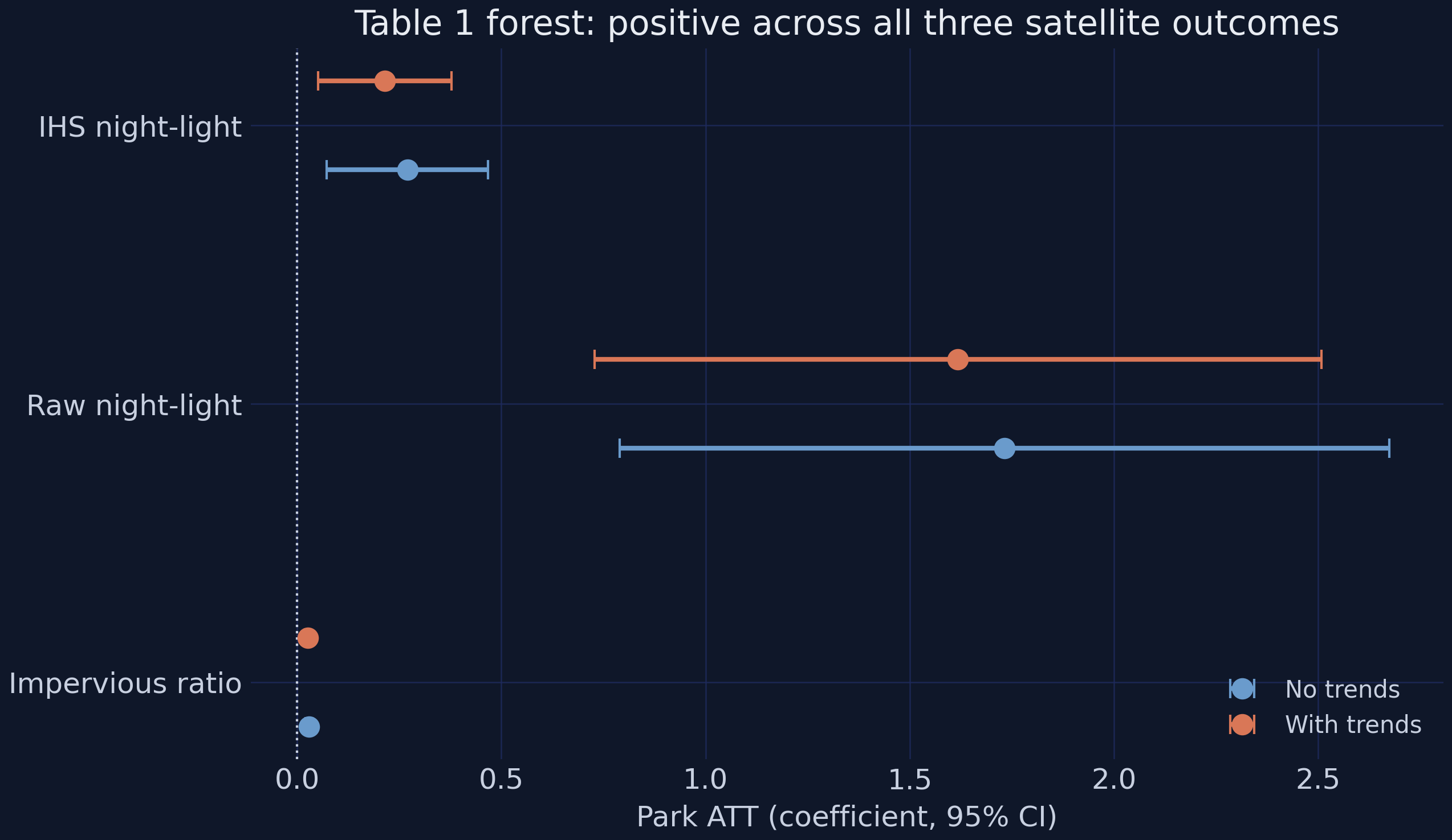
The effect on the 17 districts that got a park — not on a random district — identified under parallel trends.
Naive 2×2 — the cartoon
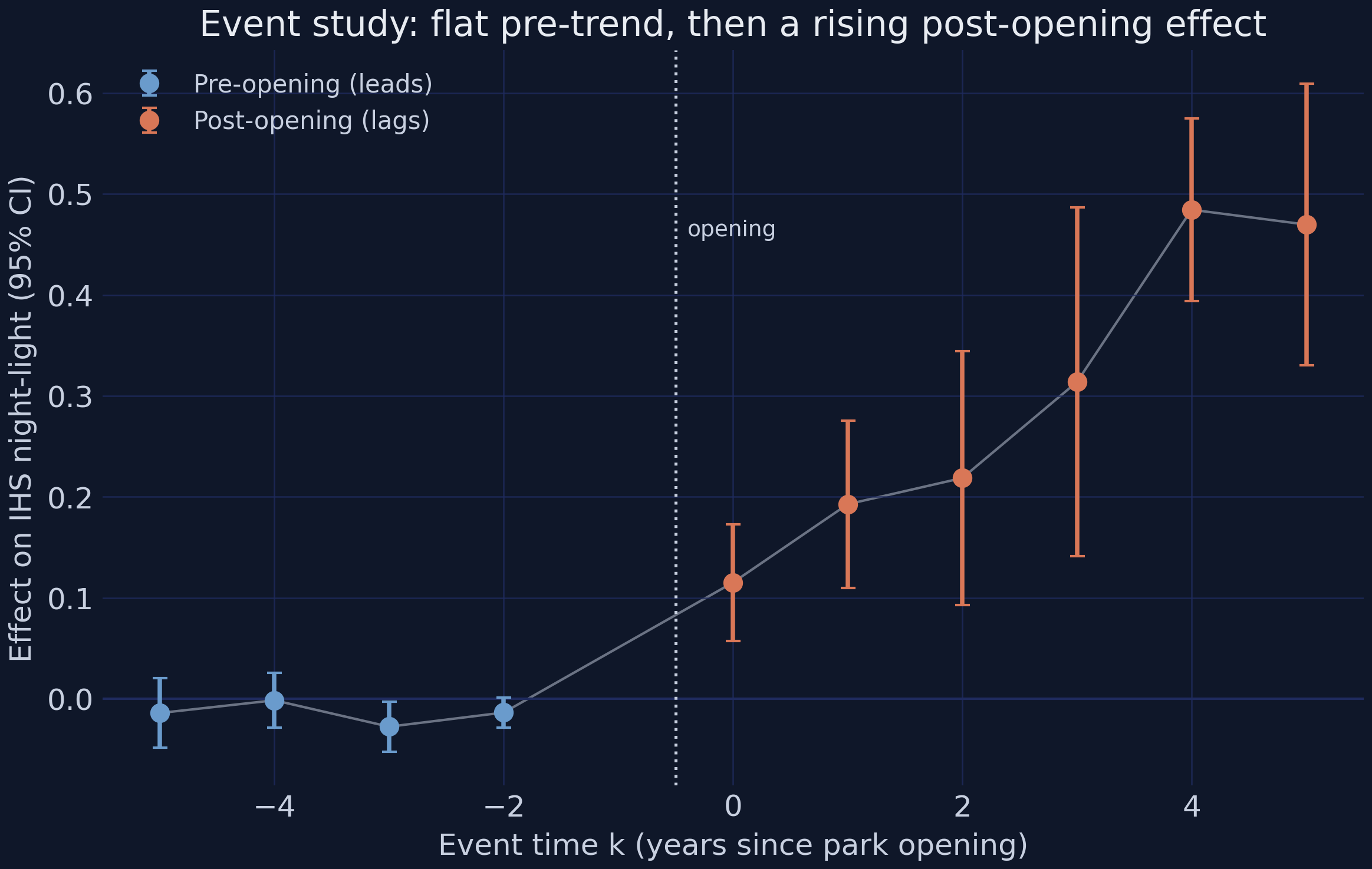
TWFE + event study — the workhorse
Sun-Abraham · Borusyak/Gardner · Callaway-Sant’Anna — the insurance
Three data streams · one design · an escalating ladder of estimators.
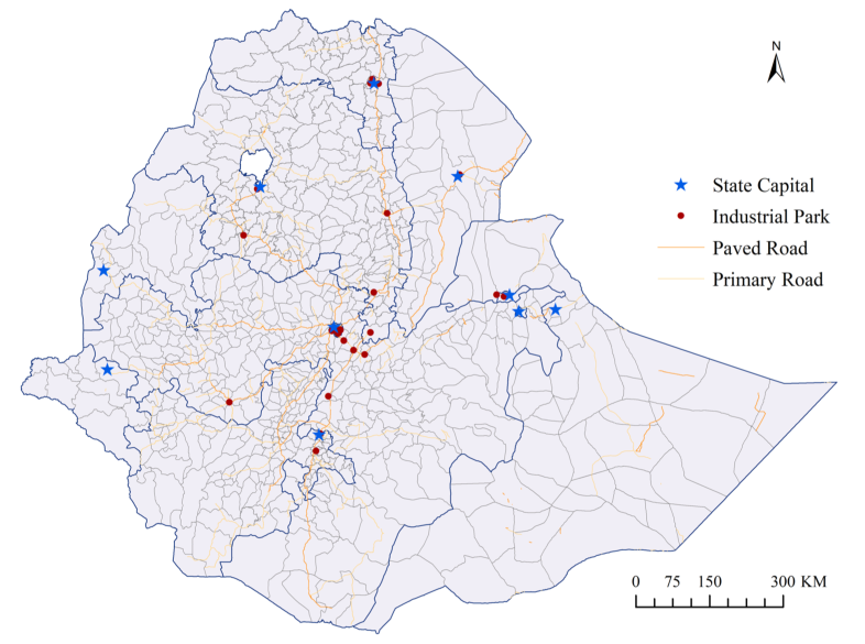
Parks cluster near Addis and the road corridors — placement was deliberate
Ethiopia’s industrial parks (red dots), regional state capitals (blue stars), and the paved and primary road network.
Source: Appendix Figure A2 in Huang, Wang & Xu (2026). Real park locations from the paper; this tutorial uses synthetic calibrated data.
Deliberate clustering near cities and roads is exactly the non-random placement the design has to handle.
The Investigation
Act II
One policy, measured at three grains — satellite, household, individual
Satellite panel
139 woredas × 16 years (2,224 rows)
17 treated vs 122 matched controls
outcome: IHS nighttime light
DHS repeated cross-sections
13,200 households · 17,900 individuals
5 survey rounds, fresh respondents
no panel key → coarse event phases
Only 17 treated woredas — the recurring source of statistical caution.
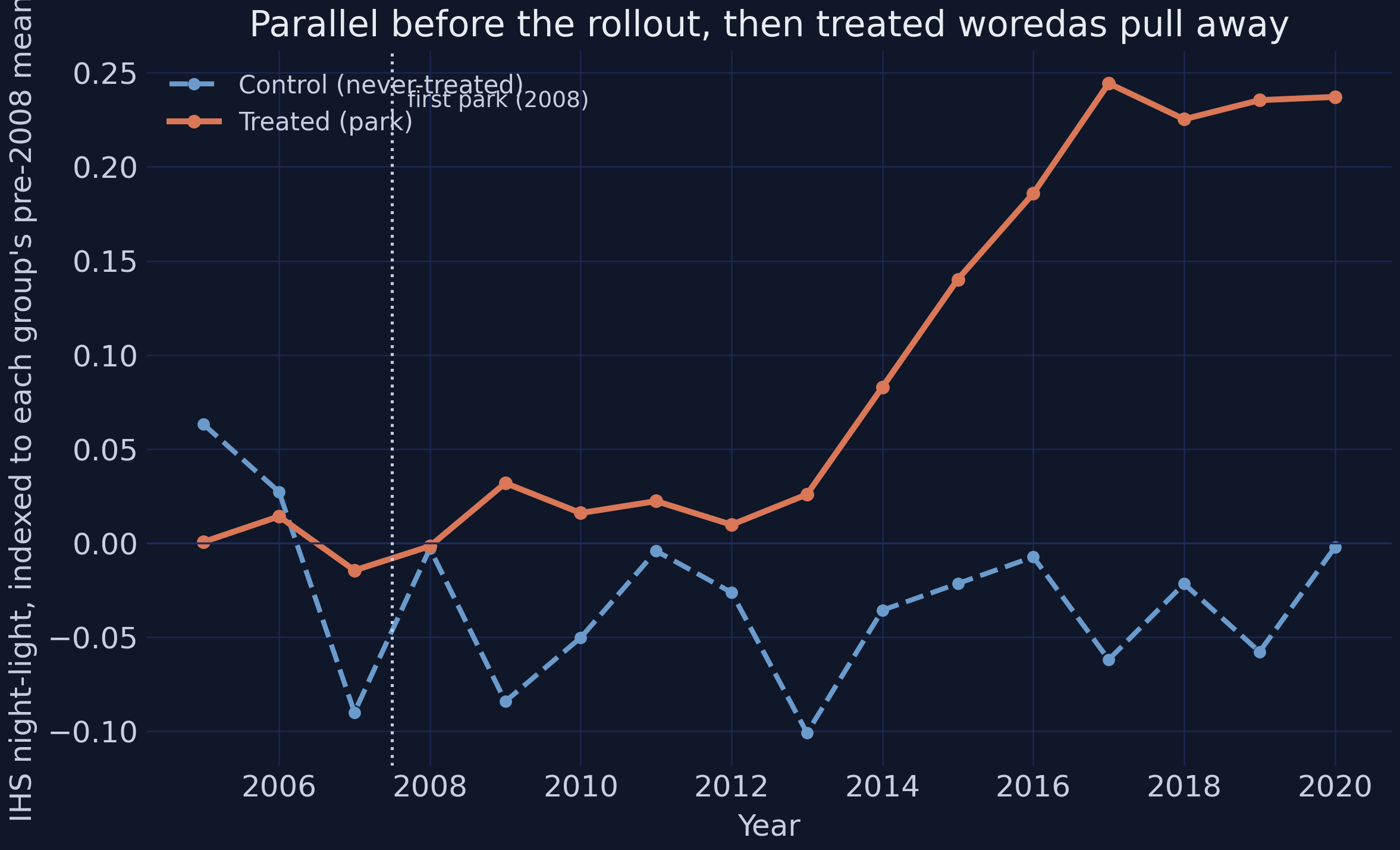
Parallel before the rollout, then the treated woredas pull away
Baseline-normalized group-mean IHS light: treated (orange) and control (blue) overlap before 2008, then the treated series climbs while controls stay flat.
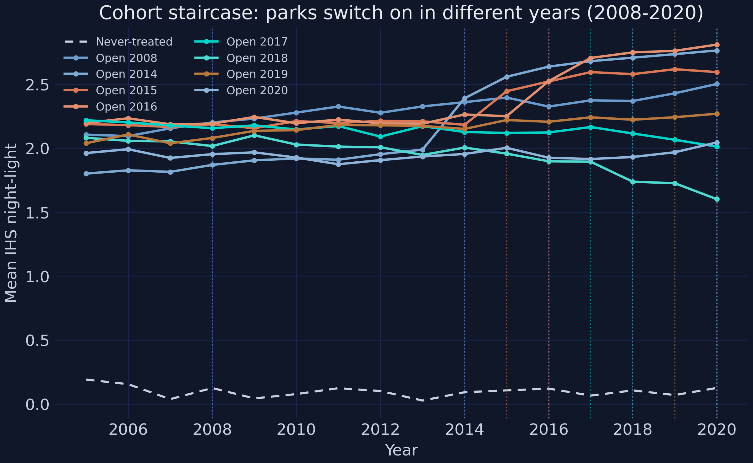
Staggered means there is no single “before” — each cohort has its own clock
Cohort staircase: each opening-year cohort turns up at its own park-opening date against a flat never-treated baseline.
1 woreda in 2008, then 2–3 per year across 2014–2020 — 17 in total.
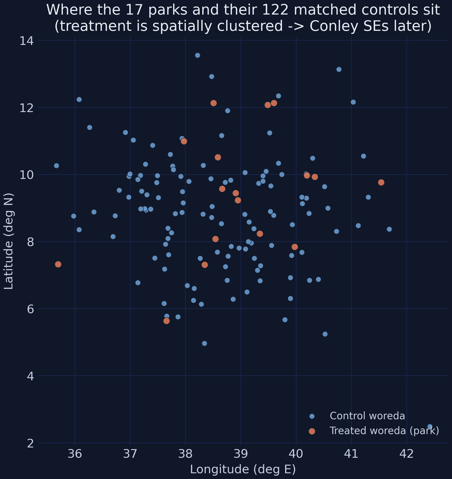
Treatment is spatially clustered — which will matter for standard errors
Treatment map: the 17 treated woredas (orange) cluster spatially among the 122 matched controls (blue).
Near things are more related than distant things — their shocks are not independent draws.
A single “after” blends the slow start with the late surge — and understates the effect
The simplest estimate collapses the design at the median opening year and takes a difference of differences:
The teaching moment: staggered TWFE can use already-treated units as controls
The worry. Under staggered timing TWFE makes “forbidden comparisons” — already-treated woredas as controls for later-treated ones. When effects grow over time, those comparisons get negative weights and can bias, even flip, the estimate.
The fix.Sun-Abraham, Borusyak/Gardner, and Callaway-Sant’Anna only ever compare treated cohorts to clean (never- or not-yet-treated) controls. Each targets the same ATT — if they agree with TWFE, the bias is not biting.
Four estimators, one estimand — they agree within 0.046 IHS units
Estimator
ATT
Sig.
TWFE
+0.2699
***
Sun-Abraham
+0.2991
***
Borusyak/Gardner
+0.3022
***
Callaway-Sant’Anna
+0.2561
***
A 0.046 spread across four estimators — the staggered-bias worry does not bite here.
And the Goodman-Bacon decomposition shows why — 95.4% clean weight
Comparison type
Weight
Avg estimate
Treated vs never
95.42%
+0.2708
Earlier vs later
3.38%
+0.3370
Later vs earlier (forbidden)
1.21%
+0.0135
The forbidden comparisons carry 1.21% of the weight — negative weighting is negligible here.
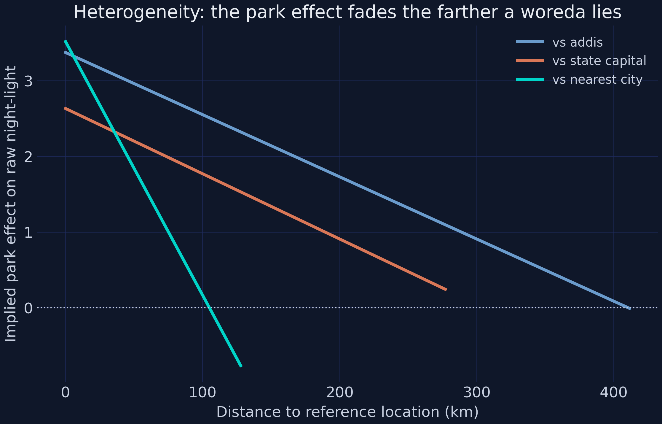
Where parks work: the effect fades with distance and is amplified by roads
Heterogeneity: the implied park effect fades the farther a woreda lies from Addis, its state capital, or the nearest city.
Distance to nearest city \(-0.0335\) (\(t = -4.90\)) · paved roads \(+0.6695\) (\(t = 2.08\)). Place is first-order.
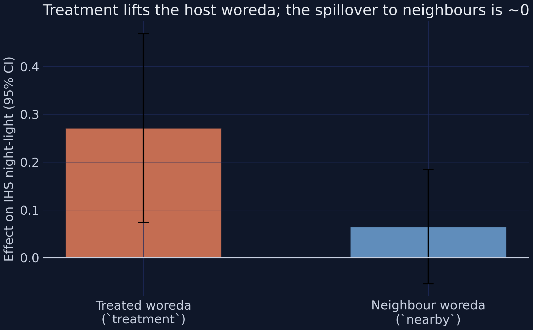
Net-new activity, not displacement — no measurable spillover to neighbours
Spillover test: treatment lifts the host woreda strongly (+0.27), but the effect on control neighbours within 10 km is about zero.
nearby\(= +0.0648\) (\(t = 1.06\)), insignificant — so the host’s gain is net-new, and SUTVA looks plausible.
Households near a park gain durables, housing, and wealth
Outcome
ATT (with controls)
Sig.
Durable goods p.c.
+0.2286 (~74%)
***
Housing quality
+0.2480
***
Wealth index
+0.3825 SD
***
Adding controls barely moves any estimate — the design already absorbs the confounding.
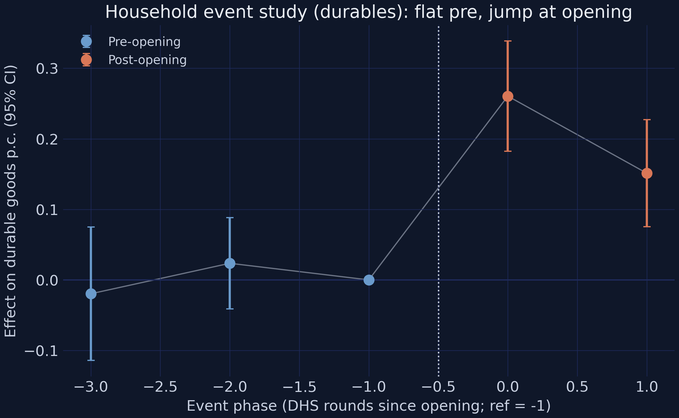
Clean timing in the survey data too — flat pre-phases, then a jump
Household durables RCS event study: flat, insignificant pre-phases, then a jump at park opening (phase 0).